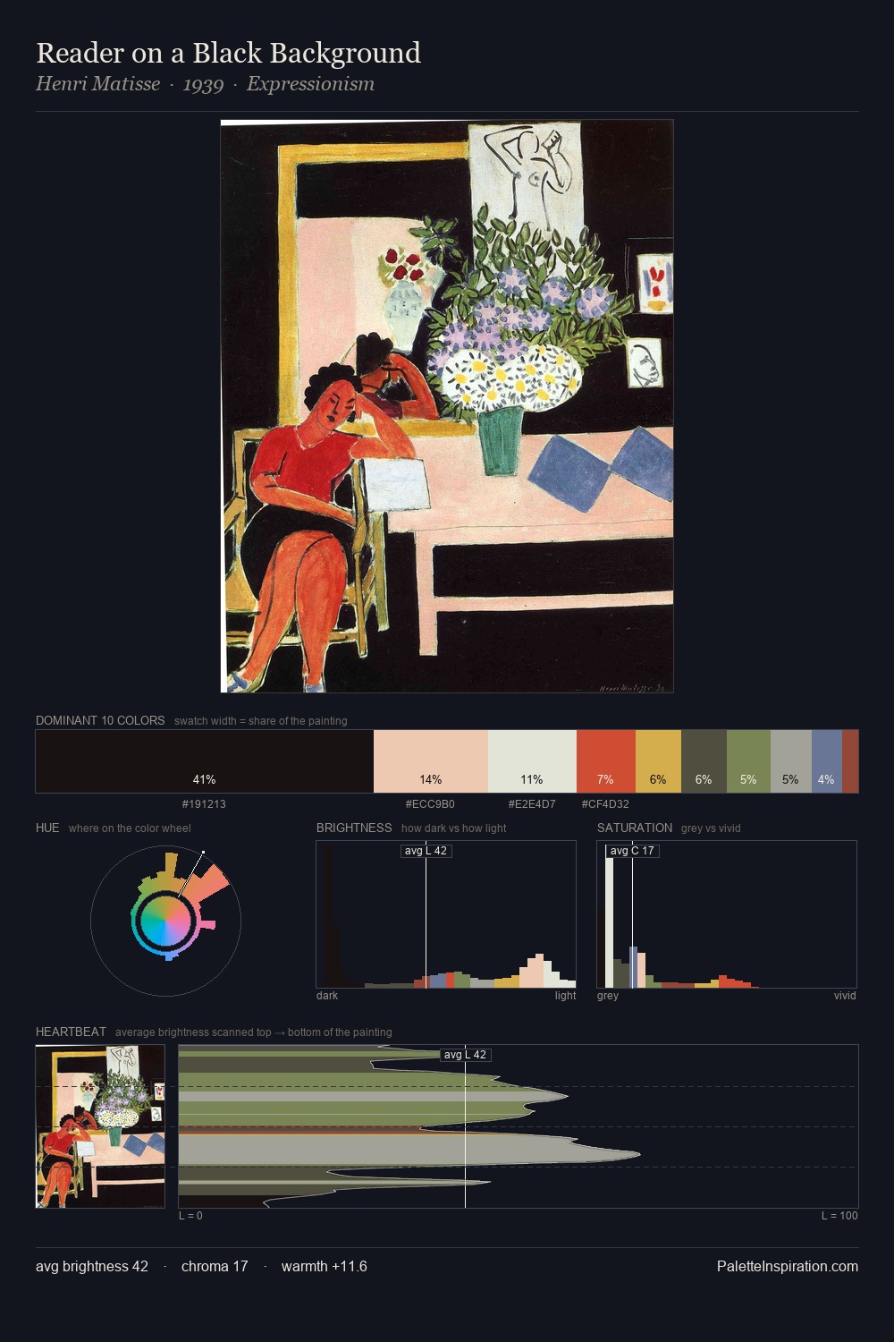
Karl Schmidt-Rottluff Palette 2

Palette Analysis
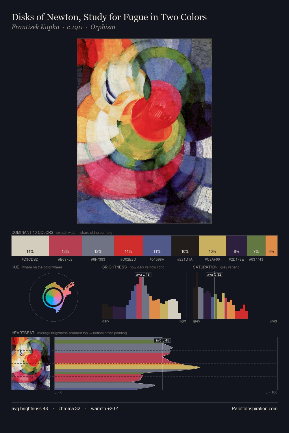
Karl Schmidt-Rottluff sits in the centre of the value range, lending the palette a sense of even, sustained light. Karl Schmidt-Rottluff tilts toward cool - blues and silver-greys carry the structural weight. Chroma is moderate: colours carry enough saturation to be read as colour, but the palette stops well short of garish intensity. The highest-chroma note - #CE311F - appears at just 4.0%, deployed as a precision accent against the quieter ground. 59 units of value range underpin the palette's structural clarity: the eye always knows where light falls. The mid-to-high key, cool bias, and moderate chroma point to outdoor observation - sky and diffused daylight as the dominant light source. Palette 2 sits within the larger chromatic argument that Karl Schmidt-Rottluff's complete body of work advances.
Example use cases
- ceramics & pottery
- boutique hospitality
- menswear
- heritage food brands
- craft & artisan brands
I Love This!
Copy, export, or download for your project