Karel Van Mander Palette 2
Shadowed Caramel
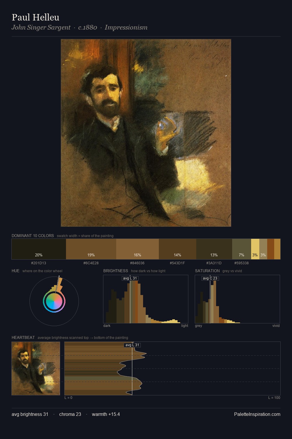
Shadowed Low-key - values weighted toward shadow, the palette of dim interiors and overcast skies.
Caramel Warm mid-brown - the color of cooked sugar, smooth and amber-toned.

Palette Analysis
Karel Van Mander sits in the centre of the value range, lending the palette a sense of even, sustained light. Warmth dominates - the palette of Karel Van Mander leans heavily on the yellow-orange-red arc of the colour wheel. Chroma is held at a comfortable level - distinct colours, but no single hue is allowed to overwhelm. #59351C delivers the chromatic peak at only 7.8% - a small shot of colour with outsized visual impact. At 38 units across the value scale, the palette keeps contrast readable without letting it dominate. Karel Van Mander's palette 2 carries its own internal logic while remaining in conversation with the artist's broader colour intelligence.
Example use cases
- theater design
- jewelry brands
- tobacco-adjacent retail
- event branding
- film & entertainment
I Love This!
Use This Palette
Copy, export, or download for your project
Copy, export, or download for your project
Copy:
Download:
Share: