Karel Van Mander Palette 1

Palette Analysis
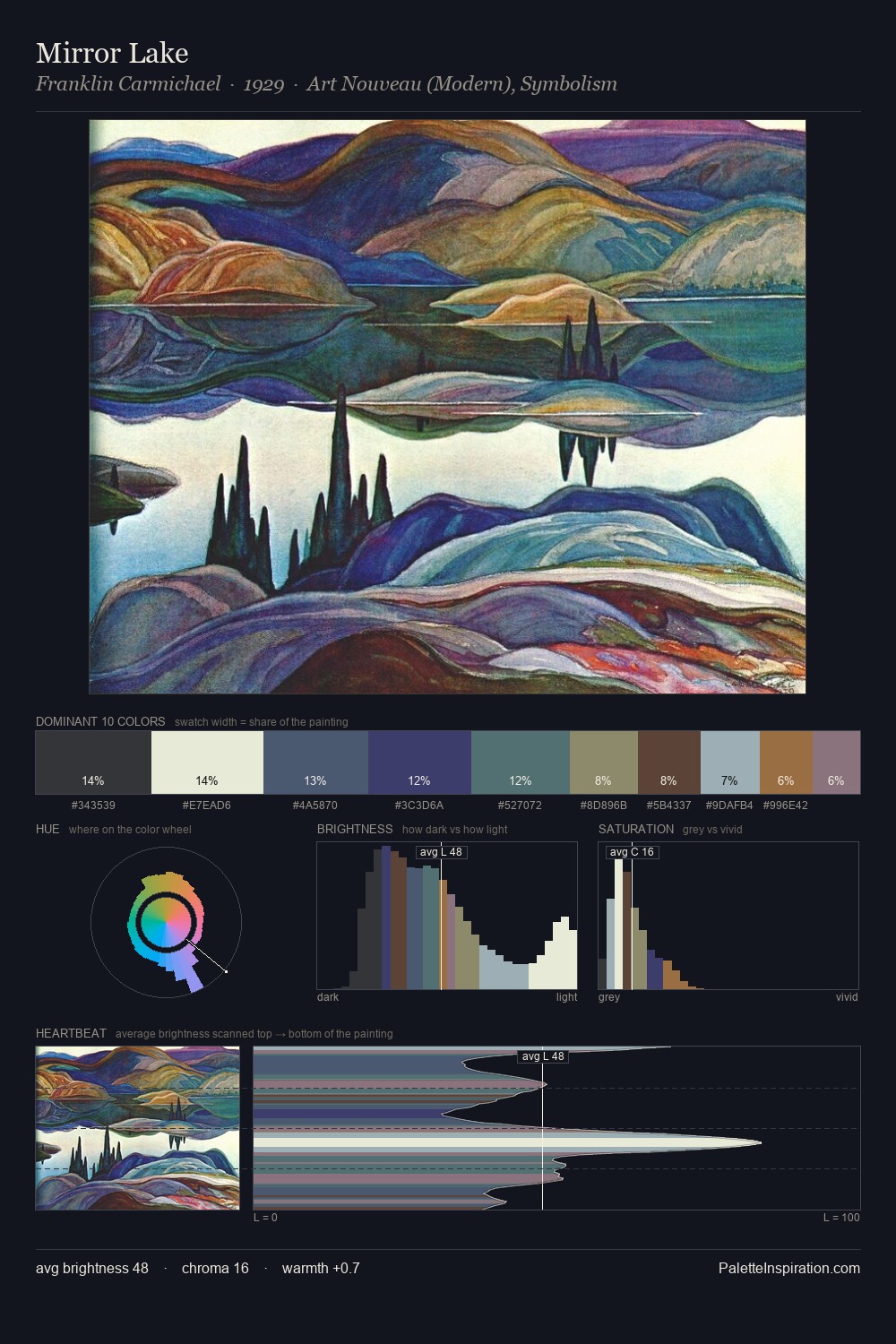
Karel Van Mander distributes its values across the middle register, creating harmony without high contrast. Cool tones set the register here - the blues and greens easily outweigh any warm accents. Every colour is desaturated; the palette proceeds through near-neutrals and gently-coloured greys. The saturated accent, #16356A, registers at 1.1% - sparse enough to feel like a deliberate surprise. The palette spans 48 value units: a measured range that delivers coherence over drama. The mid-to-high key, cool bias, and moderate chroma point to outdoor observation - sky and diffused daylight as the dominant light source. Karel Van Mander's palette 1 carries its own internal logic while remaining in conversation with the artist's broader colour intelligence.
Example use cases
- legal services
- corporate identity
- industrial design
- professional services
- fintech
I Love This!
Copy, export, or download for your project