Karel Škréta Master Palette
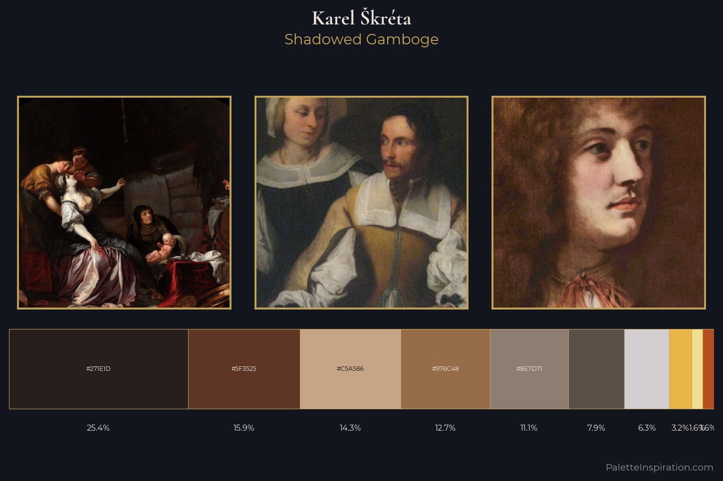
Palette Analysis
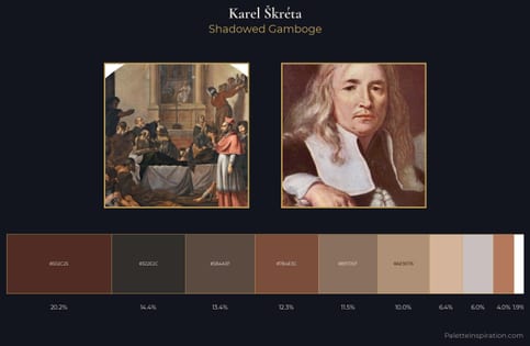
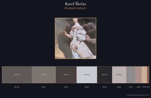
Karel kréta occupies the comfortable middle of the value scale, avoiding both extremes to hold the eye in a sustained middle grey. Temperature reads distinctly warm: the reds and earth tones from Karel kréta carry the compositional weight. All colours lean toward grey, building depth through value rather than colour punch. The dominant colour, #271E1D, takes 25.4% of the total area, establishing the overall mood before any other hue is introduced. #F1DD92 functions as the palette's exclamation mark: highest chroma, lowest percentage (1.6%). The value range spans 65 units across the palette, providing the full gamut from deep shadow to near-white and ensuring clear tonal hierarchy. The palette is recognisably Karel kréta's own: particular in its temperature, chroma, and the economy of its brightest note.
Example use cases
- theater design
- jewelry brands
- tobacco-adjacent retail
- event branding
- film & entertainment
I Love This!
Copy, export, or download for your project