Karel Škréta Palette 3
Shadowed Terracotta
Shadowed Low-key - values weighted toward shadow, the palette of dim interiors and overcast skies.
Terracotta Fired clay red-orange - the color of unglazed earthenware pottery.
Palette Analysis
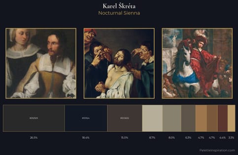
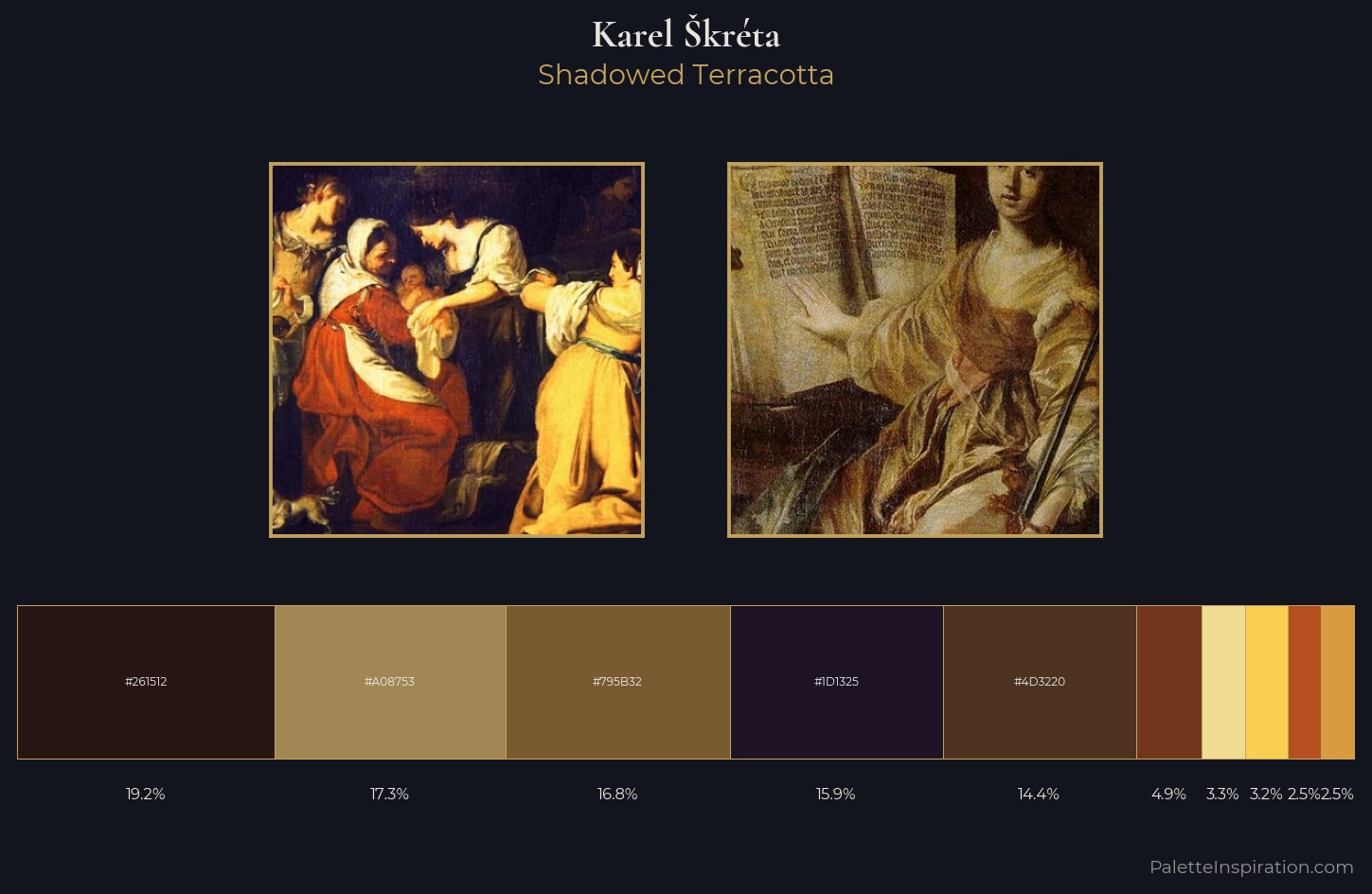
Karel kréta occupies the comfortable middle of the value scale, avoiding both extremes to hold the eye in a sustained middle grey. Warmth dominates - the palette of Karel kréta leans heavily on the yellow-orange-red arc of the colour wheel. Mid-saturation across the board: the palette has colour character without chromatic excess. #B54F20 delivers the chromatic peak at only 2.5% - a small shot of colour with outsized visual impact. 69 units of value range underpin the palette's structural clarity: the eye always knows where light falls. Karel kréta's palette 3 carries its own internal logic while remaining in conversation with the artist's broader colour intelligence.
Example use cases
- music labels
- luxury hospitality
- editorial photography
- leather goods
- premium streaming
I Love This!
Use This Palette
Copy, export, or download for your project
Copy, export, or download for your project
Copy:
Download:
Share: