Julius Kohnholz Palette 2

Palette Analysis
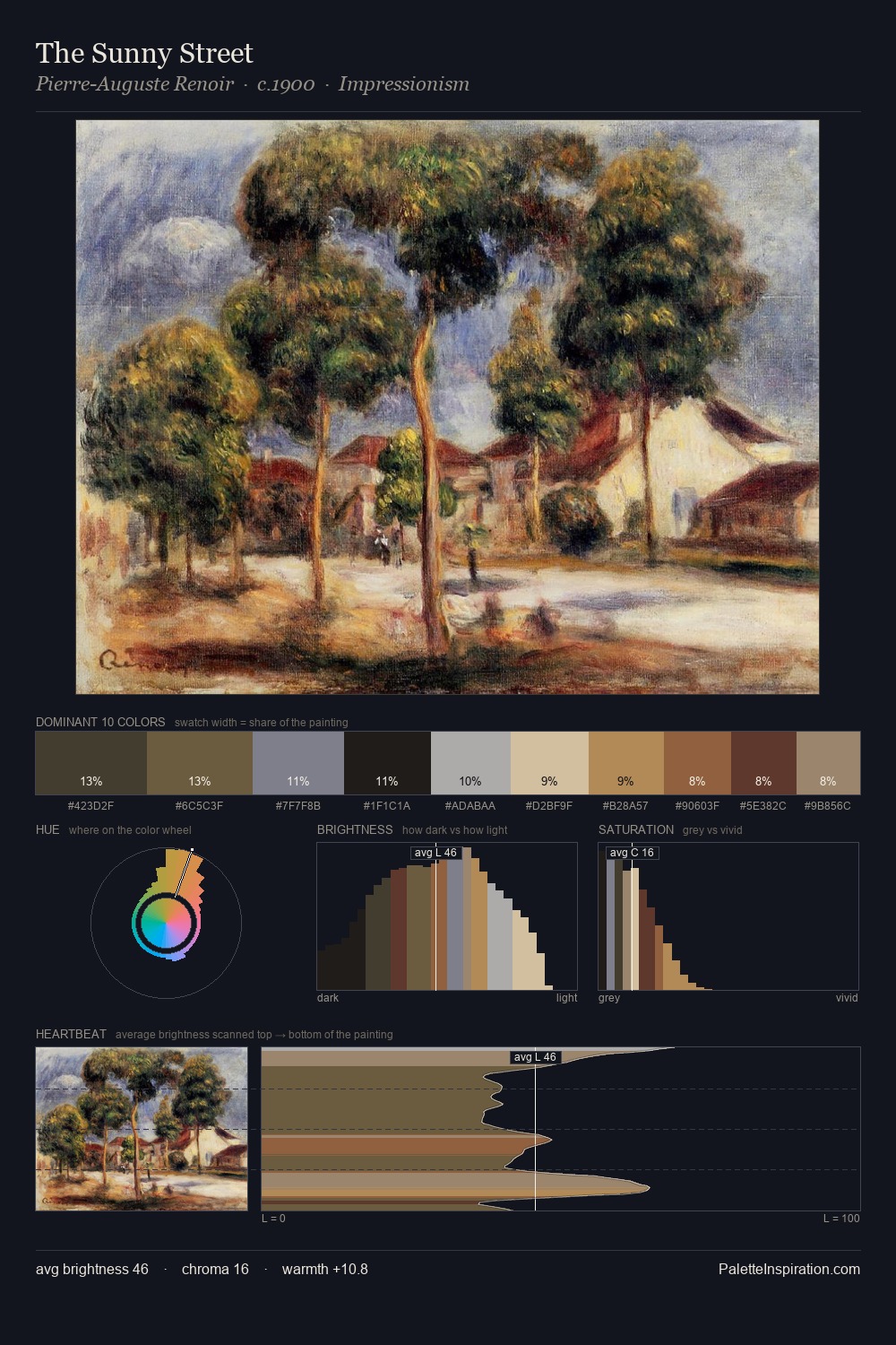
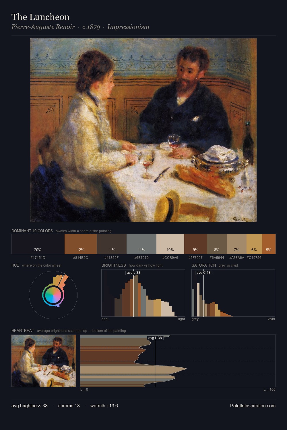
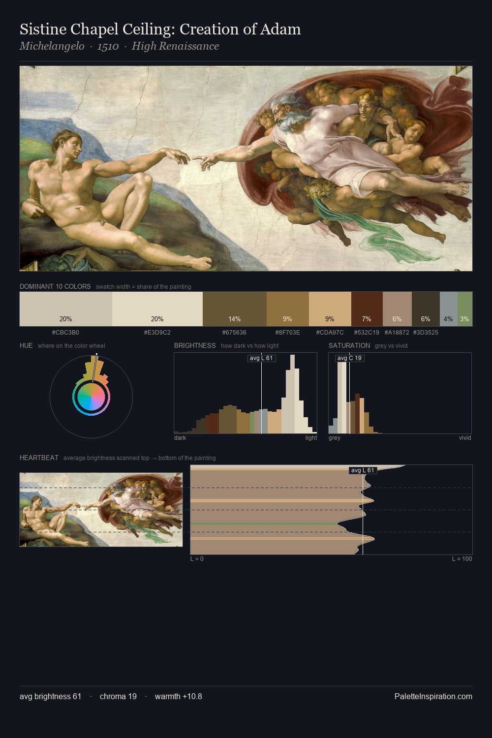
Julius Kohnholz works in the upper reaches of the value scale, creating an atmosphere of brightness and expansiveness. Cool tones set the register here - the blues and greens easily outweigh any warm accents. Chroma is kept low across all colours, producing the soft, enveloping quality that characterises tonal painting. Only 6.1% is devoted to #5B301A, yet that small allocation delivers the palette's entire chromatic tension. 53 units of value spread create a palette that is varied but unified - contrast in the service of harmony. The palette has the character of outdoor light: cool, mid-bright, with colour rendered faithfully rather than expressively. Palette 2 sits within the larger chromatic argument that Julius Kohnholz's complete body of work advances.
Example use cases
- food packaging
- leather accessories
- travel & outdoor
- natural cosmetics
- interior design
I Love This!
Copy, export, or download for your project