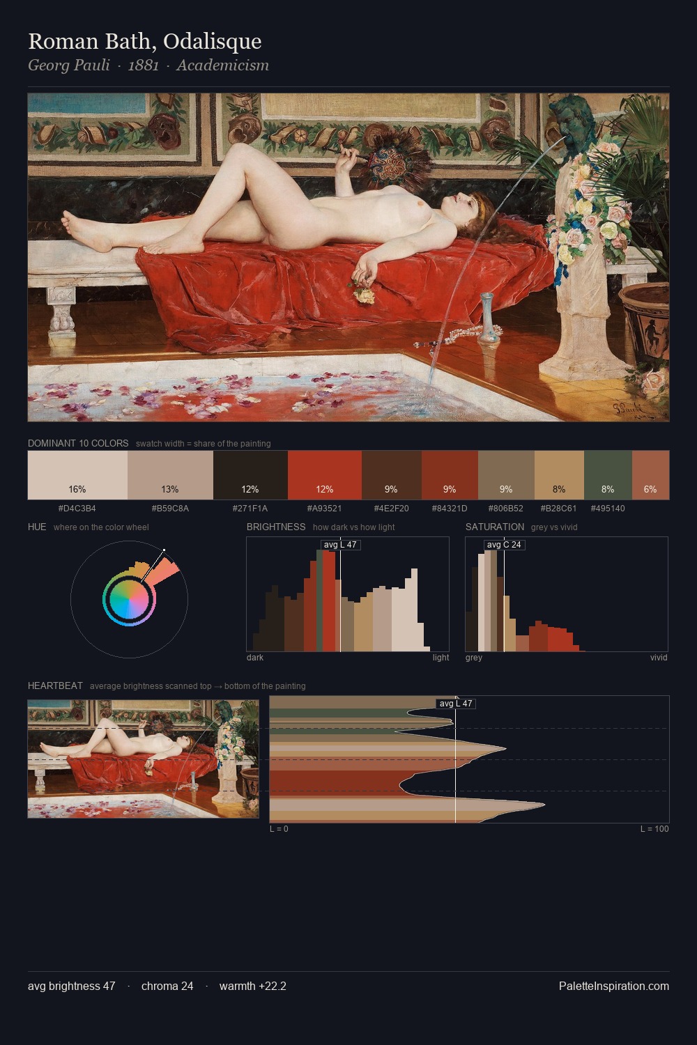
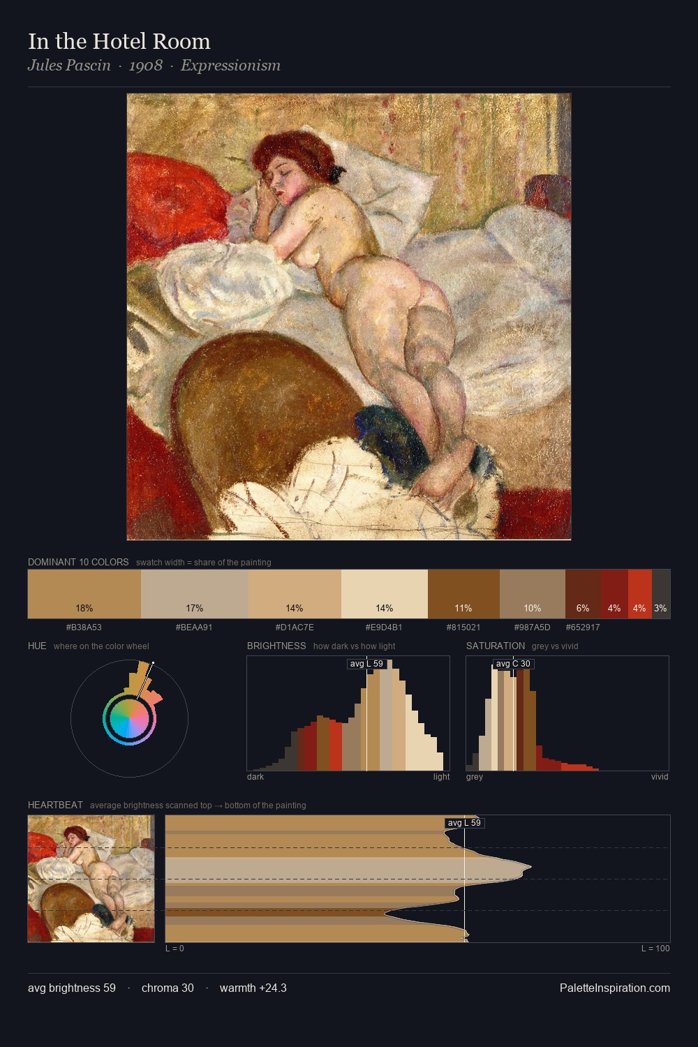
Jules Pascin Palette 3
Pale Apricot
Pale High-key and low-chroma - delicate, bleached, washed with light.
Apricot Soft warm orange - peach-adjacent, the color of ripe stone fruit.

Palette Analysis
Jules Pascin is strongly light-biased - shadow is suggested rather than declared. Jules Pascin orchestrates warmth above all else - reds, ambers, and siennas take the lead. Saturation is measured and controlled, giving the palette presence without visual aggression. #743A1A delivers the chromatic peak at only 11.3% - a small shot of colour with outsized visual impact. From deepest dark to palest light, the palette traverses 58 units of the value scale - a span that creates natural depth. Jules Pascin's palette 3 carries its own internal logic while remaining in conversation with the artist's broader colour intelligence.
Example use cases
- ceramics & pottery
- boutique hospitality
- menswear
- heritage food brands
- craft & artisan brands
I Love This!
Use This Palette
Copy, export, or download for your project
Copy, export, or download for your project
Copy:
Download:
Share: