Joseph Farquharson Palette 9

Palette Analysis
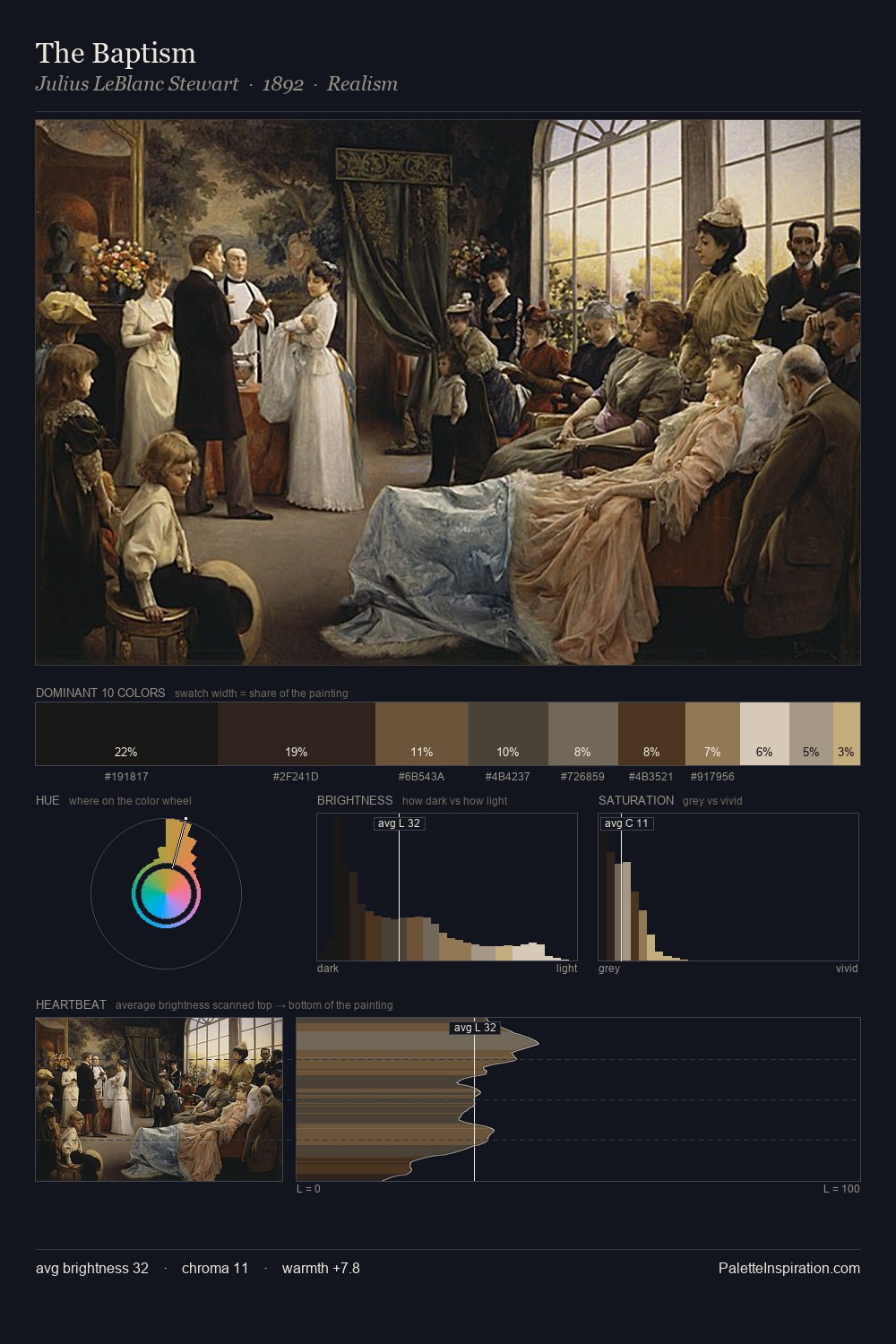
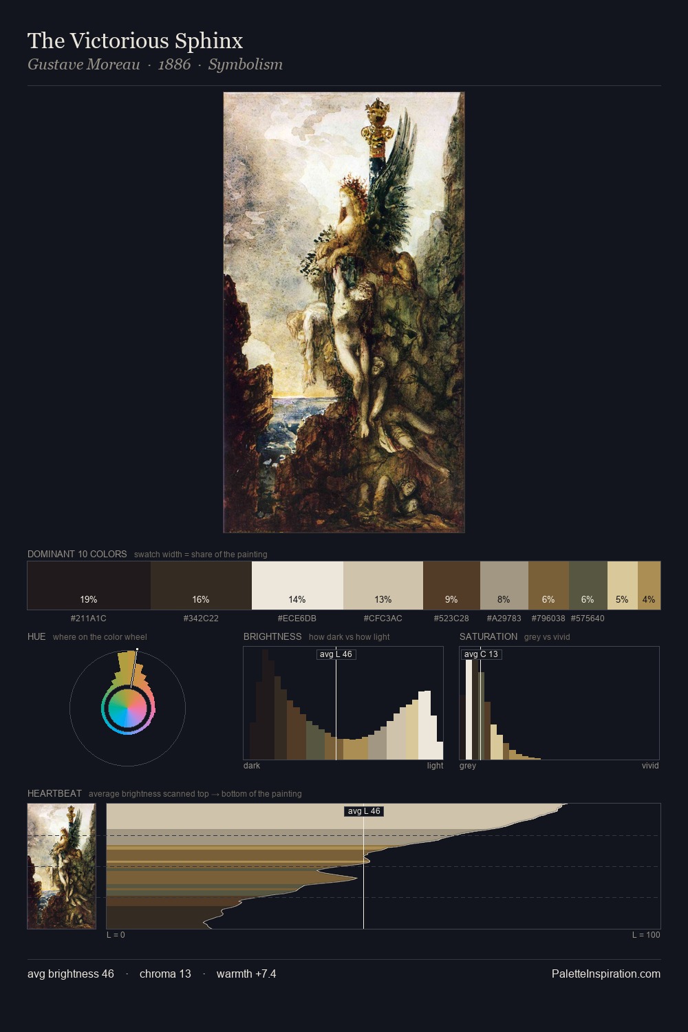
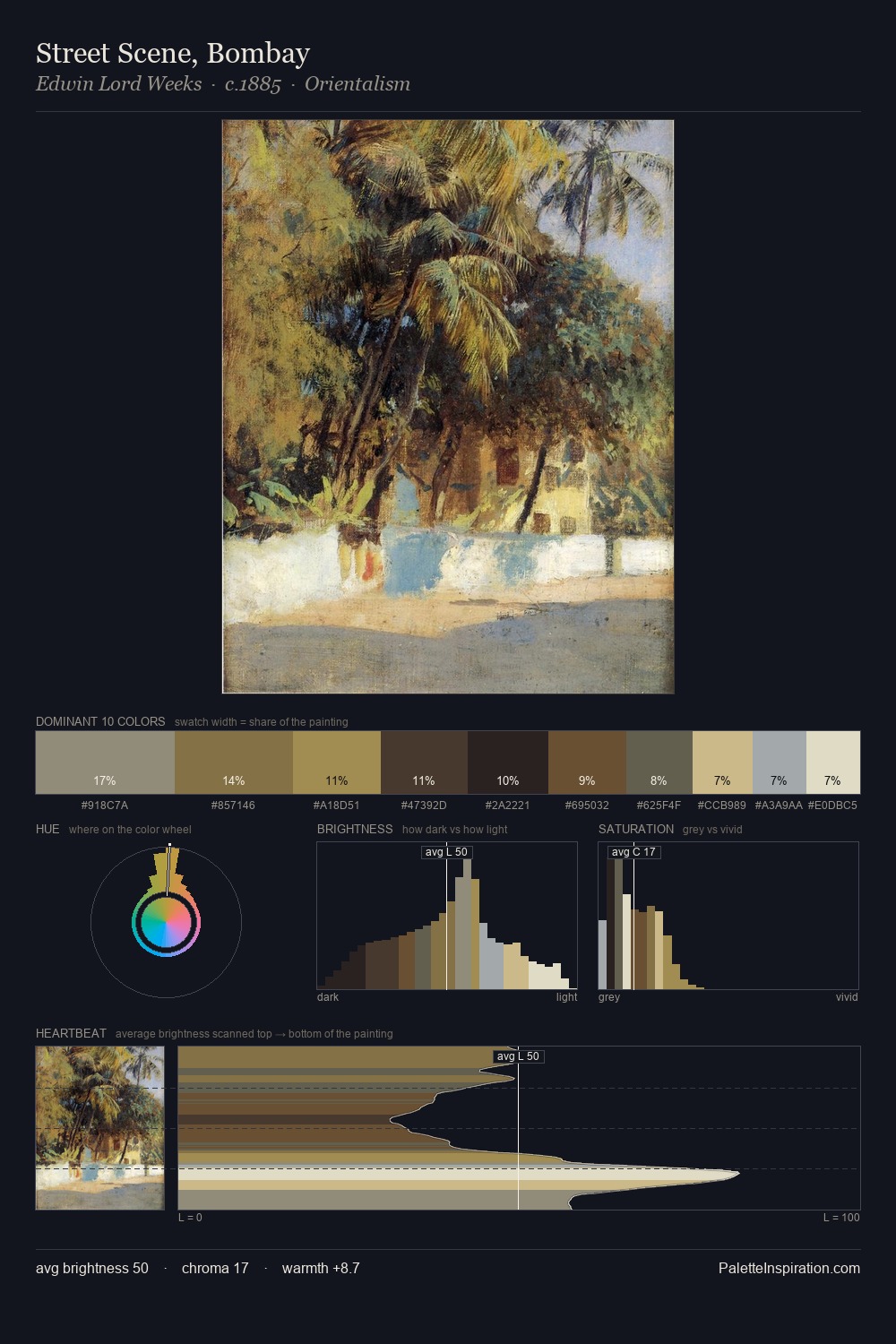
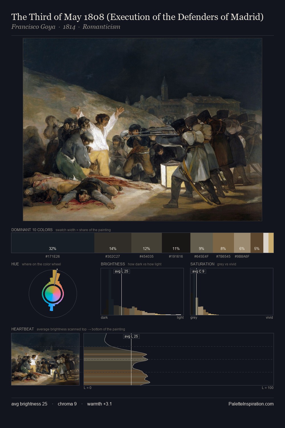
Joseph Farquharson distributes its values across the middle register, creating harmony without high contrast. Warmth dominates - the palette of Joseph Farquharson leans heavily on the yellow-orange-red arc of the colour wheel. Saturation is deliberately withheld - the beauty here lies in the near-monochromatic gradations rather than colour difference. A single dominant - #201C1D at 25.7% - sets the character of the whole composition. Only 13.2% is devoted to #281D13, yet that small allocation delivers the palette's entire chromatic tension. From deepest dark to palest light, the palette traverses 67 units of the value scale - a span that creates natural depth. In the context of Joseph Farquharson's full range of palettes, group 9 represents one movement in an ongoing chromatic dialogue.
Example use cases
- theater design
- jewelry brands
- tobacco-adjacent retail
- event branding
- film & entertainment
I Love This!
Copy, export, or download for your project