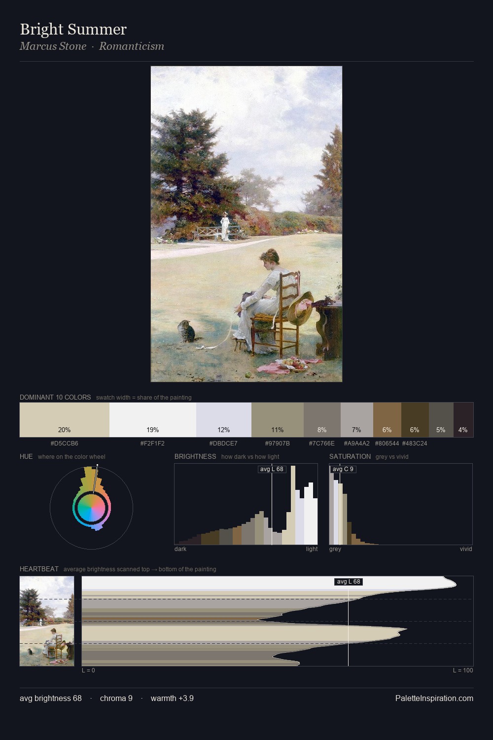
Joseph Farquharson Palette 1
Pale Ivory
Pale High-key and low-chroma - delicate, bleached, washed with light.
Ivory Warm creamy white - the color of natural ivory, warmer than pure white.

Palette Analysis
Values in Joseph Farquharson tilt decisively toward white, giving the palette its luminous character. The palette achieves thermal balance - reds and blues, ochres and greens, each holding the other in check. The absence of saturated colour is itself an expressive choice: this is a palette of restraint and atmosphere. The saturated accent, #8C6F53, registers at 5.1% - sparse enough to feel like a deliberate surprise. From deepest dark to palest light, the palette traverses 64 units of the value scale - a span that creates natural depth. Palette 1 sits within the larger chromatic argument that Joseph Farquharson's complete body of work advances.
Example use cases
- florist branding
- event design
- real estate
- jewelry retail
- hospitality branding
I Love This!
Use This Palette
Copy, export, or download for your project
Copy, export, or download for your project
Copy:
Download:
Share: