Joos van Cleve Palette 1
Palette Analysis
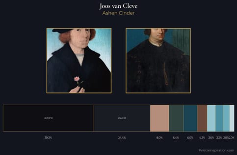
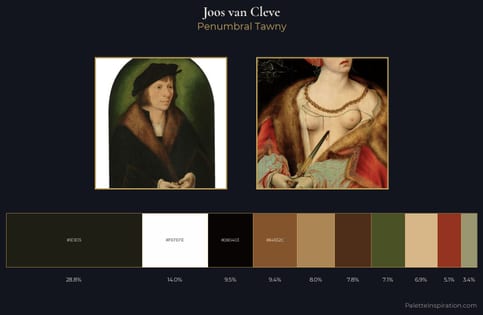
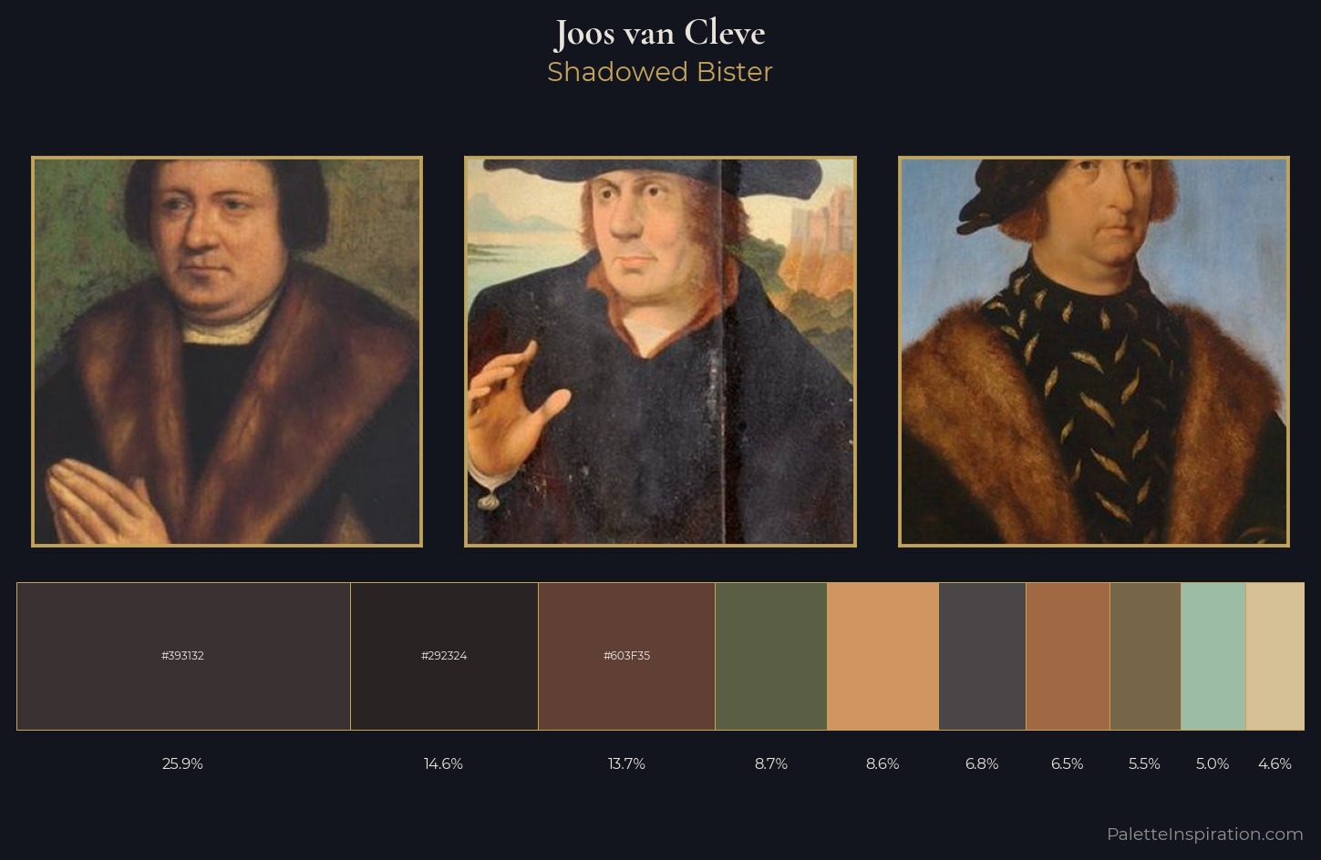
Mid-key values give Joos van Cleve its characteristic quietness - nothing blazes, nothing disappears. Heat pervades this palette; warm chromatic identities outweigh cool ones at almost every weight. All colours lean toward grey, building depth through value rather than colour punch. The dominant colour, #393132, takes 25.9% of the total area, establishing the overall mood before any other hue is introduced. At 4.6%, #D6C197 carries the palette's sharpest chromatic charge: an accent that earns its place precisely because it is withheld. 56 units of value range underpin the palette's structural clarity: the eye always knows where light falls. This is palette 1 of Joos van Cleve's sequence - a single chapter in a chromatic story told across many works.
Example use cases
- theater design
- jewelry brands
- tobacco-adjacent retail
- event branding
- film & entertainment
I Love This!
Copy, export, or download for your project