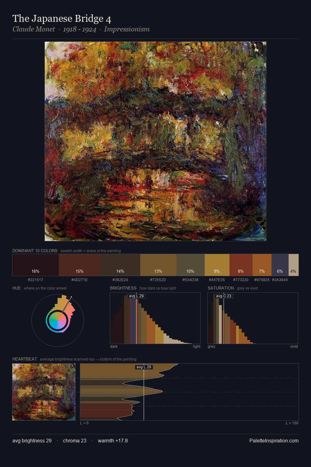
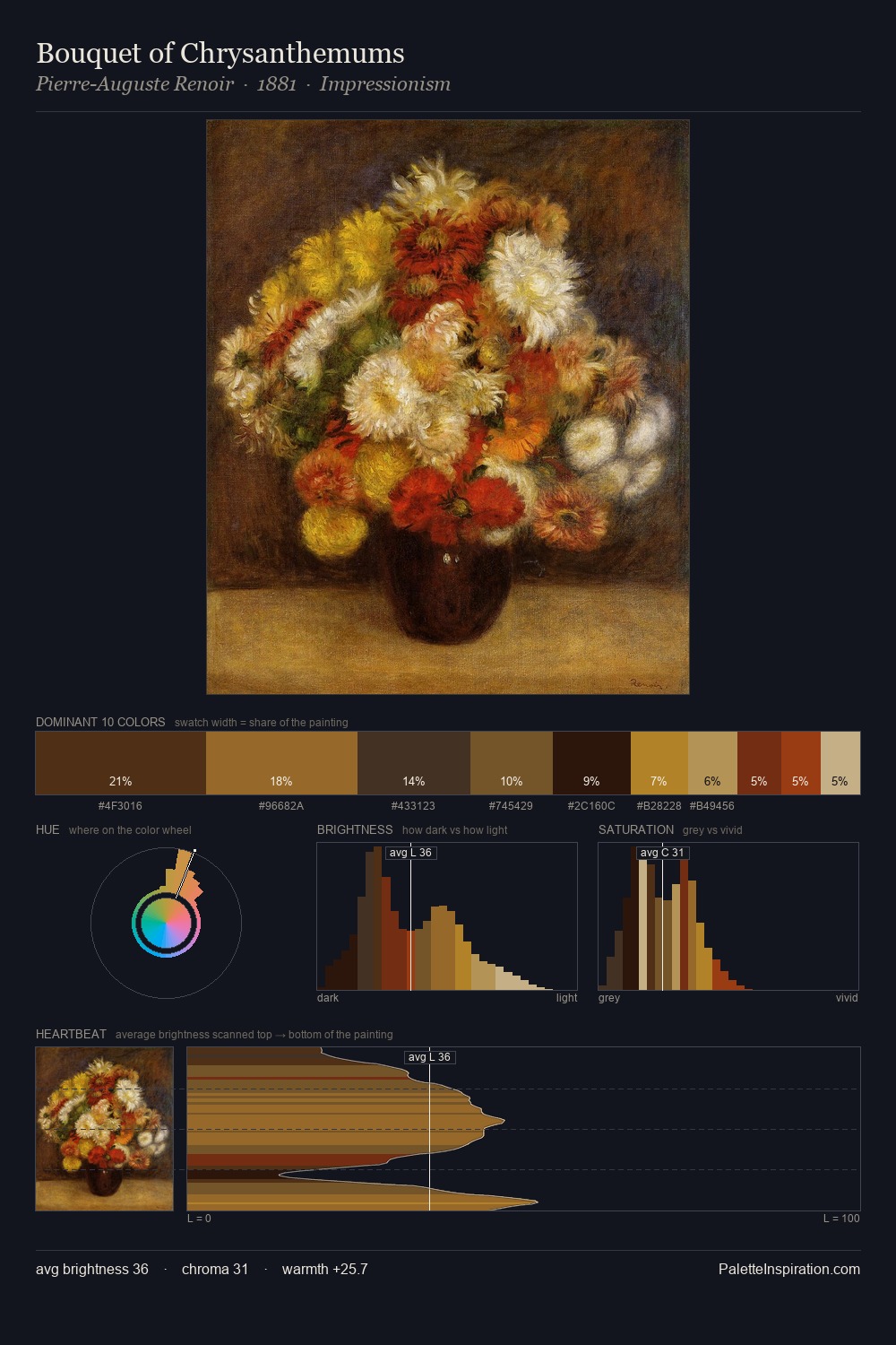
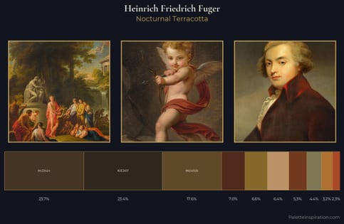
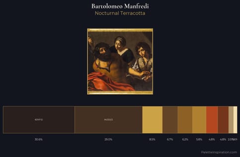
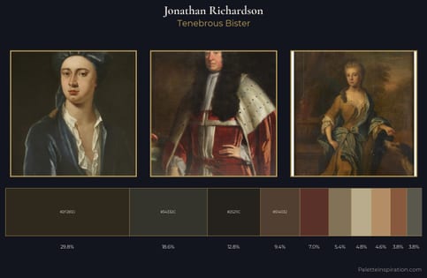
Jonathan Richardson Palette 4
Palette Analysis
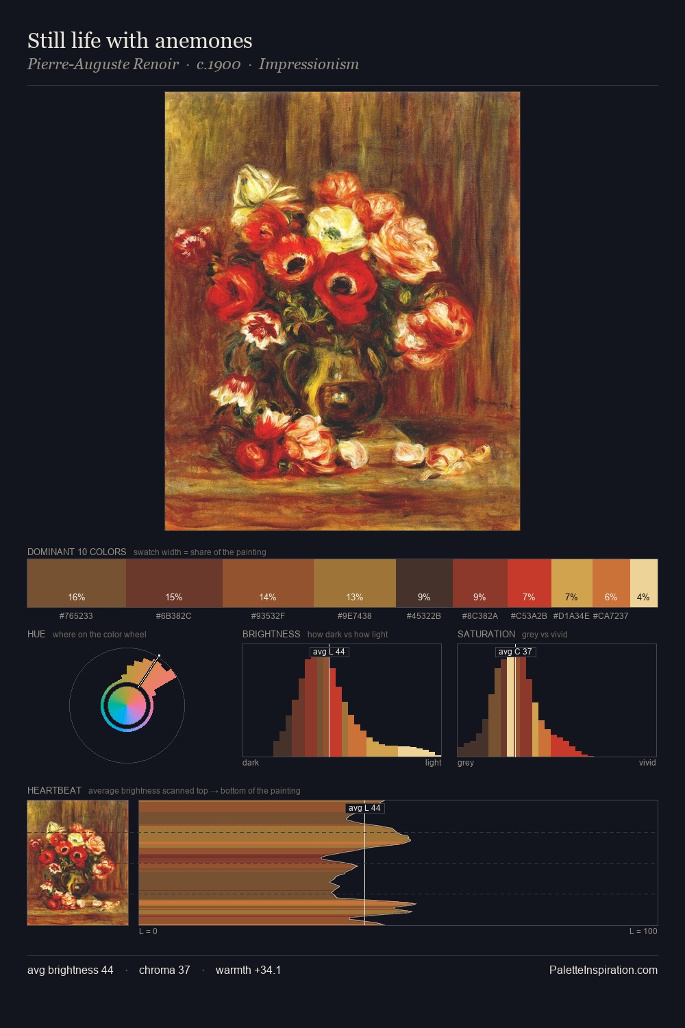
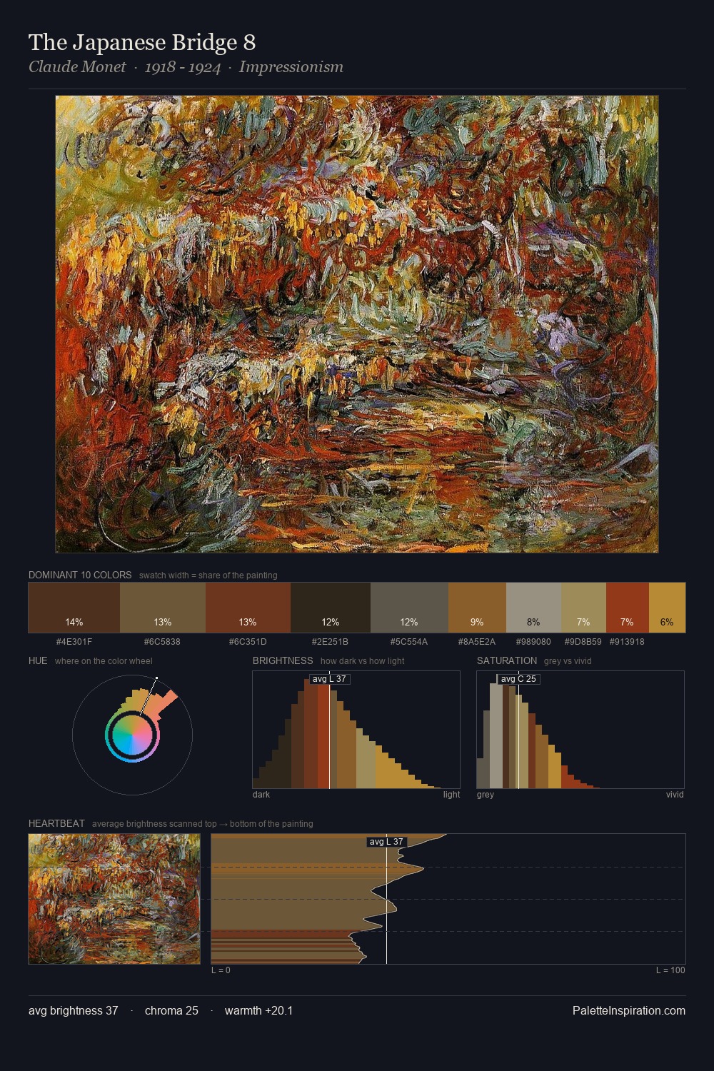
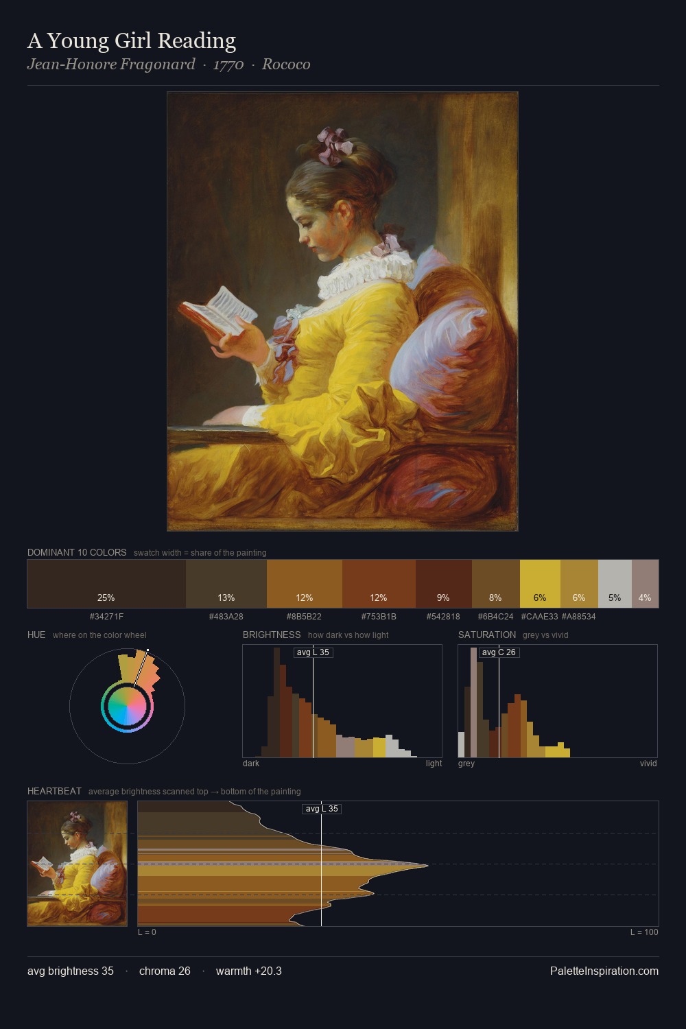
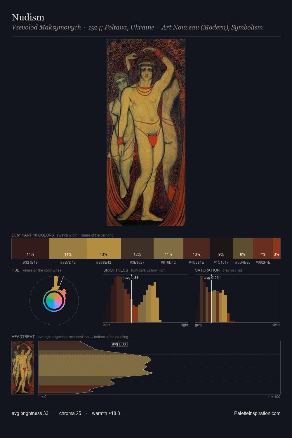
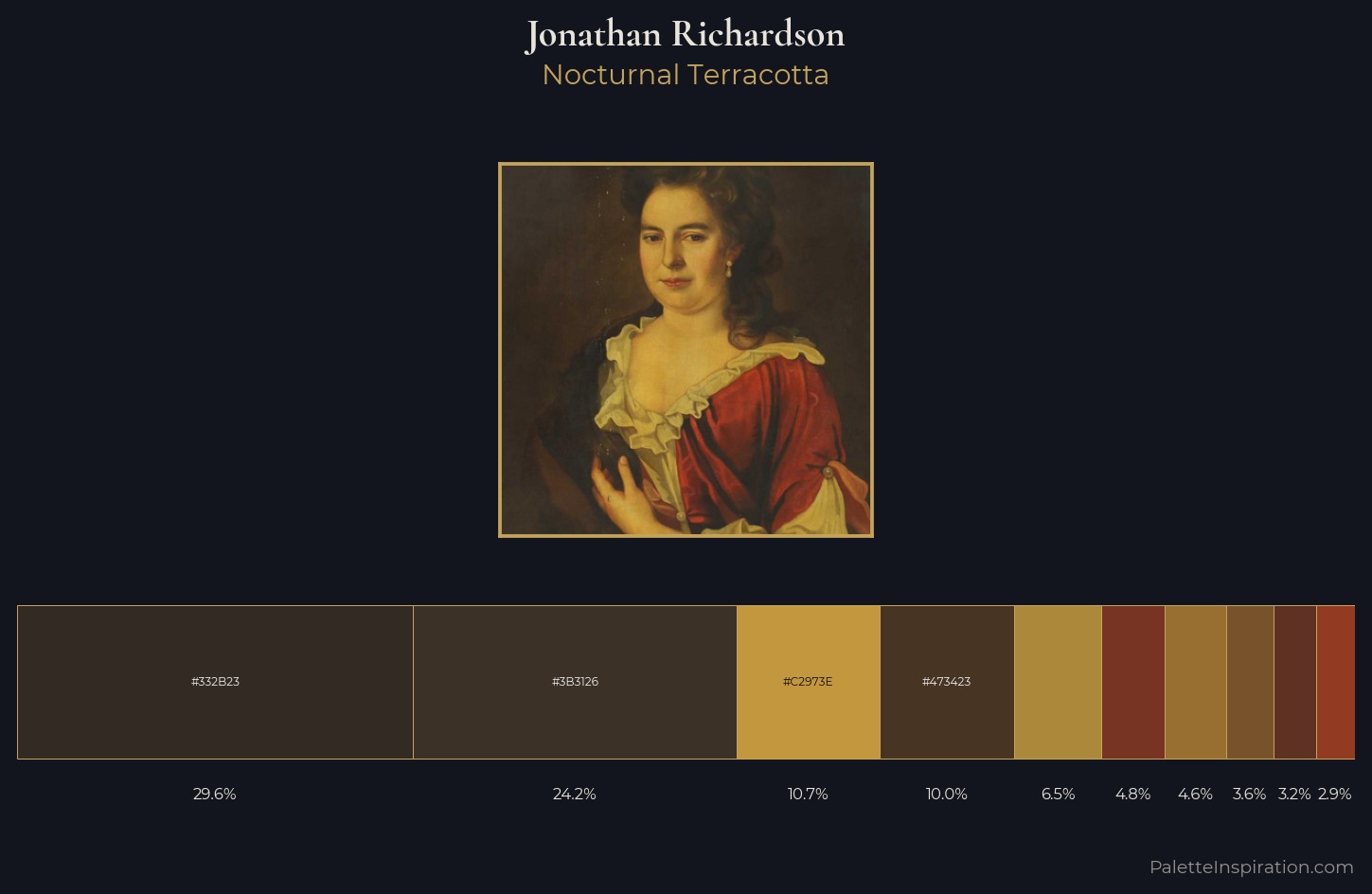
Jonathan Richardson sits in the centre of the value range, lending the palette a sense of even, sustained light. Jonathan Richardson orchestrates warmth above all else - reds, ambers, and siennas take the lead. Every colour is desaturated; the palette proceeds through near-neutrals and gently-coloured greys. The dominant colour, #332B23, takes 29.6% of the total area, establishing the overall mood before any other hue is introduced. The highest-chroma note - #783422 - appears at just 4.8%, deployed as a precision accent against the quieter ground. 40 units of value spread create a palette that is varied but unified - contrast in the service of harmony. Jonathan Richardson's palette 4 carries its own internal logic while remaining in conversation with the artist's broader colour intelligence.
Example use cases
- theater design
- jewelry brands
- tobacco-adjacent retail
- event branding
- film & entertainment
I Love This!
Copy, export, or download for your project