Jonathan Richardson Palette 2

Palette Analysis
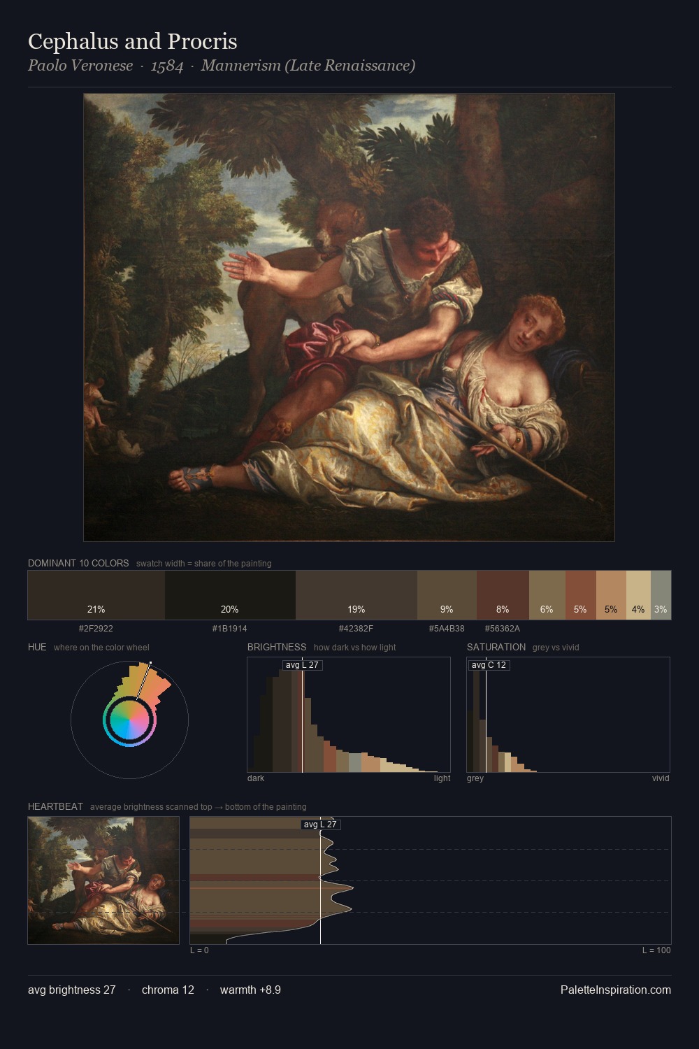
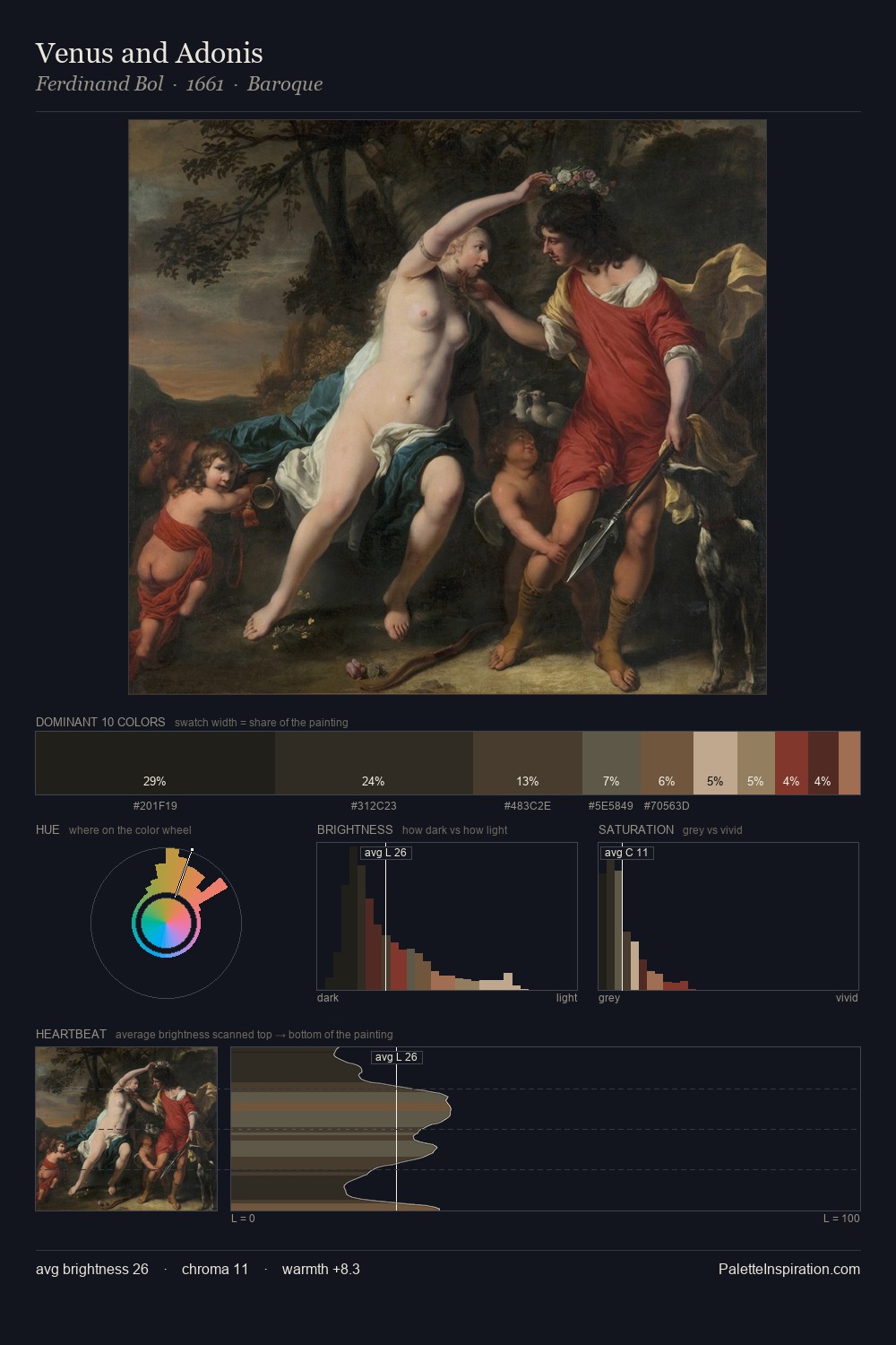
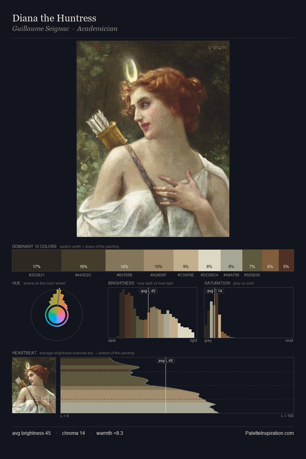
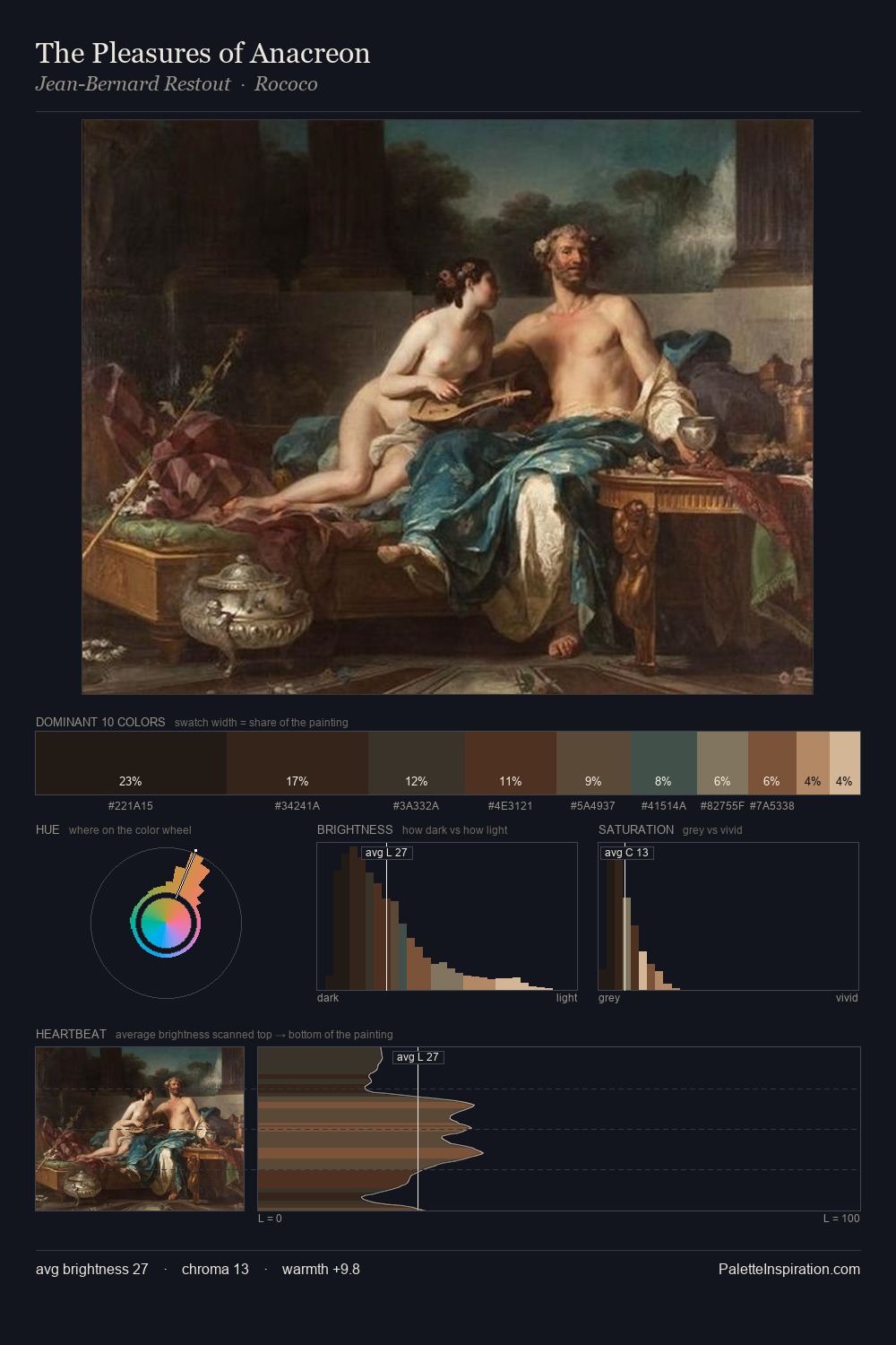
The value structure of Jonathan Richardson is mid-key: quiet, controlled, and cohesive. Jonathan Richardson builds on cool foundations: the palette favours the blue-cyan-green arc. All colours lean toward grey, building depth through value rather than colour punch. A single dominant - #2F281D at 29.8% - sets the character of the whole composition. The most saturated colour, #5A3128, is reserved to 7.0% of the surface, where it acts as a focal punctuation. At 50 units across the value scale, the palette keeps contrast readable without letting it dominate. The mid-to-high key, cool bias, and moderate chroma point to outdoor observation - sky and diffused daylight as the dominant light source. This is palette 2 of Jonathan Richardson's sequence - a single chapter in a chromatic story told across many works.
Example use cases
- theater design
- jewelry brands
- tobacco-adjacent retail
- event branding
- film & entertainment
I Love This!
Copy, export, or download for your project