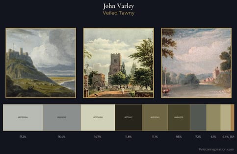
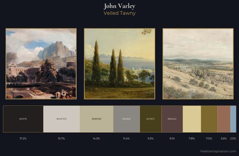
John Varley Palette 1
Palette Analysis
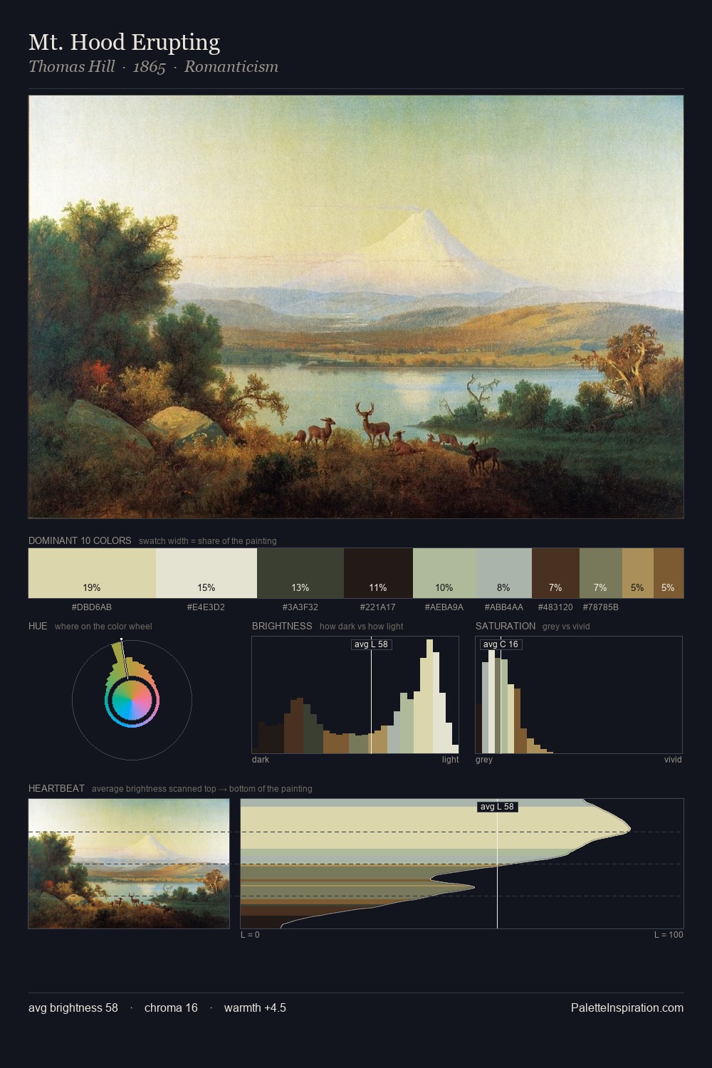
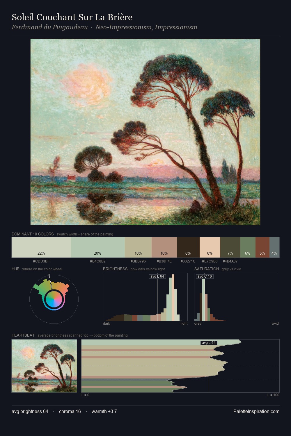
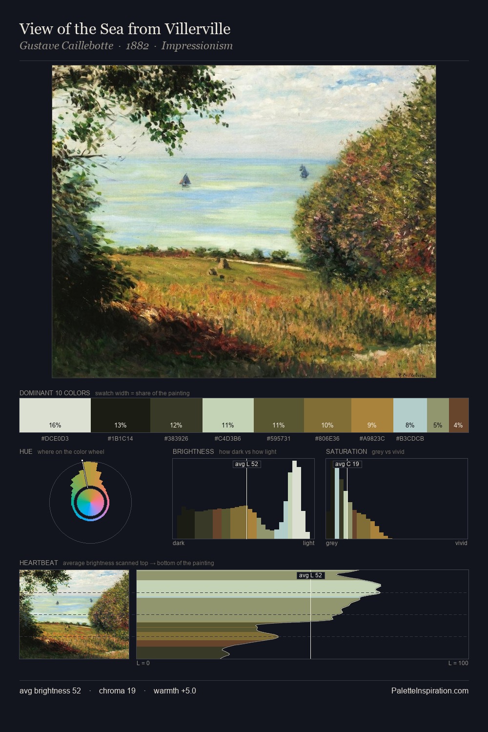
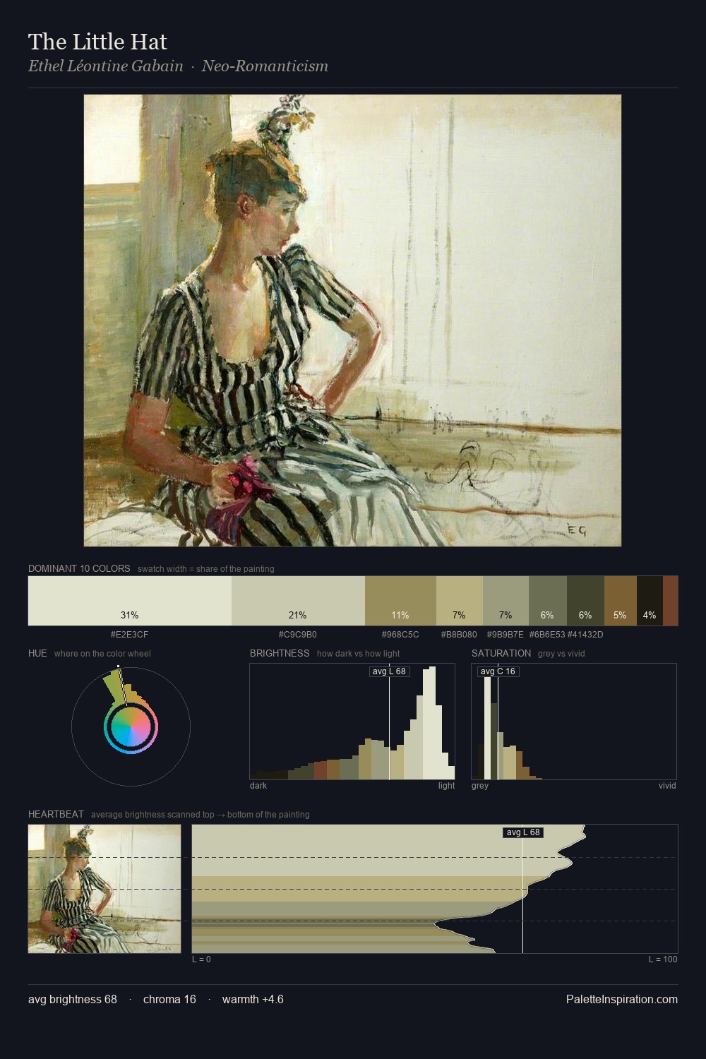
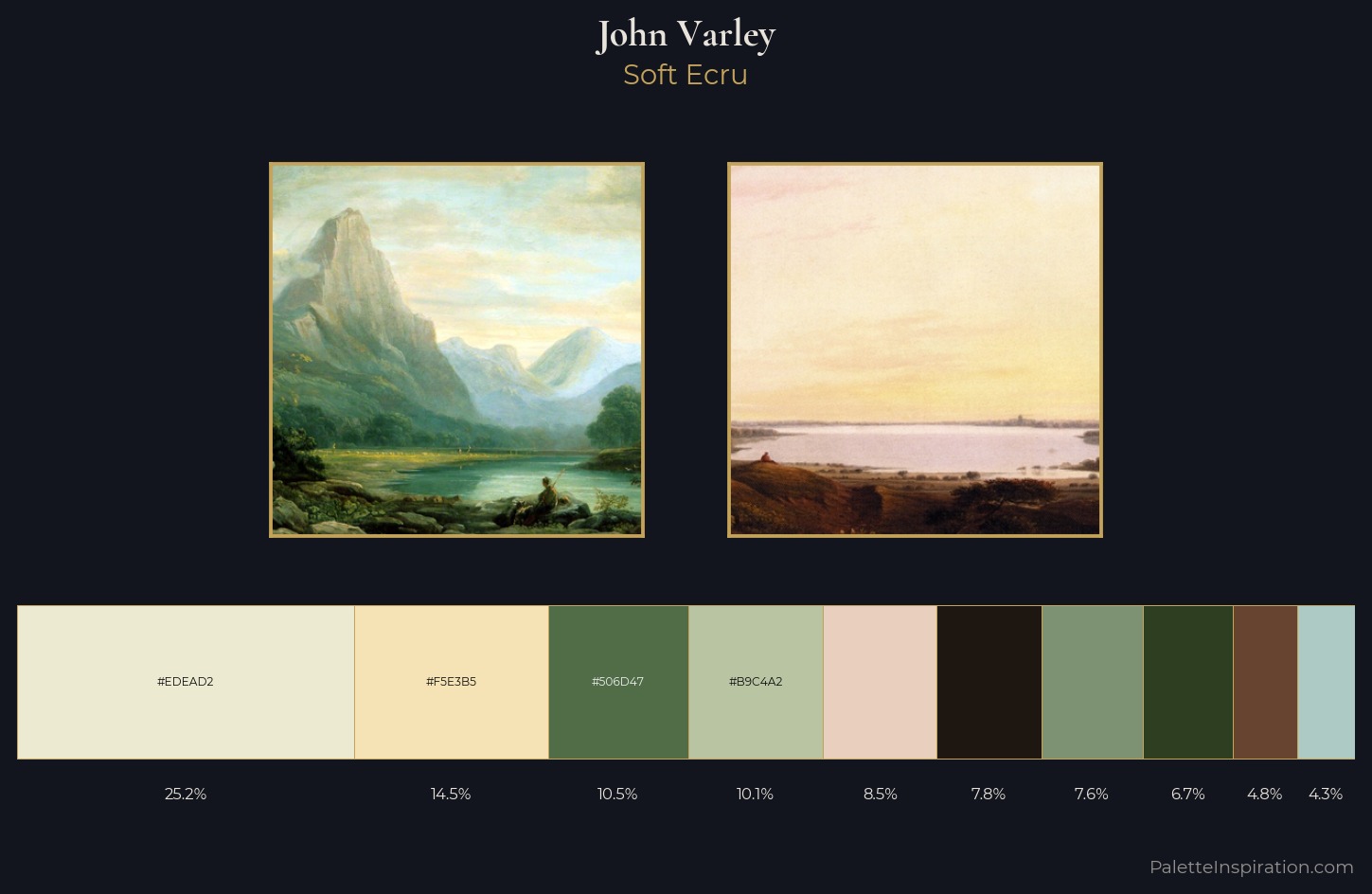
John Varley is strongly light-biased - shadow is suggested rather than declared. Temperature is cool-dominant, with blue and green families claiming the largest areas. Every colour is desaturated; the palette proceeds through near-neutrals and gently-coloured greys. 25.2% of the palette belongs to #EDEAD2, a concentration that makes it the unmistakable visual centre. Only 6.7% is devoted to #2E3E20, yet that small allocation delivers the palette's entire chromatic tension. The full value range is 72 units: broad enough to build convincing three-dimensional form. The mid-to-high key, cool bias, and moderate chroma point to outdoor observation - sky and diffused daylight as the dominant light source. In the context of John Varley's full range of palettes, group 1 represents one movement in an ongoing chromatic dialogue.
Example use cases
- craft & artisan brands
- specialty coffee
- home goods
- lifestyle retail
- ceramics & pottery
I Love This!
Copy, export, or download for your project