John Trumbull Palette 2

Palette Analysis
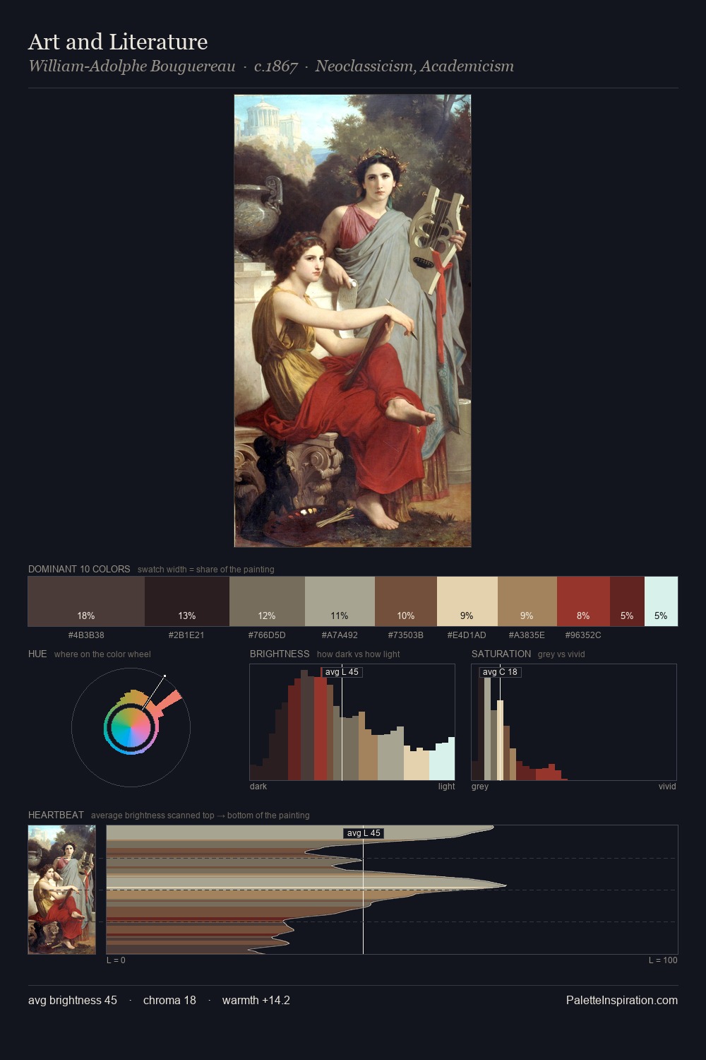
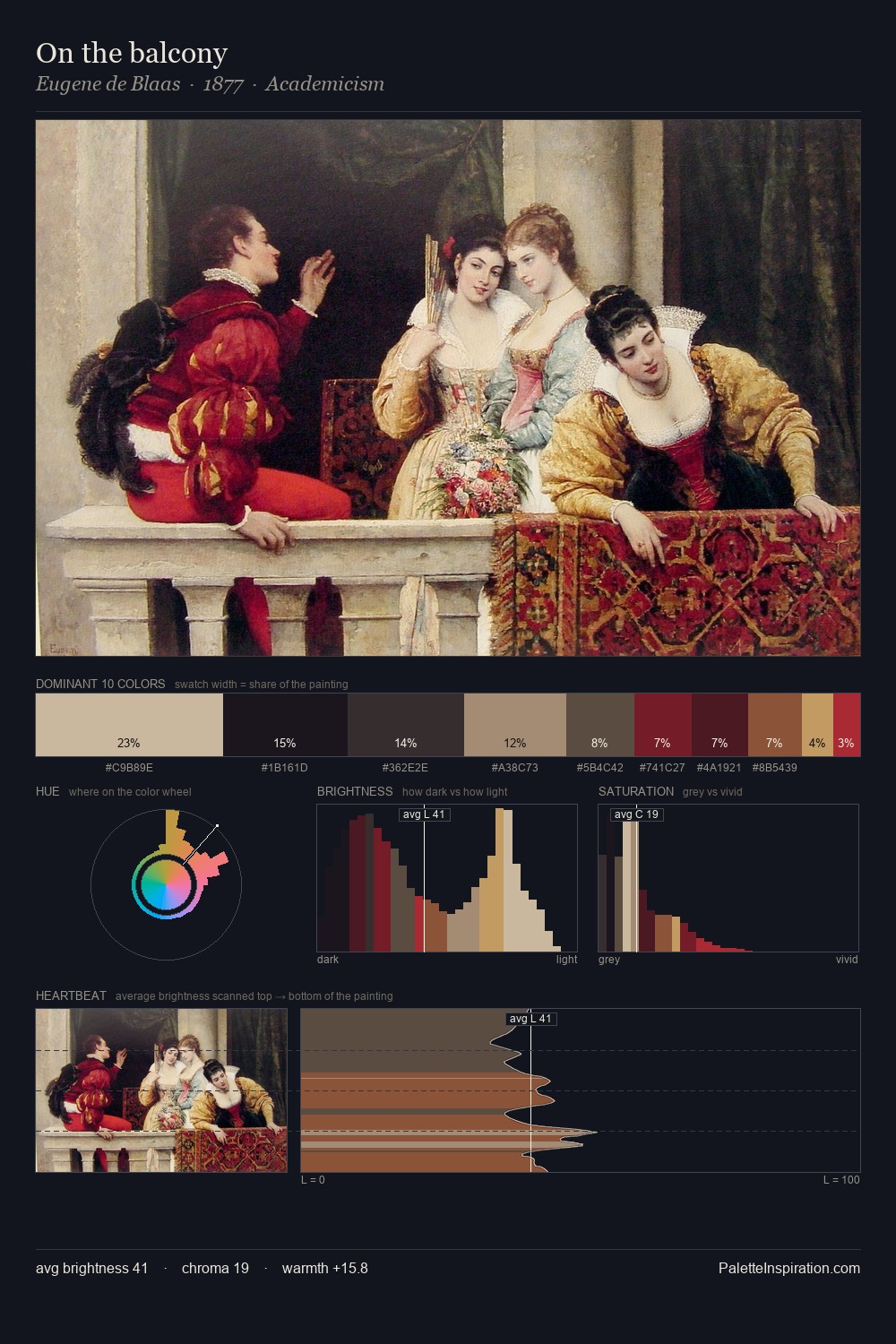
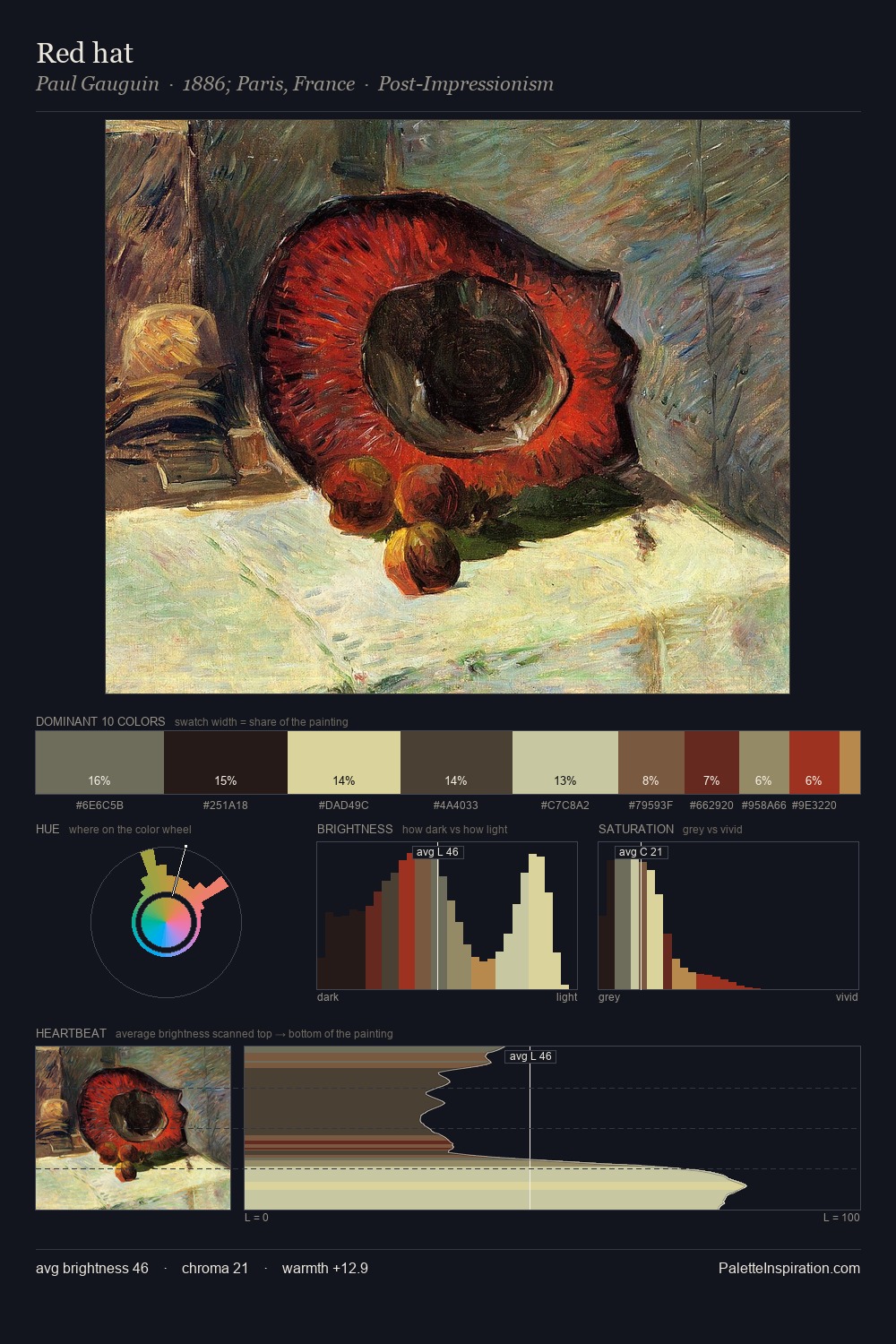
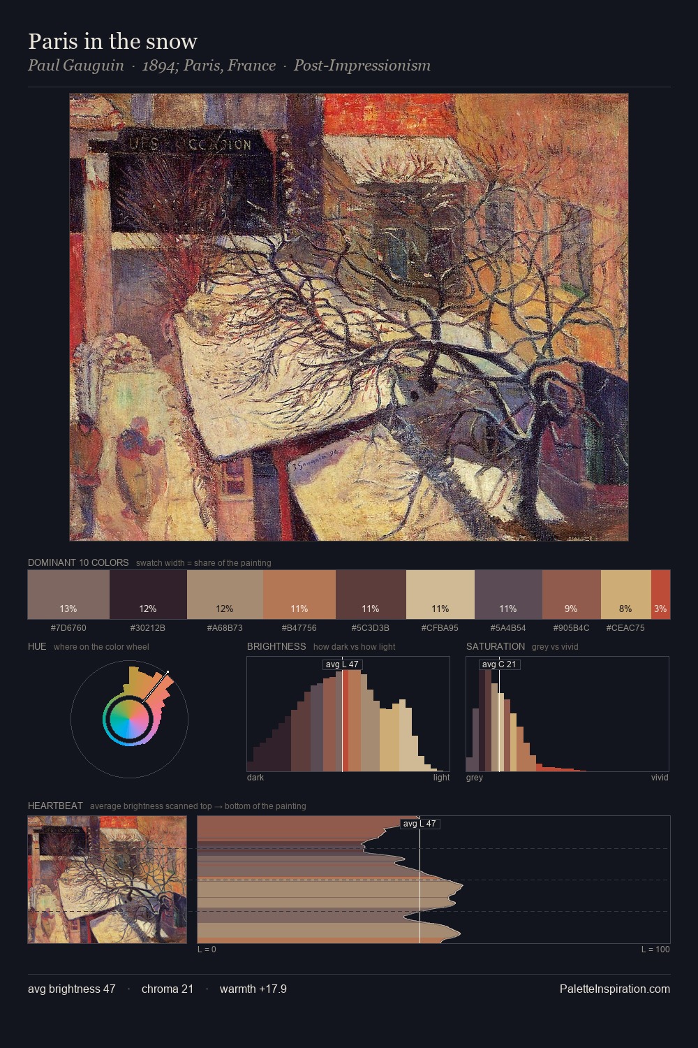
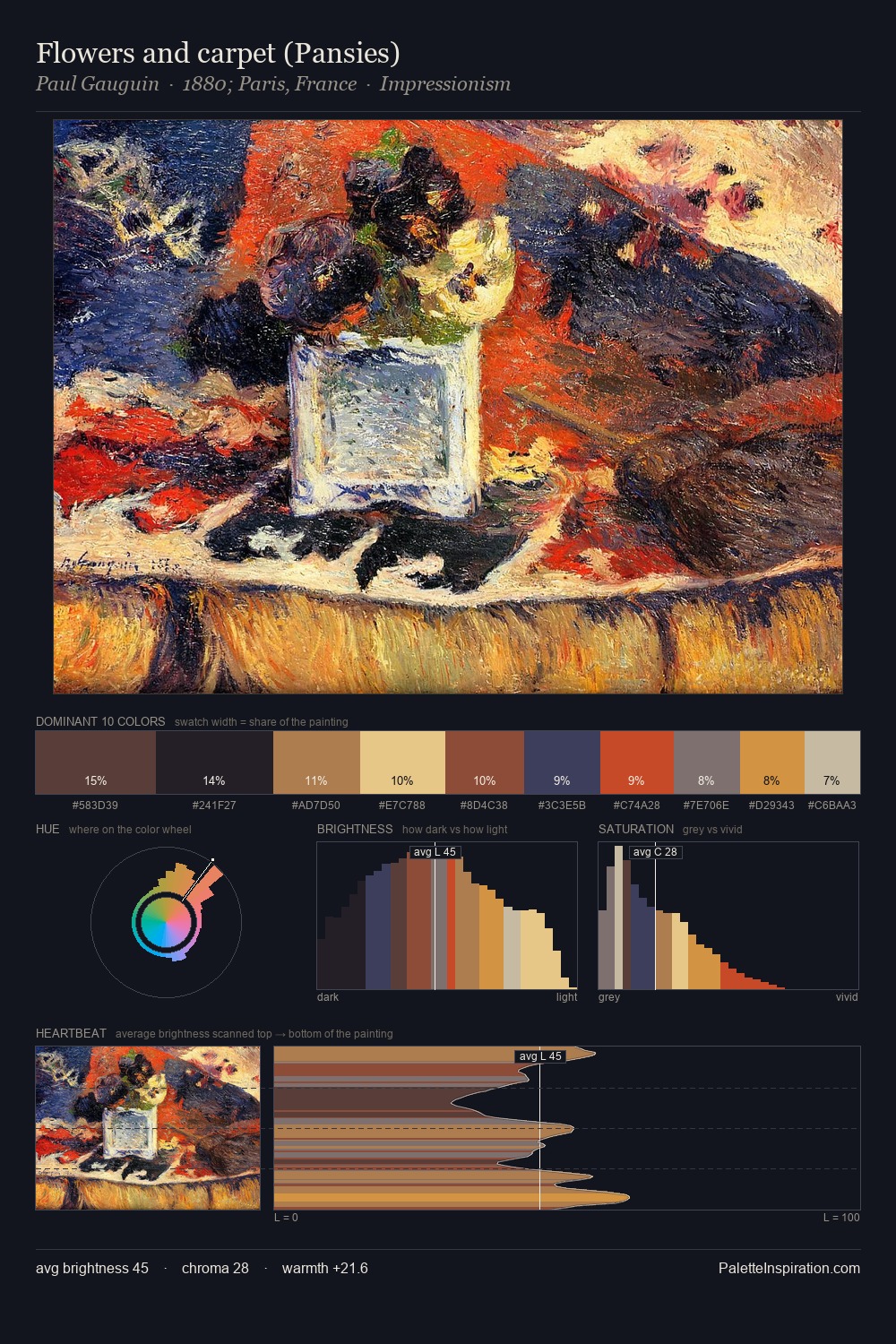
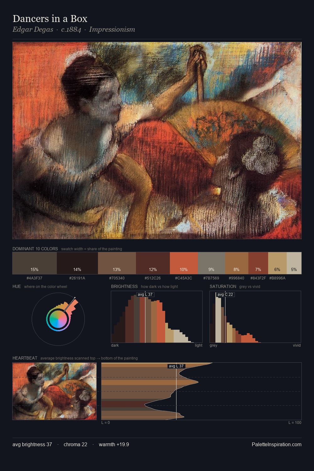
The value structure of John Trumbull is mid-key: quiet, controlled, and cohesive. The dominant temperature is warm, with earth tones and fire-hues setting the emotional key. Chroma hovers near zero; colour declares itself through subtle shifts in hue rather than outright saturation. The dominant colour, #1F1619, takes 27.1% of the total area, establishing the overall mood before any other hue is introduced. At 2.2%, #BD312C carries the palette's sharpest chromatic charge: an accent that earns its place precisely because it is withheld. The value range spans 69 units across the palette, providing the full gamut from deep shadow to near-white and ensuring clear tonal hierarchy. Palette 2 sits within the larger chromatic argument that John Trumbull's complete body of work advances.
Example use cases
- premium streaming
- cocktail bars
- fashion campaigns
- book covers
- music labels
I Love This!
Copy, export, or download for your project