John Riley Palette 7

Palette Analysis
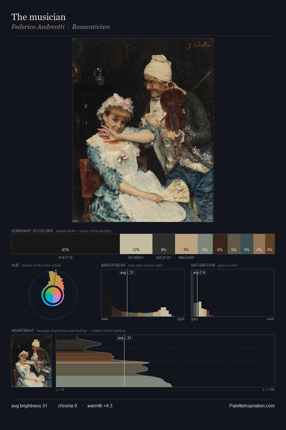
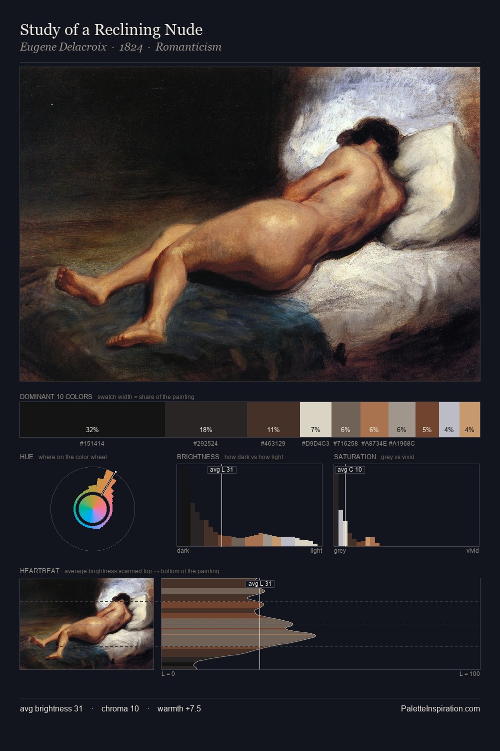
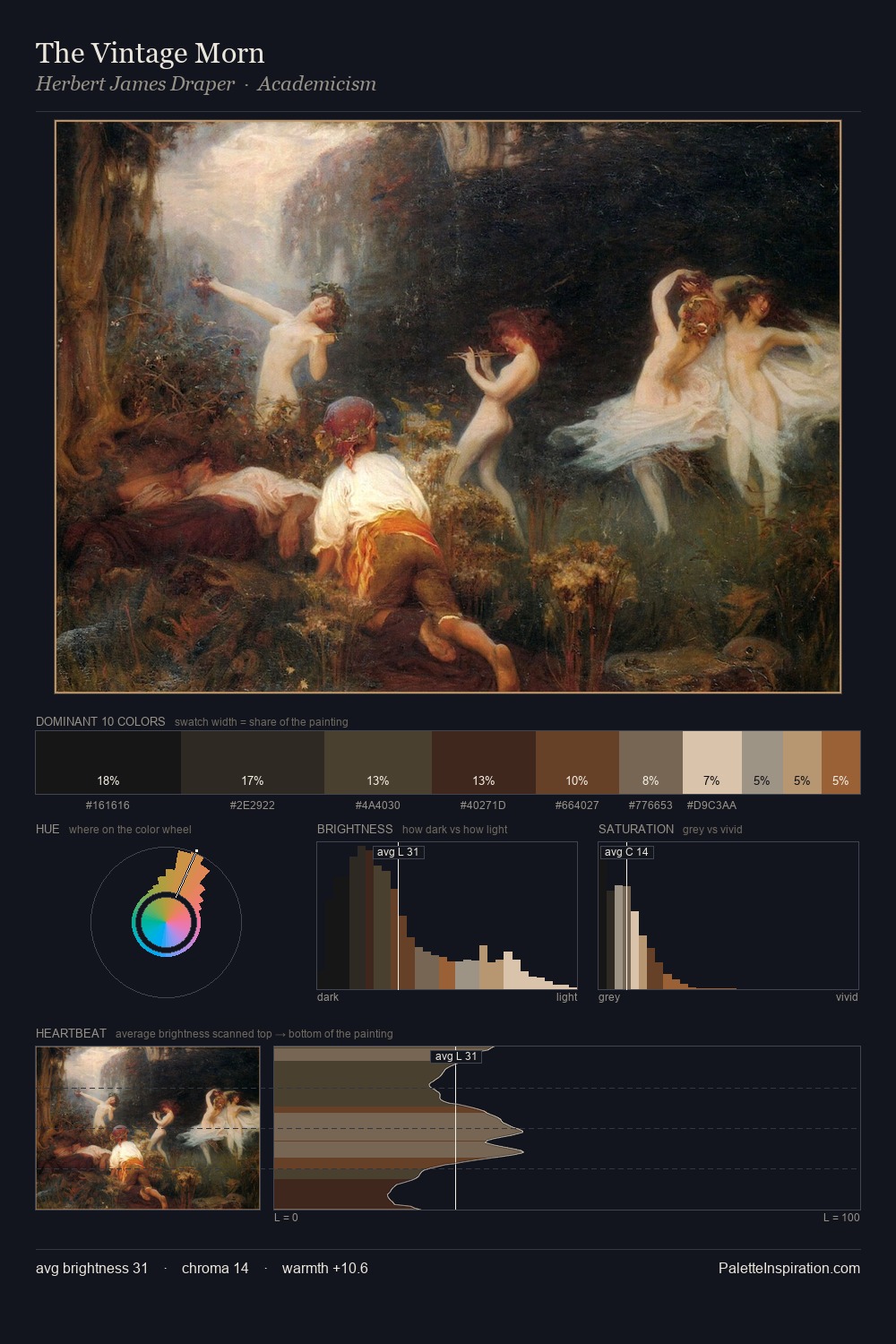
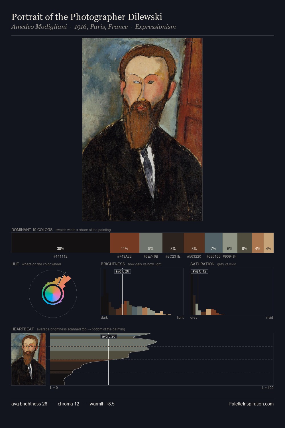
John Riley works almost entirely in the lower half of the value scale, privileging depth over brilliance. Cool hues prevail: blues, greens, and greys anchor the palette's emotional temperature. The absence of saturated colour is itself an expressive choice: this is a palette of restraint and atmosphere. John Riley gives 32.3% of the composition to a single #110E0B - a decisive chromatic anchor. Only 1.8% is devoted to #996842, yet that small allocation delivers the palette's entire chromatic tension. From deepest dark to palest light, the palette traverses 55 units of the value scale - a span that creates natural depth. This tonal restraint is characteristic of the John Riley approach: colour serves light, not the reverse. John Riley's palette 7 carries its own internal logic while remaining in conversation with the artist's broader colour intelligence.
Example use cases
- theater design
- jewelry brands
- tobacco-adjacent retail
- event branding
- film & entertainment
I Love This!
Copy, export, or download for your project