John Riley Palette 6

Palette Analysis
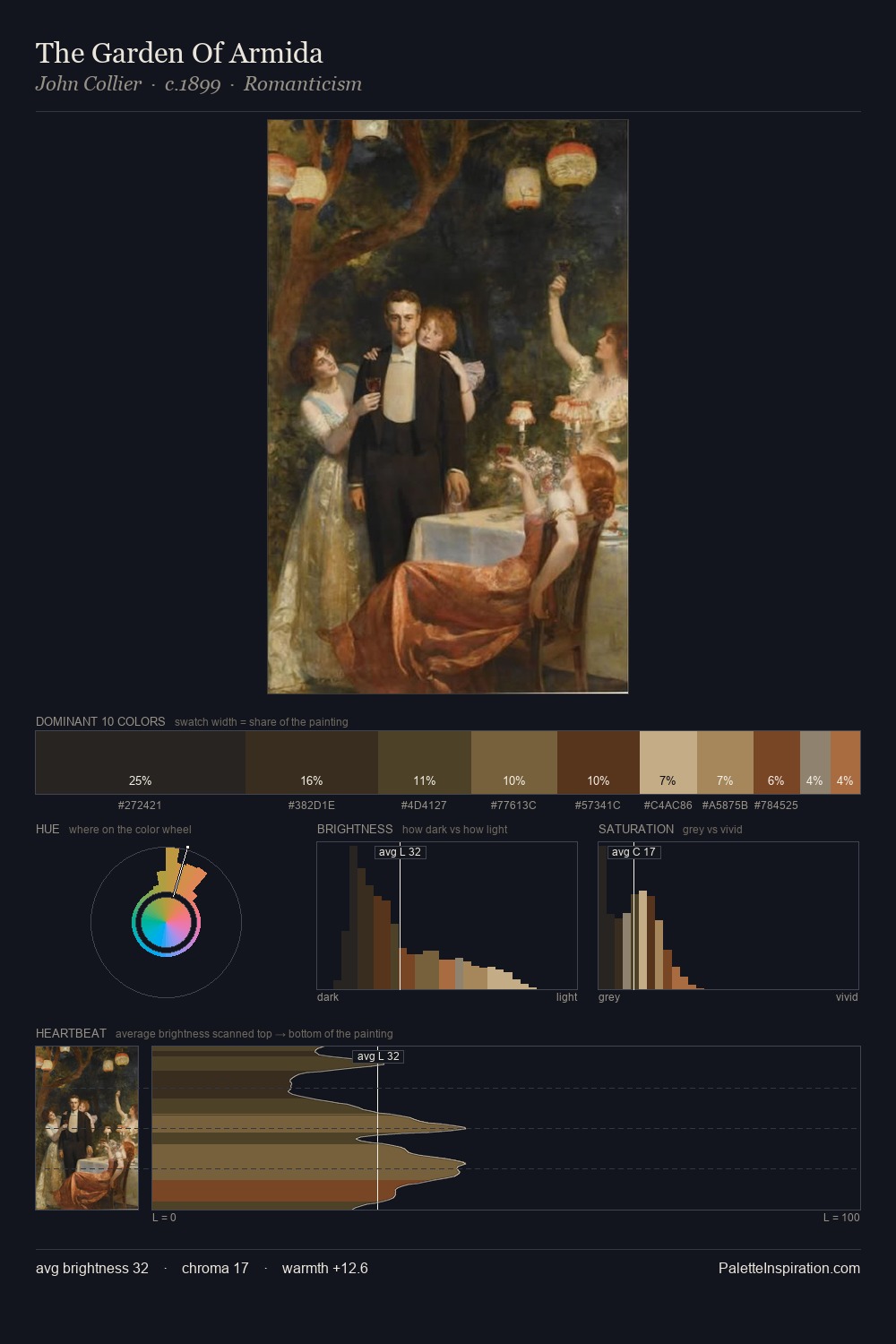
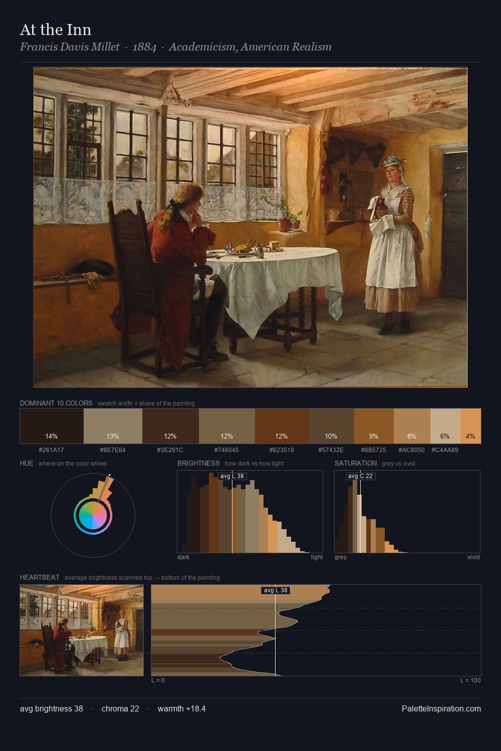
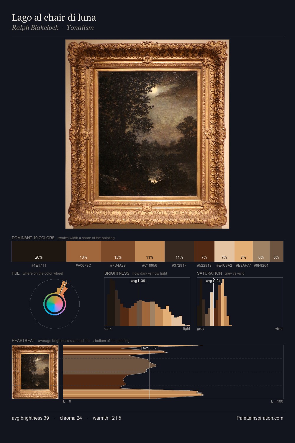
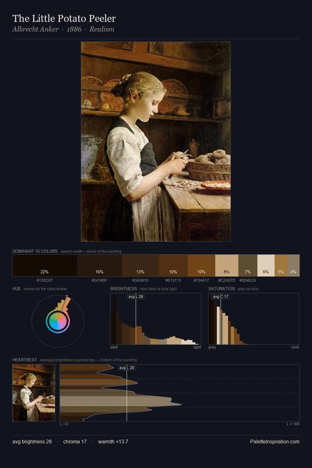
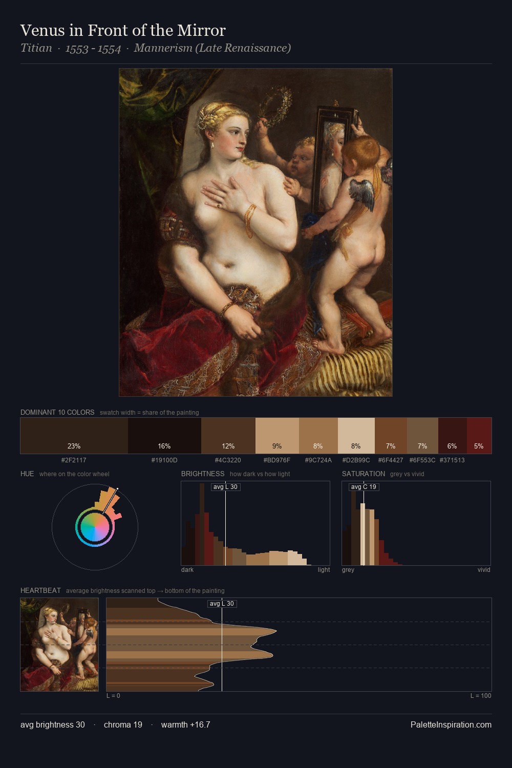
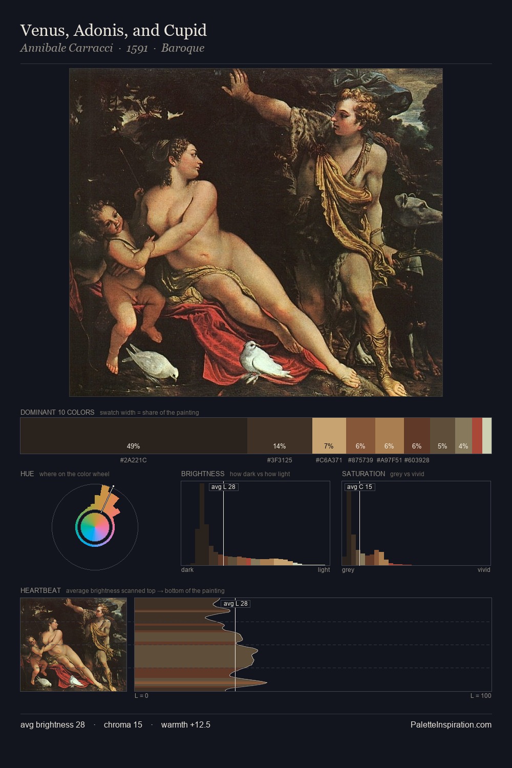
The palette of John Riley sits in the lower register of the value scale - dense, contained, and weighted. The dominant temperature is warm, with earth tones and fire-hues setting the emotional key. The absence of saturated colour is itself an expressive choice: this is a palette of restraint and atmosphere. The most saturated colour, #522C17, is reserved to 6.2% of the surface, where it acts as a focal punctuation. From deepest dark to palest light, the palette traverses 56 units of the value scale - a span that creates natural depth. This tonal restraint is characteristic of the John Riley approach: colour serves light, not the reverse. John Riley's palette 6 carries its own internal logic while remaining in conversation with the artist's broader colour intelligence.
Example use cases
- theater design
- jewelry brands
- tobacco-adjacent retail
- event branding
- film & entertainment
I Love This!
Copy, export, or download for your project