John Duncan Palette 5

Palette Analysis
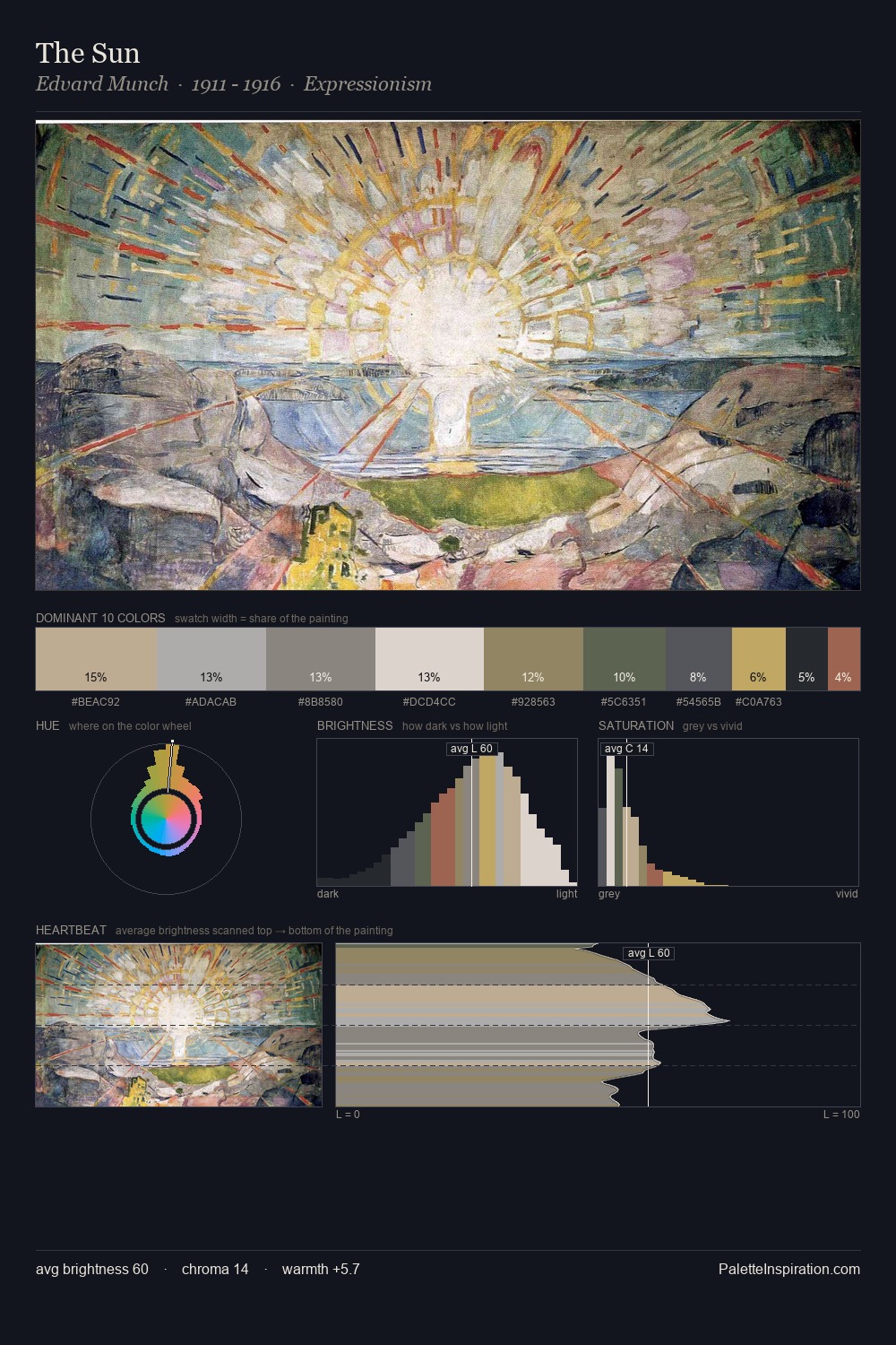
John Duncan is high in key: pale, luminous, and filled with optical air. John Duncan builds on cool foundations: the palette favours the blue-cyan-green arc. Saturation is deliberately withheld - the beauty here lies in the near-monochromatic gradations rather than colour difference. The dominant colour, #CCCCCC, takes 25.8% of the total area, establishing the overall mood before any other hue is introduced. The most saturated colour, #968460, is reserved to 6.5% of the surface, where it acts as a focal punctuation. At 45 units across the value scale, the palette keeps contrast readable without letting it dominate. The mid-to-high key, cool bias, and moderate chroma point to outdoor observation - sky and diffused daylight as the dominant light source. This is palette 5 of John Duncan's sequence - a single chapter in a chromatic story told across many works.
Example use cases
- exhibition design
- foundation branding
- estate management
- art education
- museums & galleries
I Love This!
Copy, export, or download for your project