John Brett Palette 1

Palette Analysis
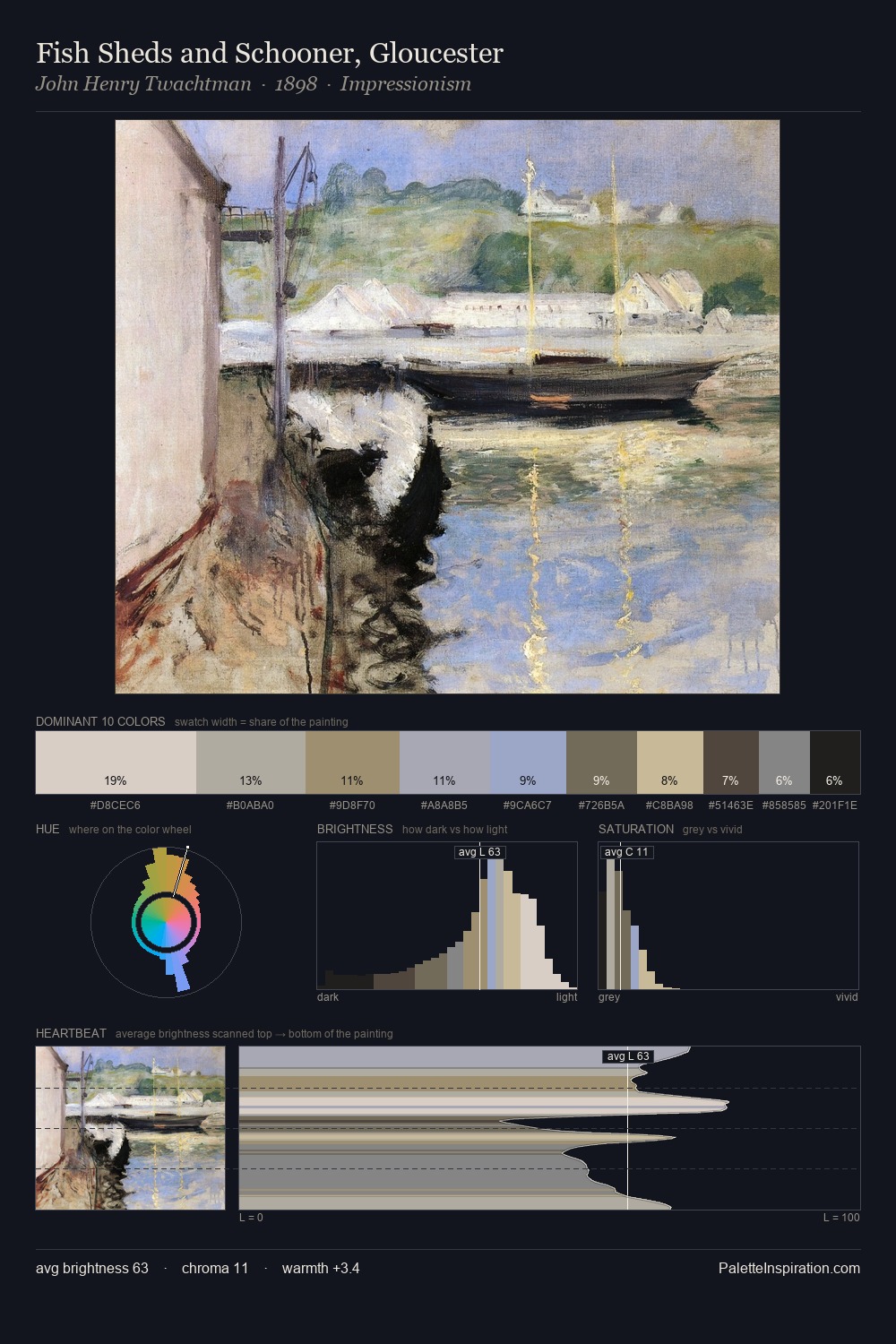
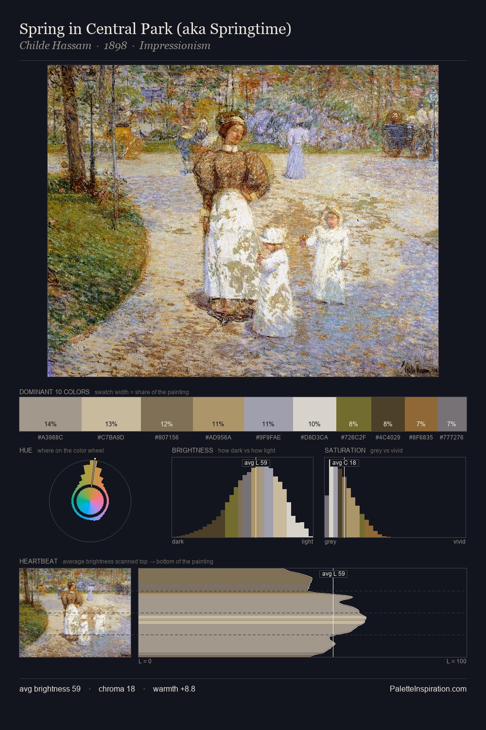
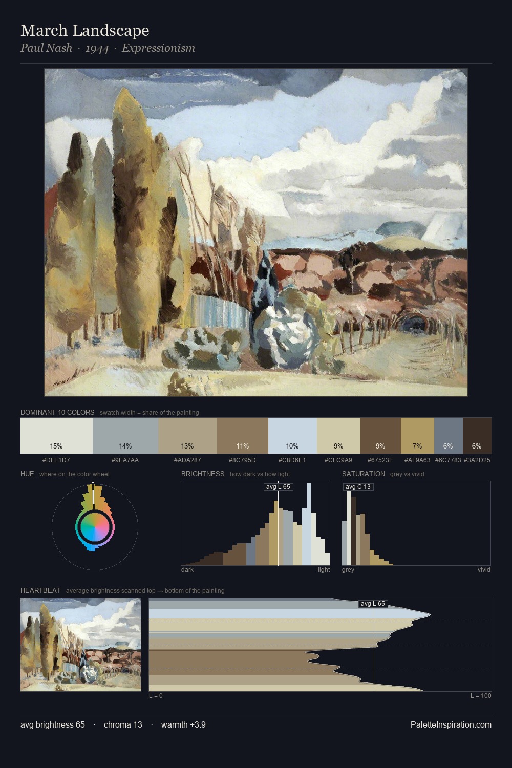
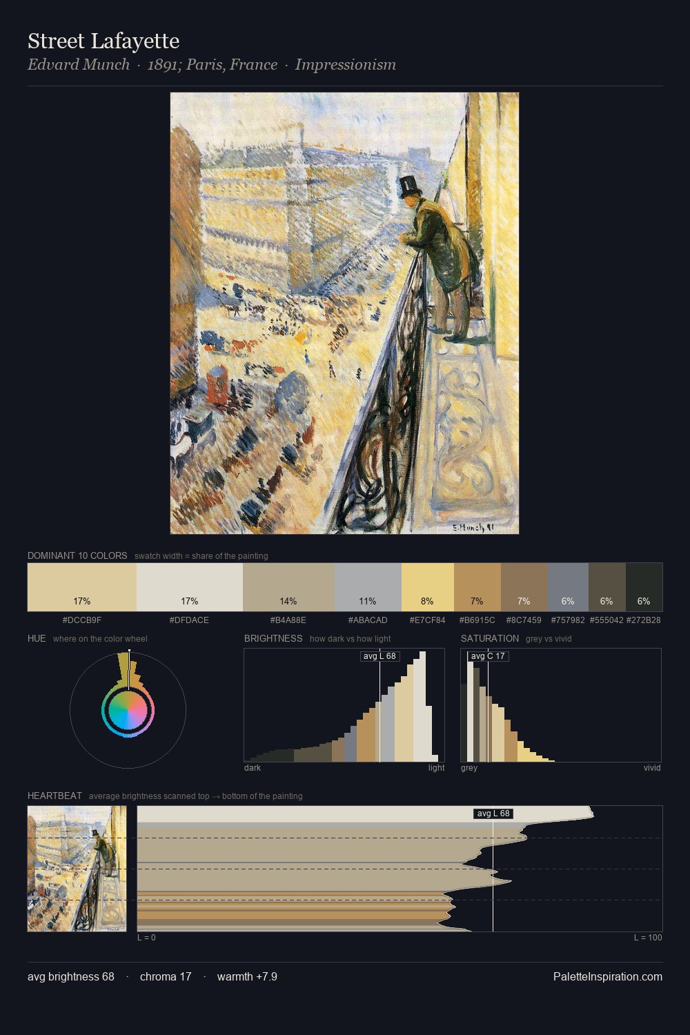
Light floods John Brett; the palette keeps values pale and airy across its range. Cool hues prevail: blues, greens, and greys anchor the palette's emotional temperature. Chroma hovers near zero; colour declares itself through subtle shifts in hue rather than outright saturation. The dominant colour, #E5DCC8, takes 25.9% of the total area, establishing the overall mood before any other hue is introduced. The saturated accent, #4D3D31, registers at 5.8% - sparse enough to feel like a deliberate surprise. At 53 units across the value scale, the palette keeps contrast readable without letting it dominate. The mid-to-high key, cool bias, and moderate chroma point to outdoor observation - sky and diffused daylight as the dominant light source. In the context of John Brett's full range of palettes, group 1 represents one movement in an ongoing chromatic dialogue.
Example use cases
- ceramics & pottery
- boutique hospitality
- menswear
- heritage food brands
- craft & artisan brands
I Love This!
Copy, export, or download for your project