John Bradley Palette 1
Subdued Gossamer
Subdued Held back from full expression - moderate values, restrained chroma, controlled.
Gossamer Nearly transparent pale - delicate, wispy, like fine spider silk.

Palette Analysis
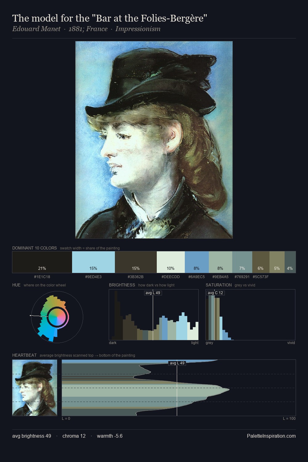
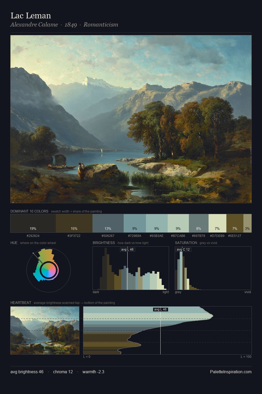
Mid-key values give John Bradley its characteristic quietness - nothing blazes, nothing disappears. Cool hues prevail: blues, greens, and greys anchor the palette's emotional temperature. Chroma is kept low across all colours, producing the soft, enveloping quality that characterises tonal painting. Only 7.4% is devoted to #5D5634, yet that small allocation delivers the palette's entire chromatic tension. A value spread of 62 units gives the palette both depth and air - shadows are genuinely dark, lights genuinely light. High luminosity and cool temperature suggest the plein-air condition: unfiltered daylight and open sky. Palette 1 sits within the larger chromatic argument that John Bradley's complete body of work advances.
Example use cases
- exhibition design
- foundation branding
- estate management
- art education
- museums & galleries
I Love This!
Use This Palette
Copy, export, or download for your project
Copy, export, or download for your project
Copy:
Download:
Share:
![[Unkown] palette card](/cards/0000164.jpg)