Joao Pedroso Master Palette

Palette Analysis
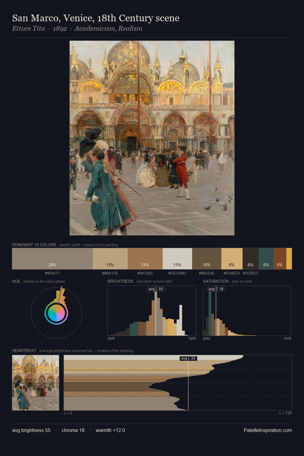
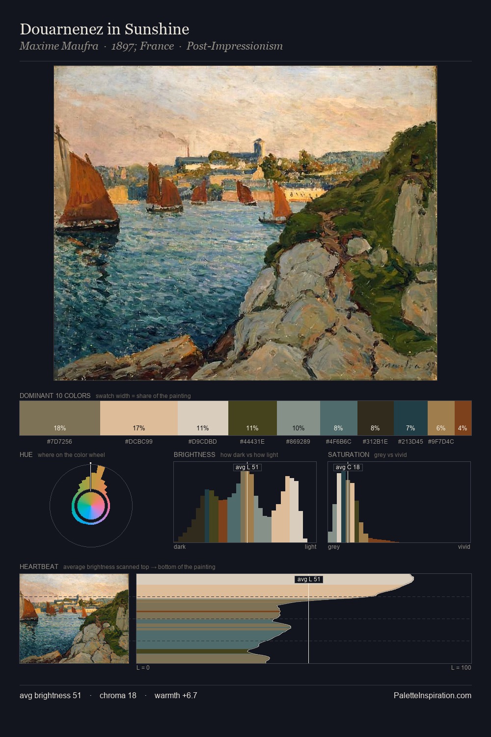
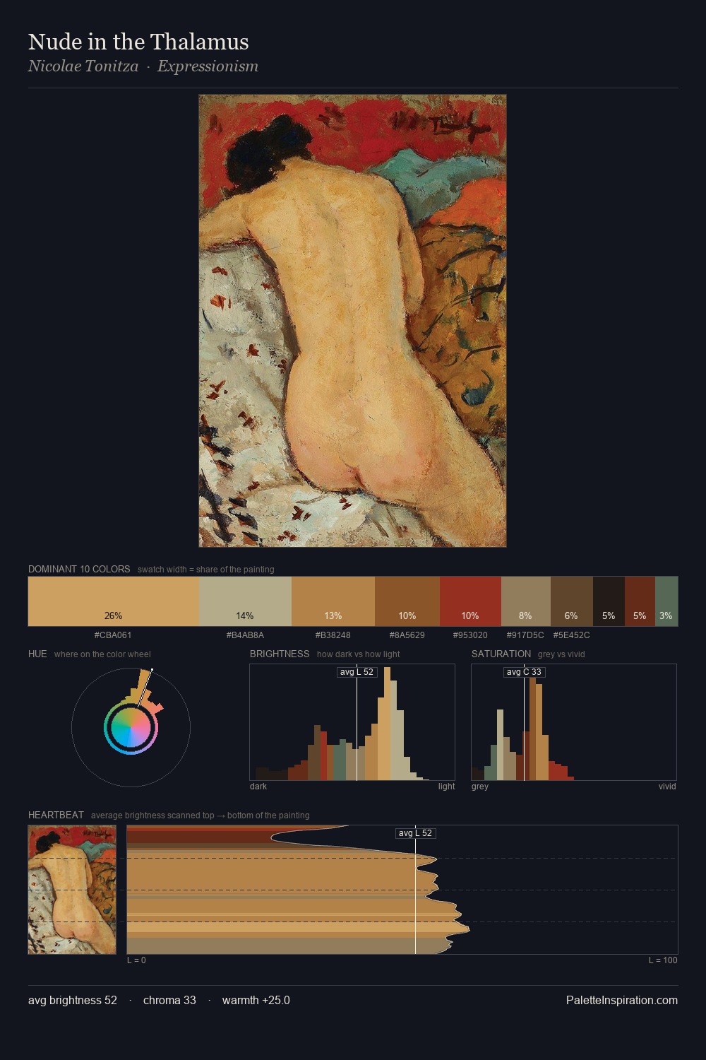
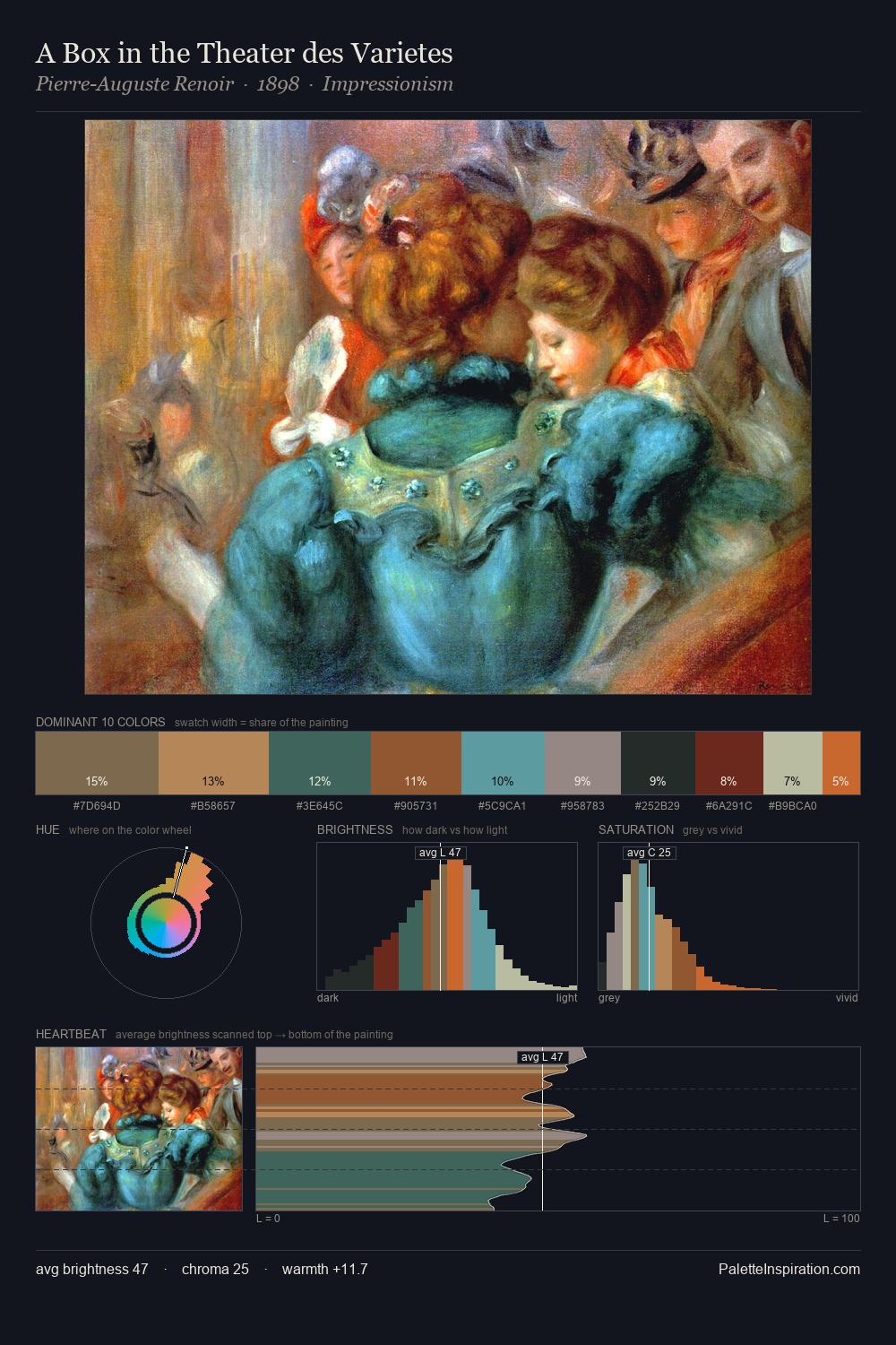
Joao Pedroso occupies the comfortable middle of the value scale, avoiding both extremes to hold the eye in a sustained middle grey. Blues and teal-greys govern the palette, lending it an aquatic or atmospheric quality. Every colour is desaturated; the palette proceeds through near-neutrals and gently-coloured greys. Only 10.0% is devoted to #5C4B31, yet that small allocation delivers the palette's entire chromatic tension. From deepest dark to palest light, the palette traverses 56 units of the value scale - a span that creates natural depth. High luminosity and cool temperature suggest the plein-air condition: unfiltered daylight and open sky. The palette is a signature: Joao Pedroso's particular sense of value, warmth, and colour weight made legible.
Example use cases
- ceramics & pottery
- boutique hospitality
- menswear
- heritage food brands
- craft & artisan brands
I Love This!
Copy, export, or download for your project