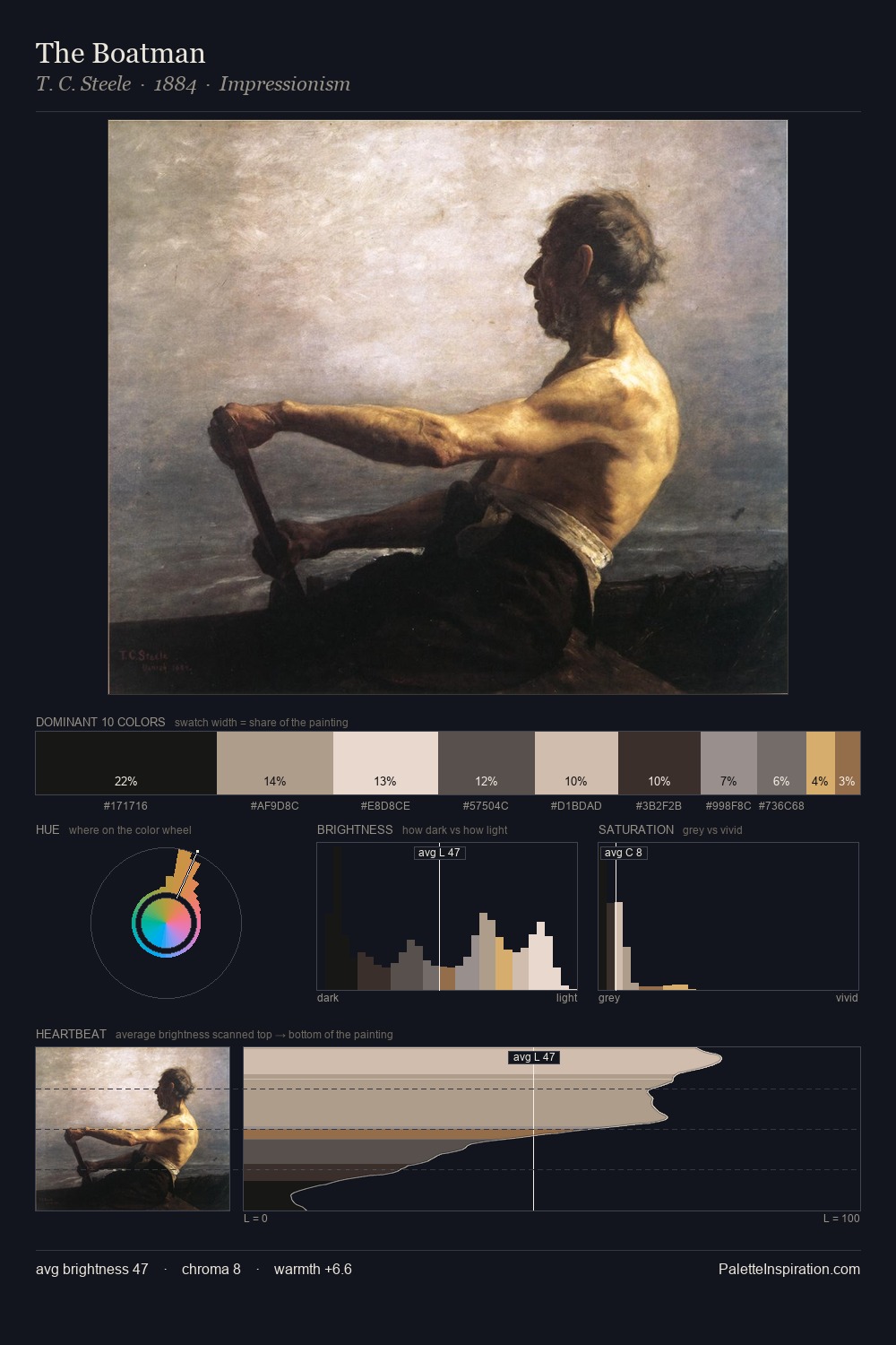
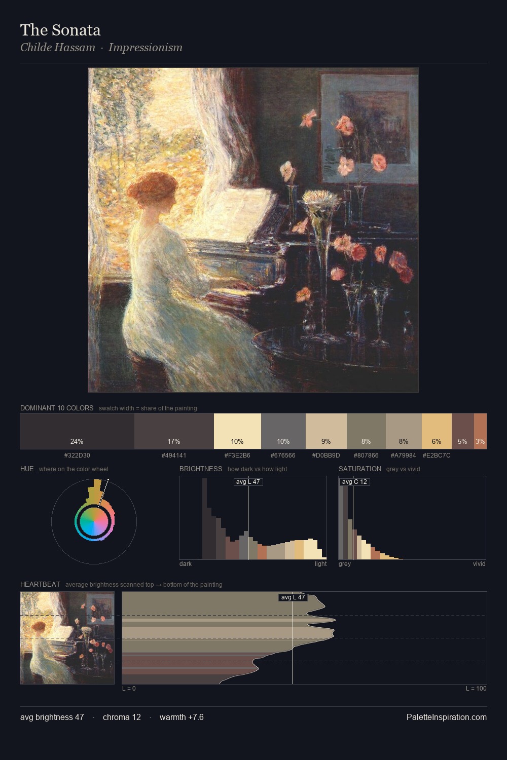
Jindrich Styrsky Palette 5

Palette Analysis
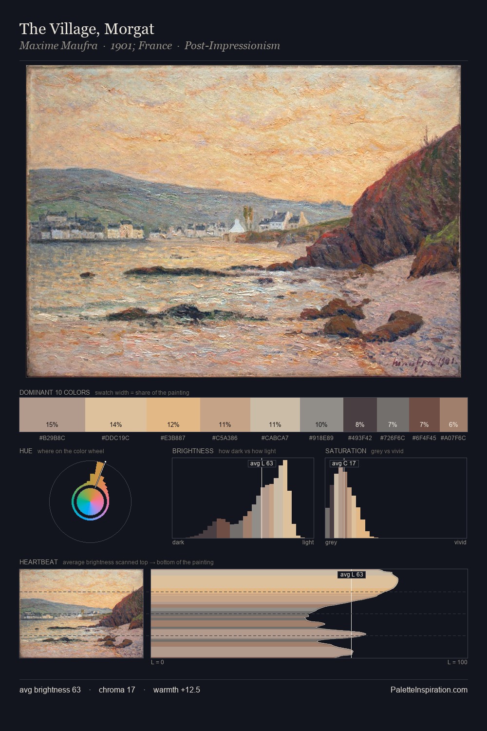
Mid-key values give Jindrich Styrsky its characteristic quietness - nothing blazes, nothing disappears. Warmth dominates - the palette of Jindrich Styrsky leans heavily on the yellow-orange-red arc of the colour wheel. Chroma hovers near zero; colour declares itself through subtle shifts in hue rather than outright saturation. At 25.8%, #4A3F3C functions less as a colour accent and more as a complete atmospheric environment. The most saturated colour, #C5B39C, is reserved to 5.1% of the surface, where it acts as a focal punctuation. At 53 units across the value scale, the palette keeps contrast readable without letting it dominate. Jindrich Styrsky's palette 5 carries its own internal logic while remaining in conversation with the artist's broader colour intelligence.
Example use cases
- theater design
- jewelry brands
- tobacco-adjacent retail
- event branding
- film & entertainment
I Love This!
Copy, export, or download for your project