Jean-Paul Laurens Palette 6

Palette Analysis
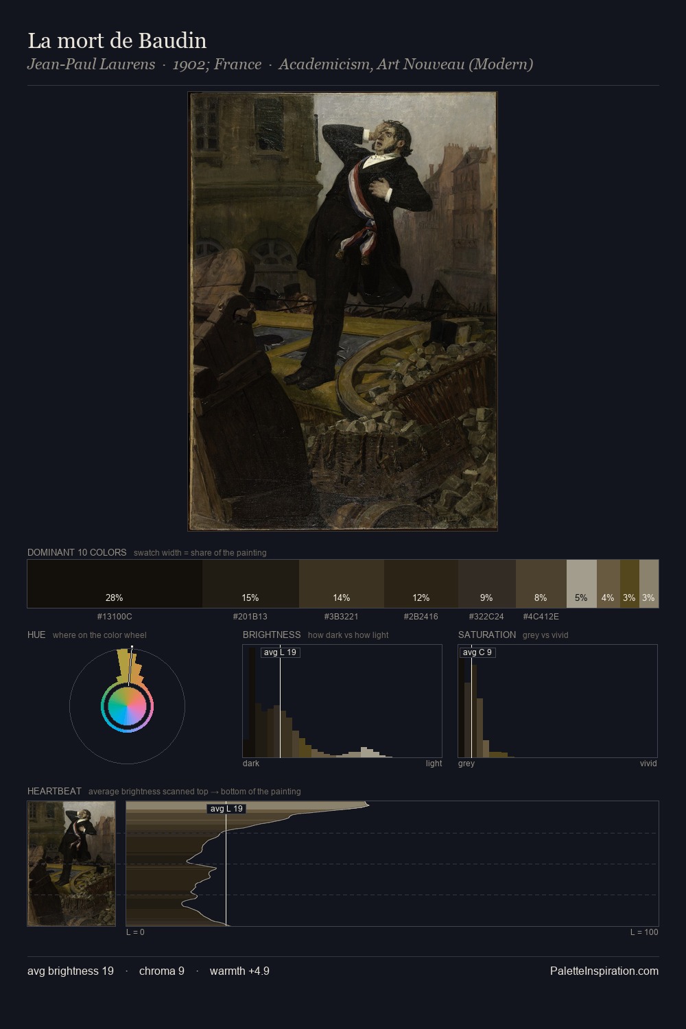
Darkness anchors Jean-Paul Laurens; light is rationed, creating dramatic contrast rather than open air. Jean-Paul Laurens tilts toward cool - blues and silver-greys carry the structural weight. Saturation is deliberately withheld - the beauty here lies in the near-monochromatic gradations rather than colour difference. The dominant colour, #13100C, takes 33.0% of the total area, establishing the overall mood before any other hue is introduced. #57481C functions as the palette's exclamation mark: highest chroma, lowest percentage (3.3%). At 46 units across the value scale, the palette keeps contrast readable without letting it dominate. This tonal restraint is characteristic of the Jean-Paul Laurens approach: colour serves light, not the reverse. Jean-Paul Laurens's palette 6 carries its own internal logic while remaining in conversation with the artist's broader colour intelligence.
Example use cases
- theater design
- jewelry brands
- tobacco-adjacent retail
- event branding
- film & entertainment
I Love This!
Copy, export, or download for your project