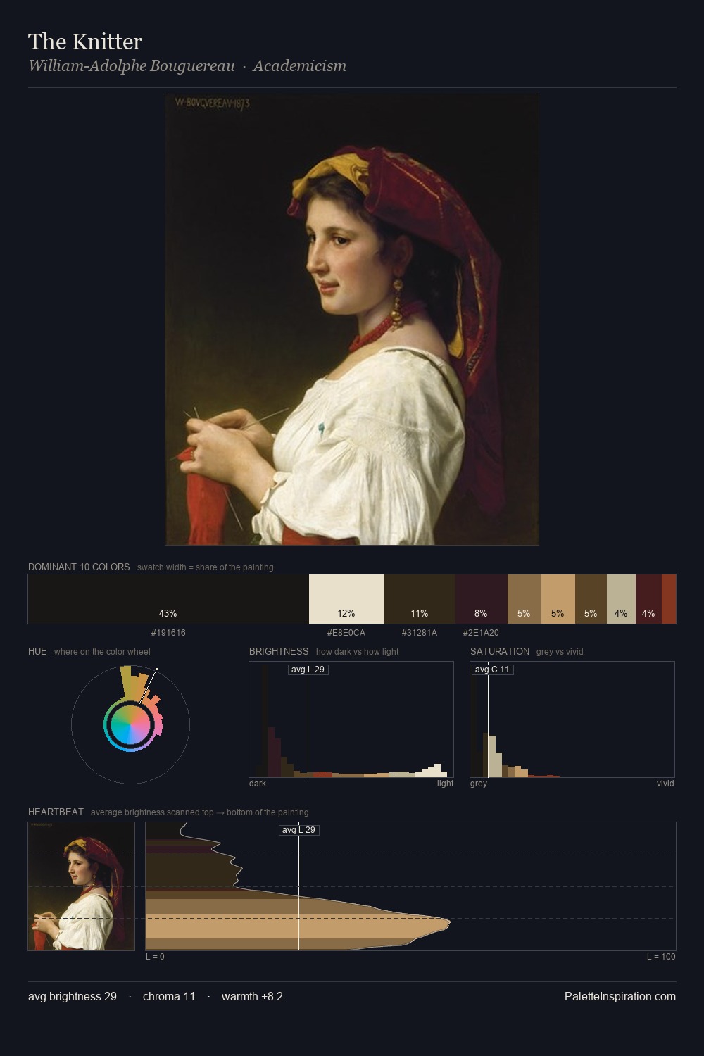
Jacob Toorenvliet Palette 4

Palette Analysis
Jacob Toorenvliet works almost entirely in the lower half of the value scale, privileging depth over brilliance. Neither warm nor cool has the upper hand here; the equilibrium between the two generates the palette's visual energy. Chroma is kept low across all colours, producing the soft, enveloping quality that characterises tonal painting. #0C0B0A at 29.8% of the palette: an overwhelming presence that pulls all other colours into its gravitational field. The most saturated colour, #994C21, is reserved to 1.1% of the surface, where it acts as a focal punctuation. From deepest dark to palest light, the palette traverses 59 units of the value scale - a span that creates natural depth. Together these qualities place Jacob Toorenvliet firmly in the tonal tradition - concerned with mood and atmosphere rather than chromatic display. Palette 4 sits within the larger chromatic argument that Jacob Toorenvliet's complete body of work advances.
Example use cases
- premium streaming
- cocktail bars
- fashion campaigns
- book covers
- music labels
I Love This!
Copy, export, or download for your project