Jean Baptiste van Moer Master Palette

Palette Analysis
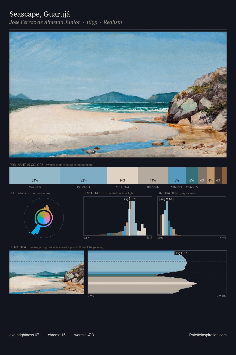
Jean Baptiste van Moer sits in the centre of the value range, lending the palette a sense of even, sustained light. Heat pervades this palette; warm chromatic identities outweigh cool ones at almost every weight. Muted throughout, the palette achieves its effects through value and temperature rather than chromatic force. The dominant colour, #443327, takes 30.0% of the total area, establishing the overall mood before any other hue is introduced. The saturated accent, #BFAC9A, registers at 5.0% - sparse enough to feel like a deliberate surprise. The value range spans 55 units across the palette, providing the full gamut from deep shadow to near-white and ensuring clear tonal hierarchy. This is the light Jean Baptiste van Moer preferred, made measurable.
Example use cases
- food packaging
- leather accessories
- travel & outdoor
- natural cosmetics
- interior design
I Love This!
Copy, export, or download for your project