Jean Baptiste van Moer Palette 1
Soft Ivory
Soft Low-contrast, gentle chroma - mid-key values and low saturation, approachable and calm.
Ivory Warm creamy white - the color of natural ivory, warmer than pure white.

Palette Analysis
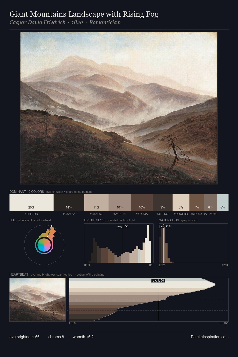
Jean Baptiste van Moer is strongly light-biased - shadow is suggested rather than declared. Temperature is balanced: the palette pits warm earth against cool sky without declaring a winner. Chroma hovers near zero; colour declares itself through subtle shifts in hue rather than outright saturation. At 10.7%, #E3E3D0 carries the palette's sharpest chromatic charge: an accent that earns its place precisely because it is withheld. The value range spans 58 units across the palette, providing the full gamut from deep shadow to near-white and ensuring clear tonal hierarchy. Jean Baptiste van Moer's palette 1 carries its own internal logic while remaining in conversation with the artist's broader colour intelligence.
Example use cases
- exhibition design
- foundation branding
- estate management
- art education
- museums & galleries
I Love This!
Use This Palette
Copy, export, or download for your project
Copy, export, or download for your project
Copy:
Download:
Share: