Jane Sutherland Master Palette

Palette Analysis
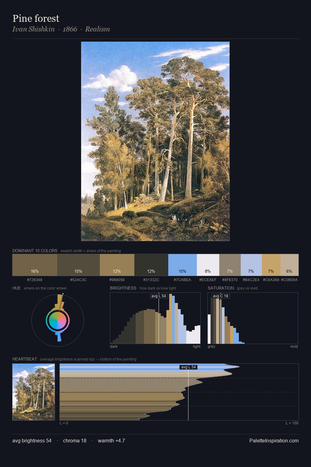
Jane Sutherland distributes its values across the middle register, creating harmony without high contrast. Cool tones set the register here - the blues and greens easily outweigh any warm accents. Muted throughout, the palette achieves its effects through value and temperature rather than chromatic force. The highest-chroma note - #94ACF5 - appears at just 2.0%, deployed as a precision accent against the quieter ground. 48 units of value spread create a palette that is varied but unified - contrast in the service of harmony. The palette has the character of outdoor light: cool, mid-bright, with colour rendered faithfully rather than expressively. Jane Sutherland arrived at this balance through long practice; the palette carries the weight of that experience.
Example use cases
- nonprofit identity
- public libraries
- historical sites
- literary journals
- archival print
I Love This!
Copy, export, or download for your project
![[Unkown] palette card](/cards/0000165.jpg)