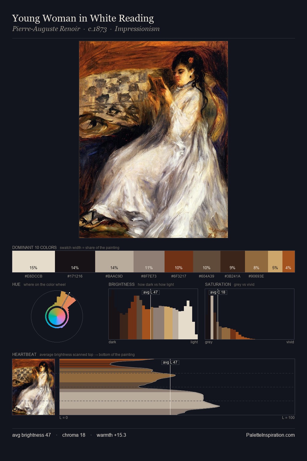
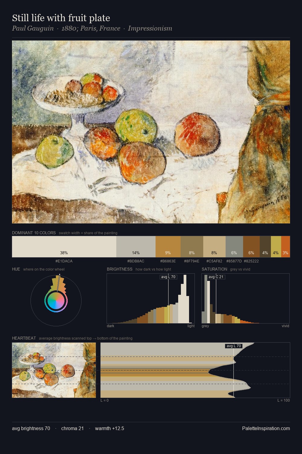
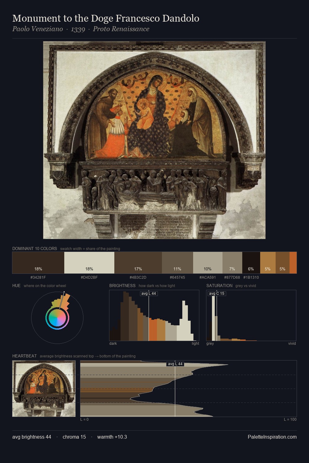
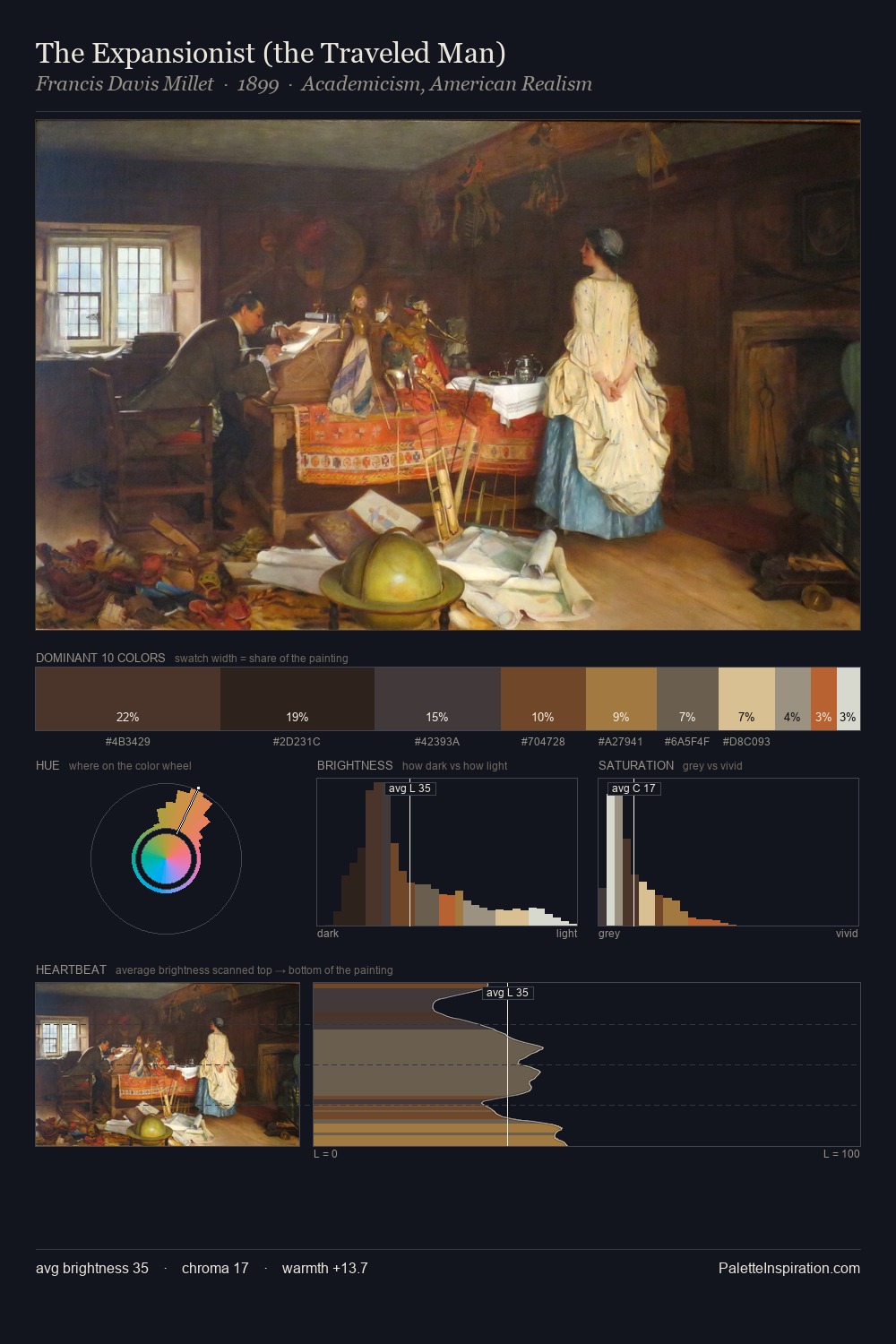
Jan Verbruggen Master Palette
Muted Caramel
Muted Deliberately desaturated - chroma pulled toward gray, the restraint of tonal painting.
Caramel Warm mid-brown - the color of cooked sugar, smooth and amber-toned.

Palette Analysis
Mid-key values give Jan Verbruggen its characteristic quietness - nothing blazes, nothing disappears. Jan Verbruggen orchestrates warmth above all else - reds, ambers, and siennas take the lead. Chroma is kept low across all colours, producing the soft, enveloping quality that characterises tonal painting. Jan Verbruggen gives 210.0% of the composition to a single #402813 - a decisive chromatic anchor. At 5.0%, #967041 carries the palette's sharpest chromatic charge: an accent that earns its place precisely because it is withheld. The full value range is 62 units: broad enough to build convincing three-dimensional form. Jan Verbruggen arrived at this balance through long practice; the palette carries the weight of that experience.
Example use cases
- craft & artisan brands
- specialty coffee
- home goods
- lifestyle retail
- ceramics & pottery
I Love This!
Use This Palette
Copy, export, or download for your project
Copy, export, or download for your project
Copy:
Download:
Share: