Jan Verbruggen Palette 2
Shadowed Tawny
Shadowed Low-key - values weighted toward shadow, the palette of dim interiors and overcast skies.
Tawny Warm orange-brown - a traditional term for the color of tanned leather or lion fur.

Palette Analysis
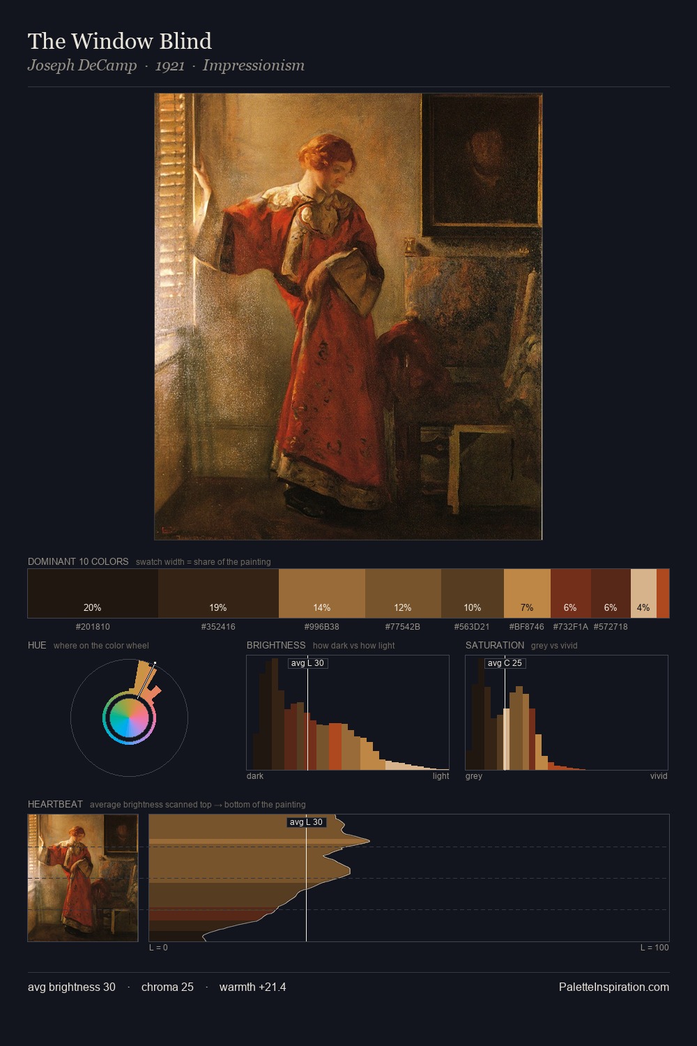
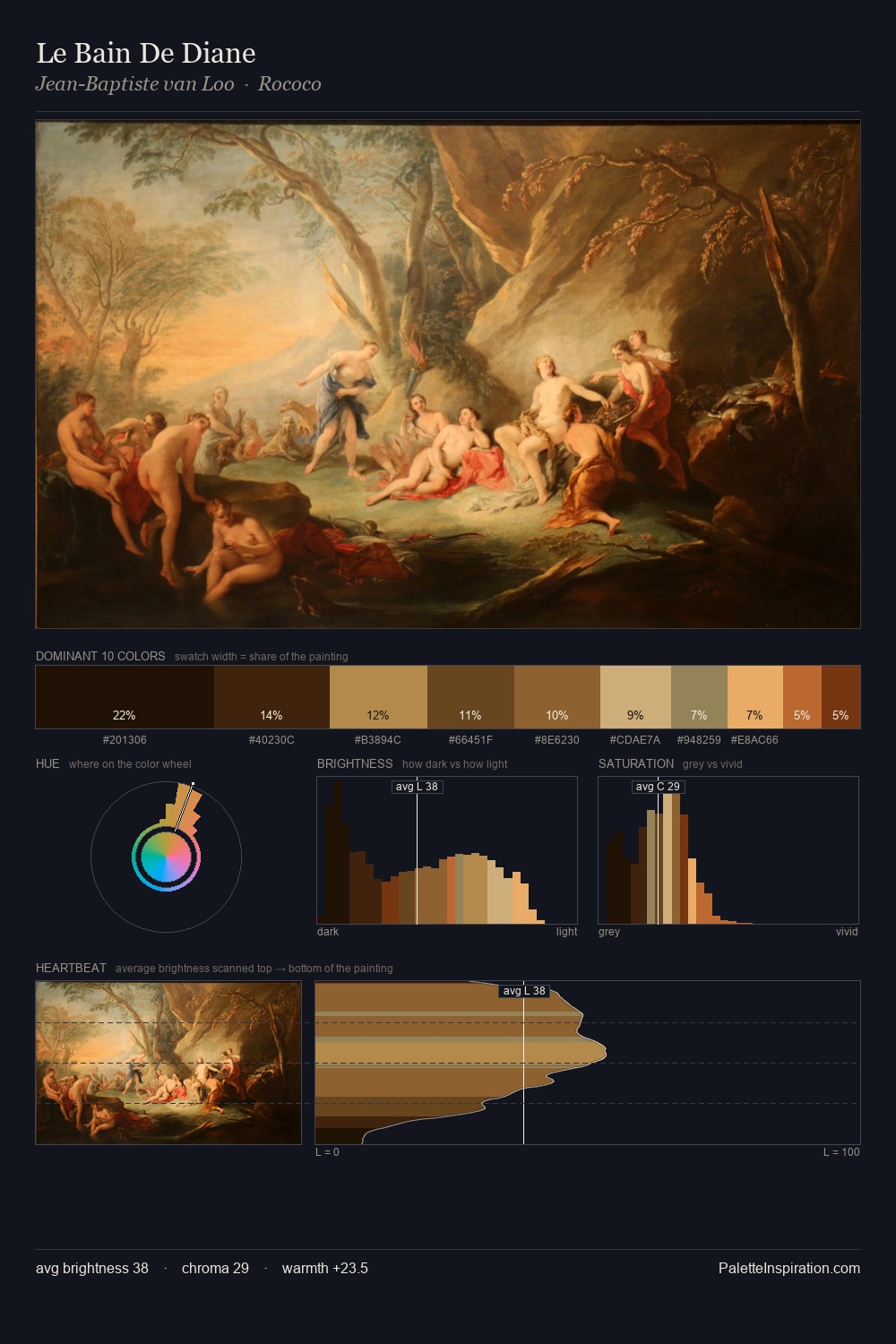
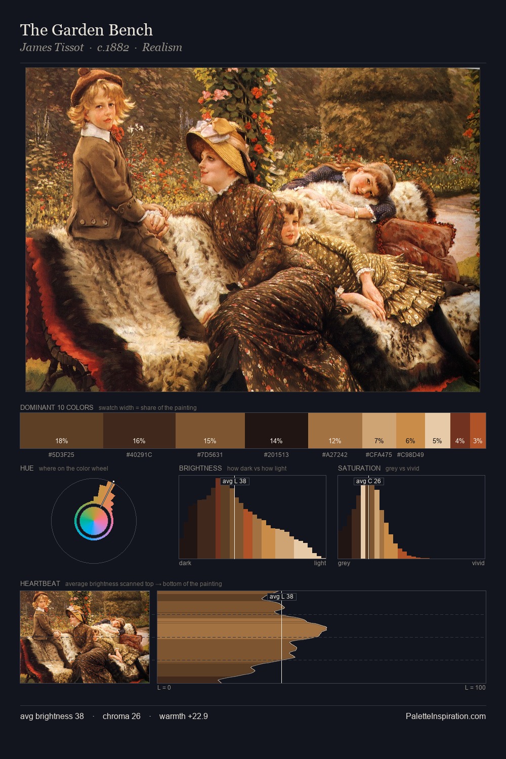
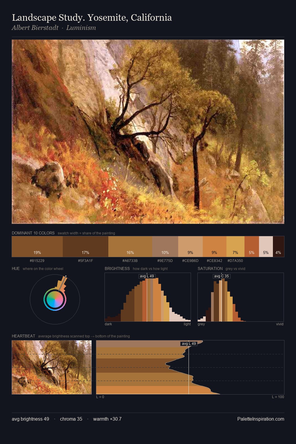
Jan Verbruggen distributes its values across the middle register, creating harmony without high contrast. Warm hues command this palette; Jan Verbruggen favours the reds, oranges, and yellows of firelight and earth. Chroma is moderate: colours carry enough saturation to be read as colour, but the palette stops well short of garish intensity. #B44F1B delivers the chromatic peak at only 0.4% - a small shot of colour with outsized visual impact. At 45 units across the value scale, the palette keeps contrast readable without letting it dominate. In the context of Jan Verbruggen's full range of palettes, group 2 represents one movement in an ongoing chromatic dialogue.
Example use cases
- music labels
- luxury hospitality
- editorial photography
- leather goods
- premium streaming
I Love This!
Use This Palette
Copy, export, or download for your project
Copy, export, or download for your project
Copy:
Download:
Share: