Jan van Kessel the Elder Palette 6

Palette Analysis
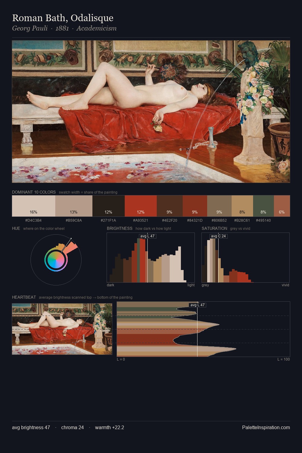
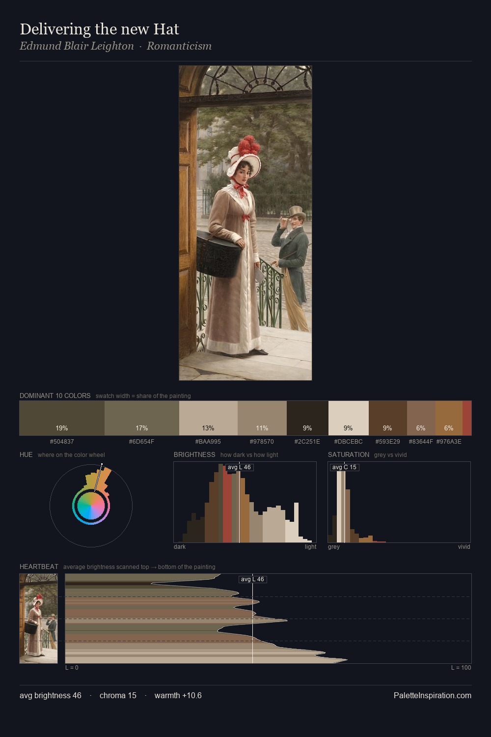
Jan van Kessel the Elder distributes its values across the middle register, creating harmony without high contrast. Jan van Kessel the Elder tilts toward cool - blues and silver-greys carry the structural weight. All colours lean toward grey, building depth through value rather than colour punch. 29.9% of the palette belongs to #161513, a concentration that makes it the unmistakable visual centre. The saturated accent, #A38452, registers at 2.7% - sparse enough to feel like a deliberate surprise. A value spread of 58 units gives the palette both depth and air - shadows are genuinely dark, lights genuinely light. High luminosity and cool temperature suggest the plein-air condition: unfiltered daylight and open sky. Palette 6 sits within the larger chromatic argument that Jan van Kessel the Elder's complete body of work advances.
Example use cases
- music labels
- luxury hospitality
- editorial photography
- leather goods
- premium streaming
I Love This!
Copy, export, or download for your project