James Sharples Palette 7

Palette Analysis
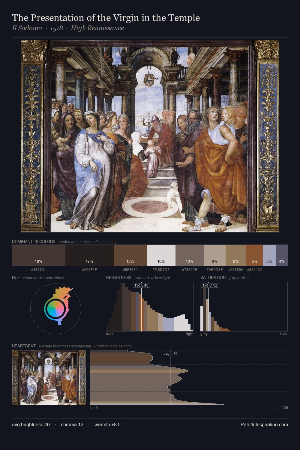
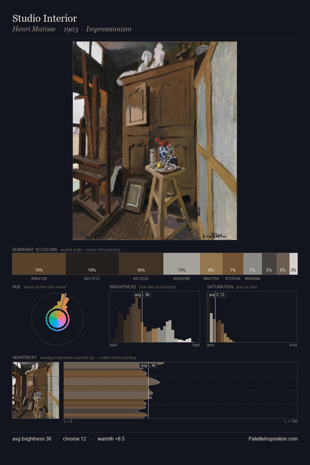
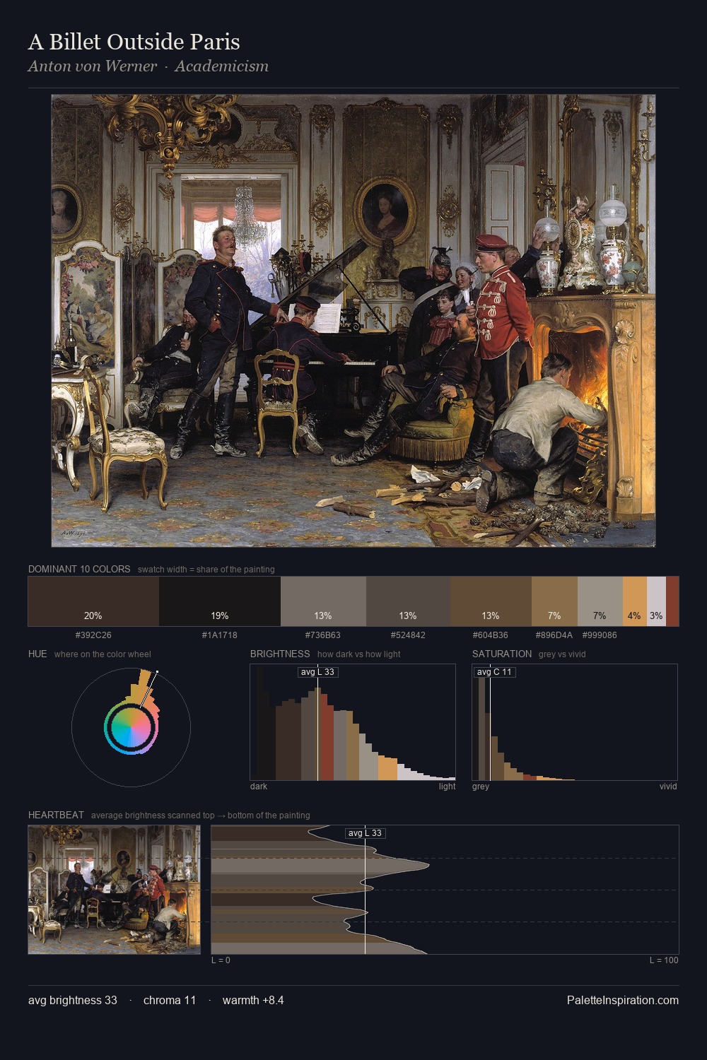
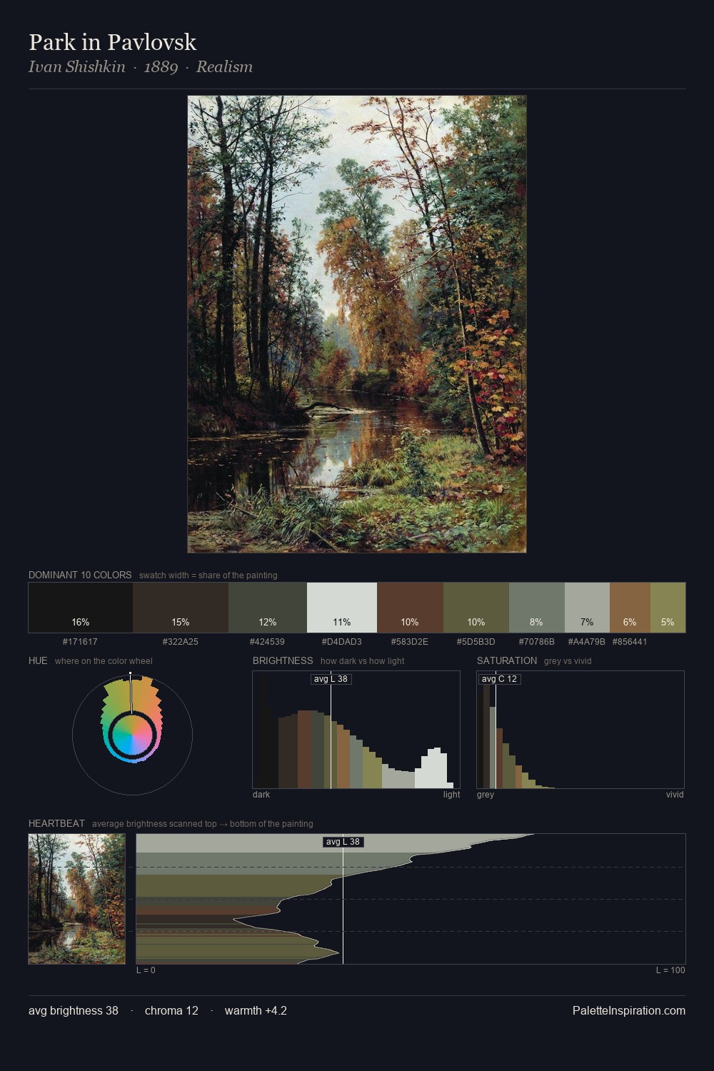
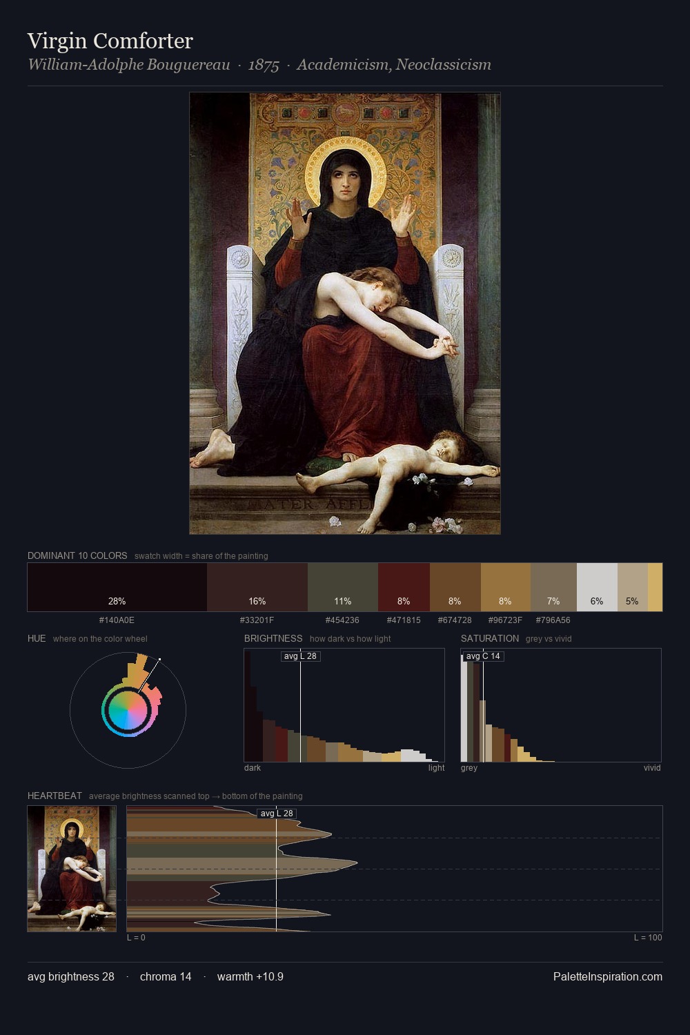
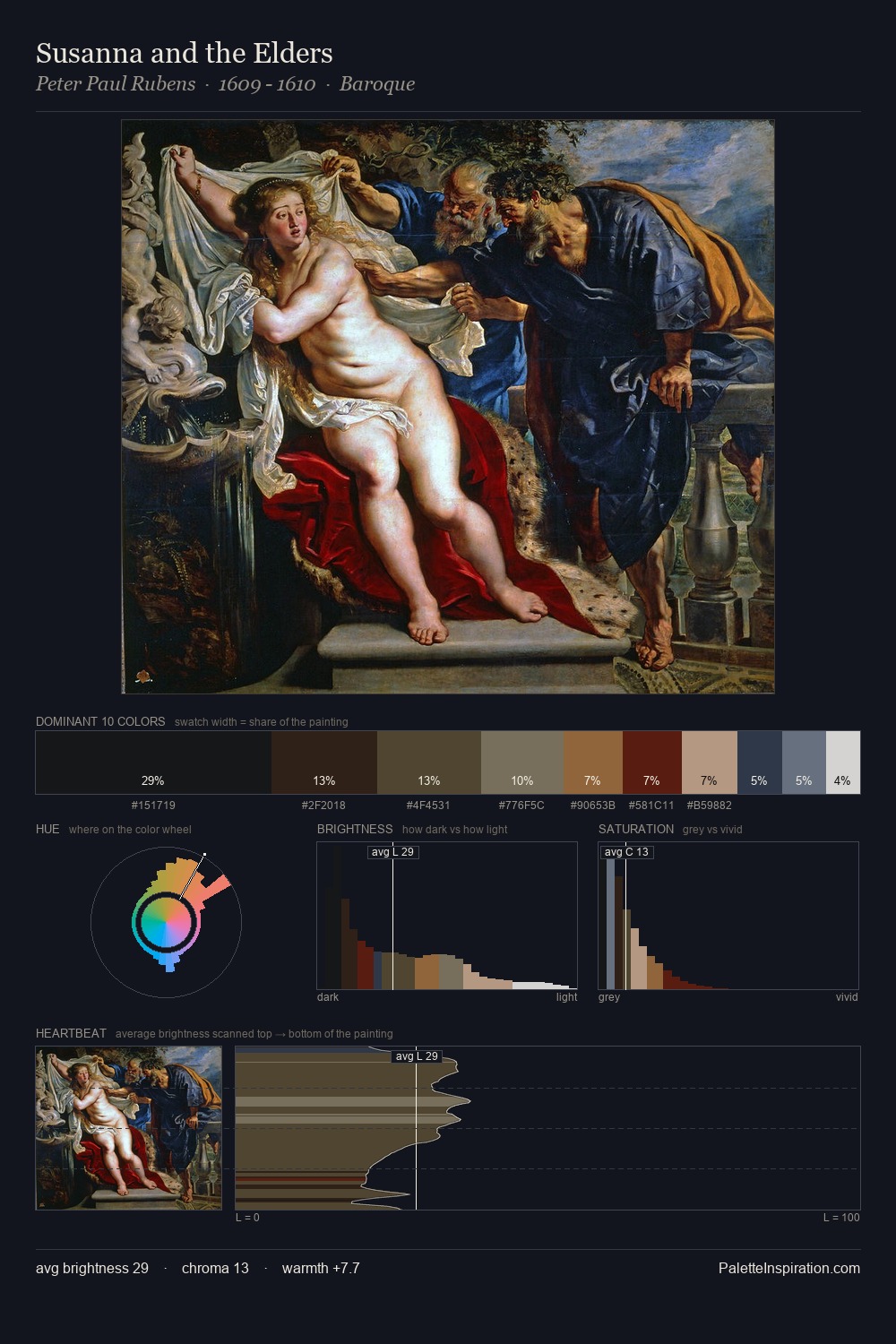
James Sharples distributes its values across the middle register, creating harmony without high contrast. Blues and teal-greys govern the palette, lending it an aquatic or atmospheric quality. Every colour is desaturated; the palette proceeds through near-neutrals and gently-coloured greys. At 2.3%, #927241 carries the palette's sharpest chromatic charge: an accent that earns its place precisely because it is withheld. From deepest dark to palest light, the palette traverses 71 units of the value scale - a span that creates natural depth. The mid-to-high key, cool bias, and moderate chroma point to outdoor observation - sky and diffused daylight as the dominant light source. In the context of James Sharples's full range of palettes, group 7 represents one movement in an ongoing chromatic dialogue.
Example use cases
- theater design
- jewelry brands
- tobacco-adjacent retail
- event branding
- film & entertainment
I Love This!
Copy, export, or download for your project