James Sharples Palette 5

Palette Analysis
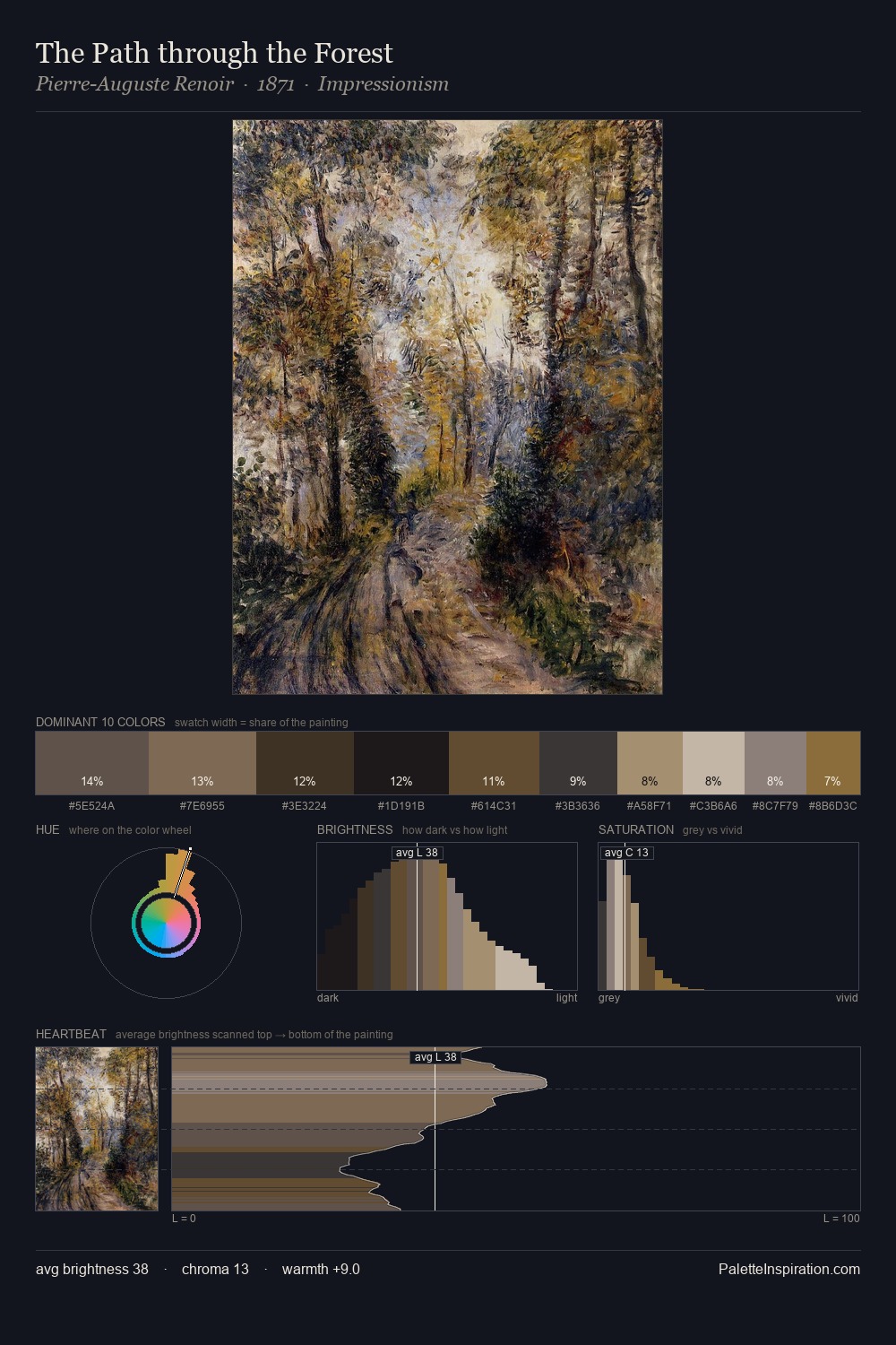
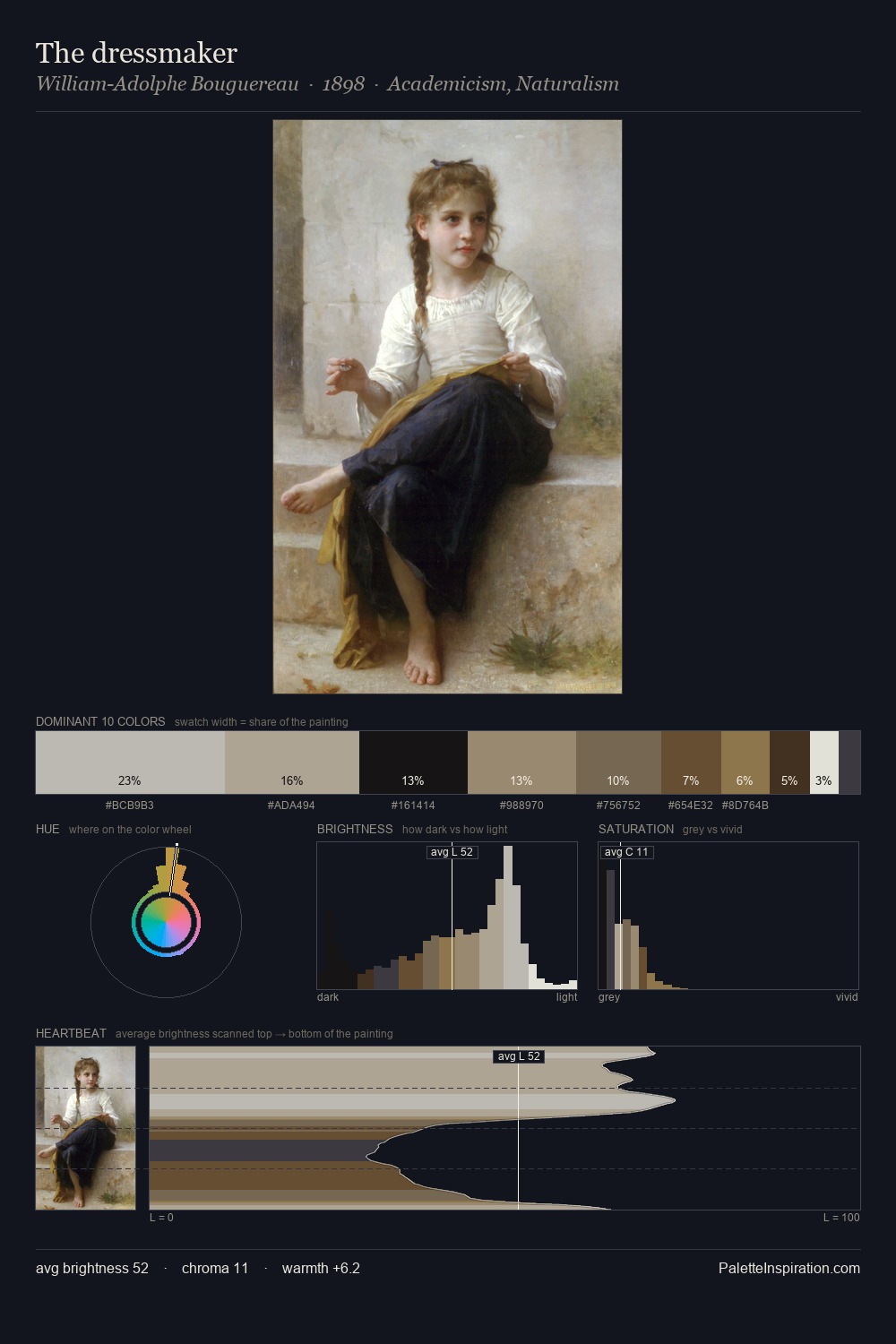
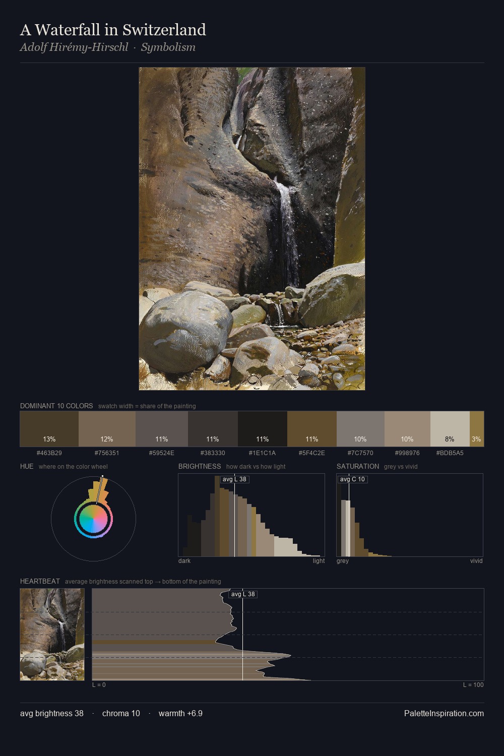
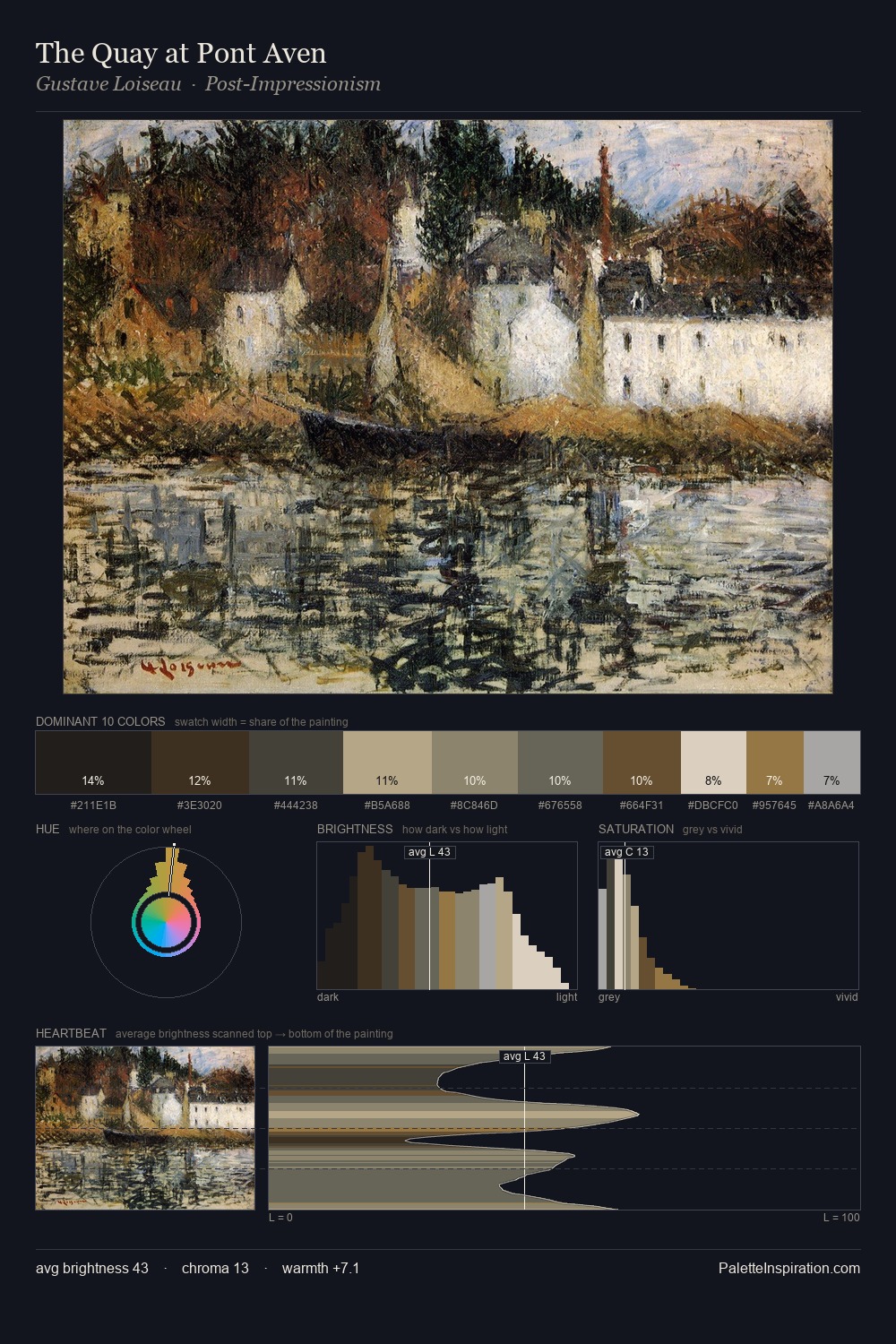
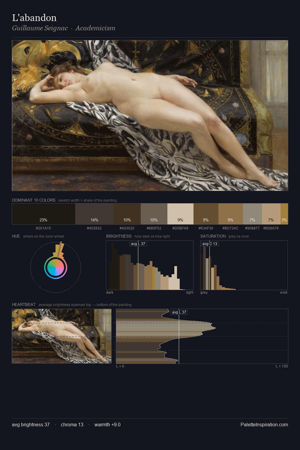
James Sharples distributes its values across the middle register, creating harmony without high contrast. James Sharples tilts toward cool - blues and silver-greys carry the structural weight. Saturation is deliberately withheld - the beauty here lies in the near-monochromatic gradations rather than colour difference. #A99374 at 28.9% of the palette: an overwhelming presence that pulls all other colours into its gravitational field. The highest-chroma note - #403527 - appears at just 5.9%, deployed as a precision accent against the quieter ground. The value range spans 65 units across the palette, providing the full gamut from deep shadow to near-white and ensuring clear tonal hierarchy. High luminosity and cool temperature suggest the plein-air condition: unfiltered daylight and open sky. James Sharples's palette 5 carries its own internal logic while remaining in conversation with the artist's broader colour intelligence.
Example use cases
- exhibition design
- foundation branding
- estate management
- art education
- museums & galleries
I Love This!
Copy, export, or download for your project