Jacopo Vignali Palette 2
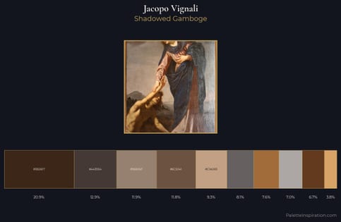
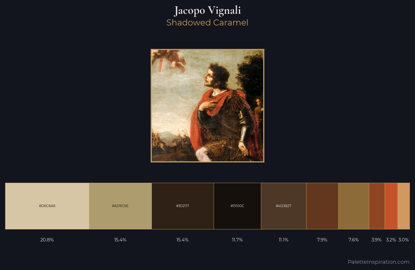
Shadowed Caramel
Shadowed Low-key - values weighted toward shadow, the palette of dim interiors and overcast skies.
Caramel Warm mid-brown - the color of cooked sugar, smooth and amber-toned.
Palette Analysis
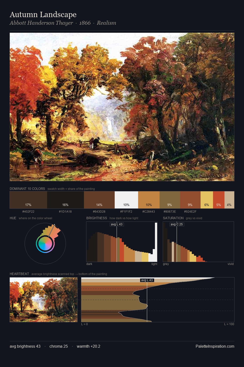
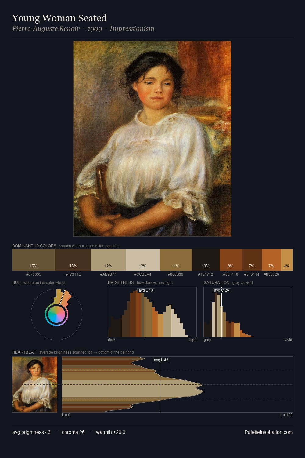
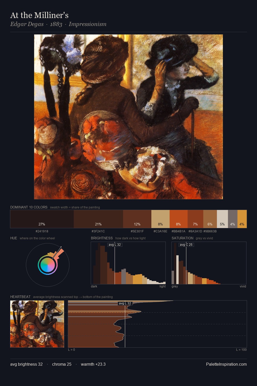
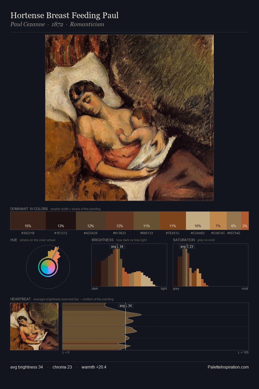
Values in Jacopo Vignali rest in the mid-range - neither dramatically lit nor steeped in shadow. Jacopo Vignali keeps warm and cool in parity, a balance that lends the work a perceptual shimmer. Saturation is deliberately withheld - the beauty here lies in the near-monochromatic gradations rather than colour difference. #8F4422 delivers the chromatic peak at only 3.9% - a small shot of colour with outsized visual impact. At 65 units of value range, the palette has the tonal breadth to sustain complex spatial readings. Palette 2 sits within the larger chromatic argument that Jacopo Vignali's complete body of work advances.
Example use cases
- theater design
- jewelry brands
- tobacco-adjacent retail
- event branding
- film & entertainment
I Love This!
Use This Palette
Copy, export, or download for your project
Copy, export, or download for your project
Copy:
Download:
Share: