Jacob van Schuppen Master Palette
Shadowed Tawny
Shadowed Low-key - values weighted toward shadow, the palette of dim interiors and overcast skies.
Tawny Warm orange-brown - a traditional term for the color of tanned leather or lion fur.

Palette Analysis
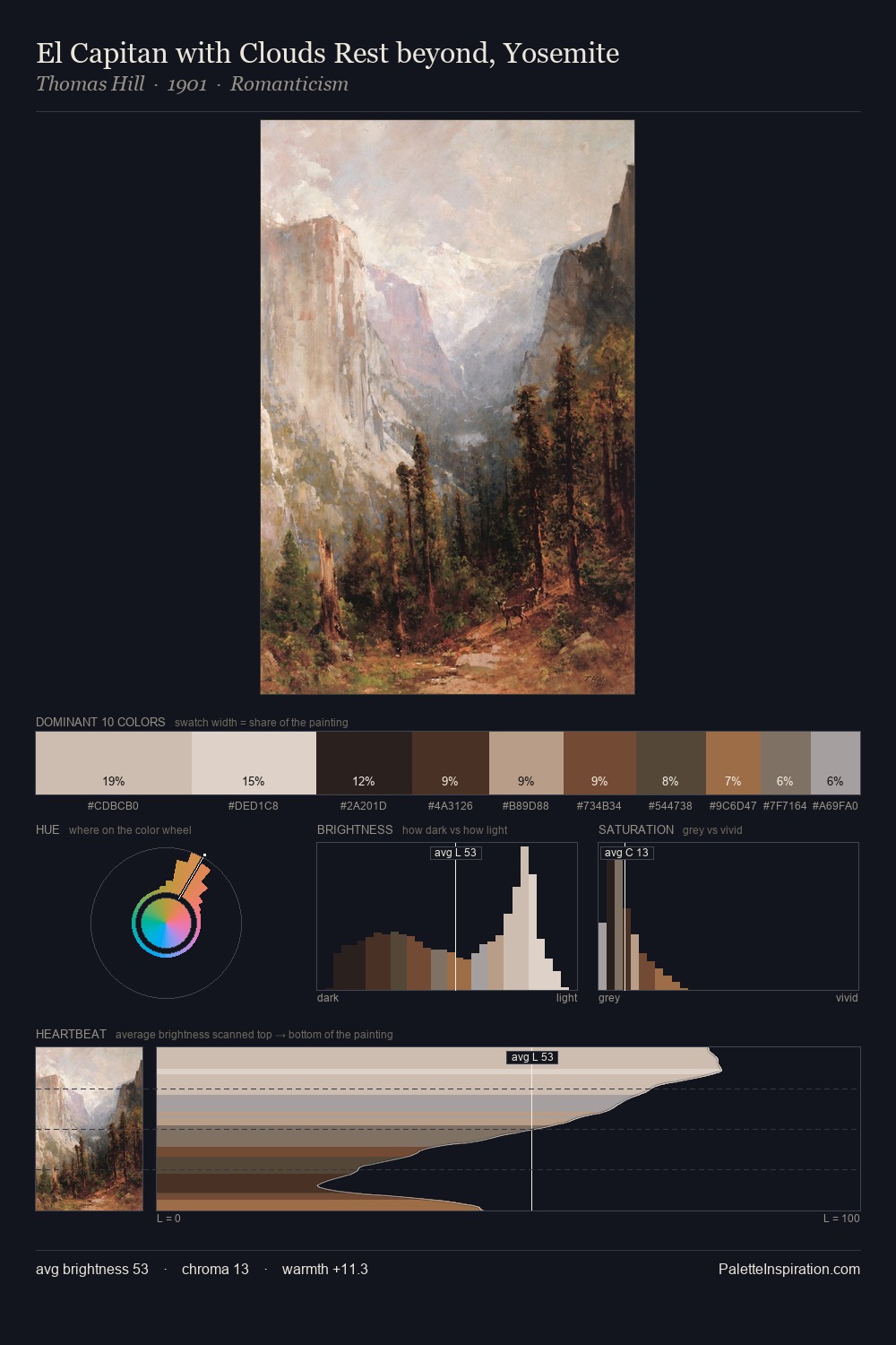
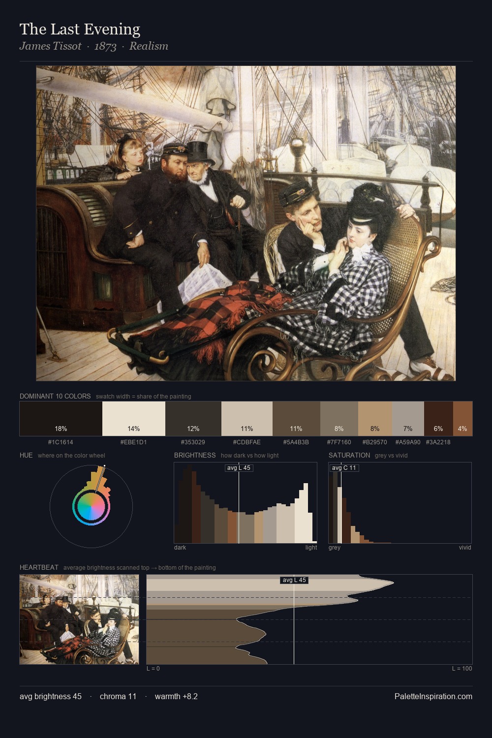
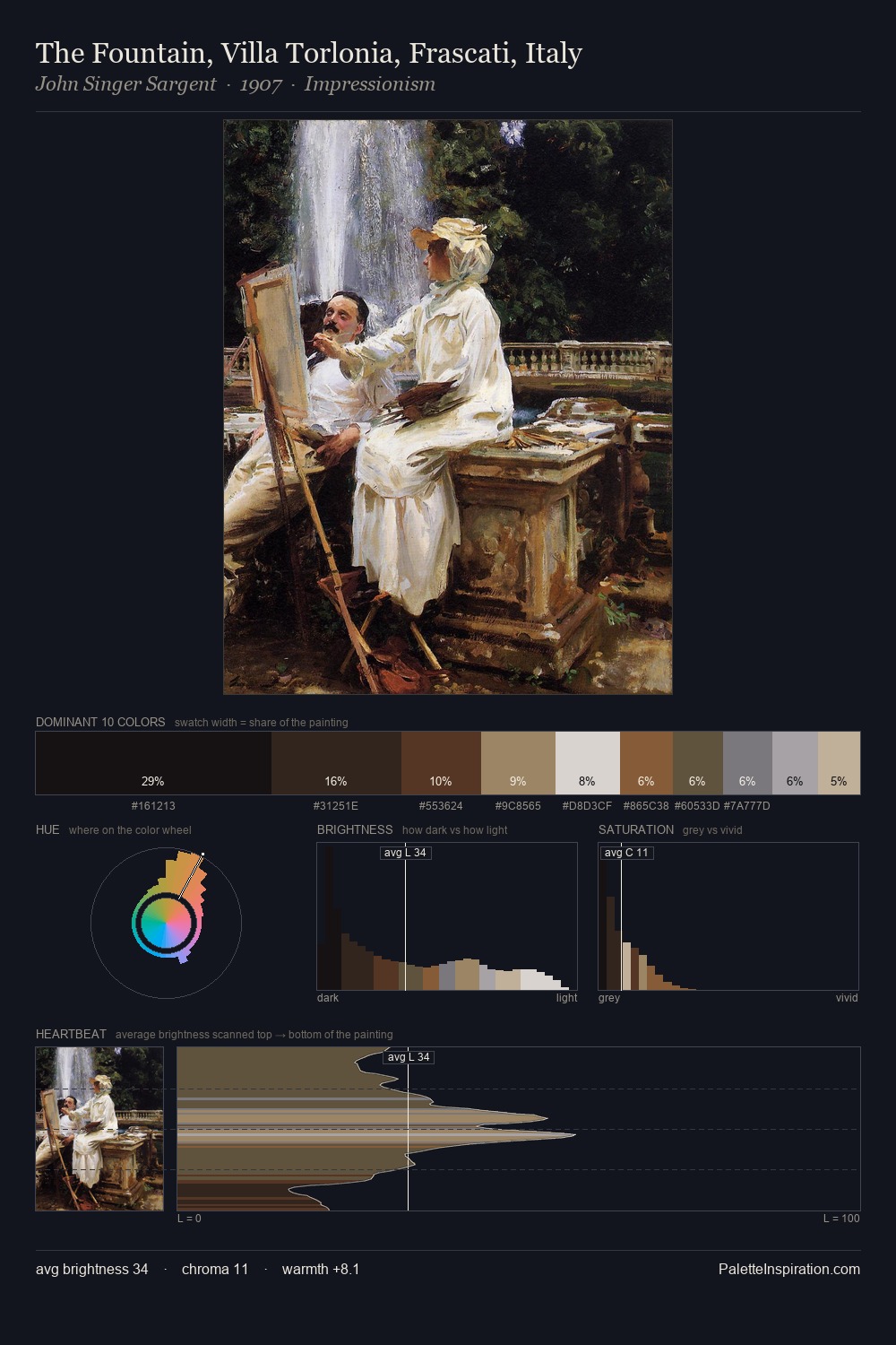
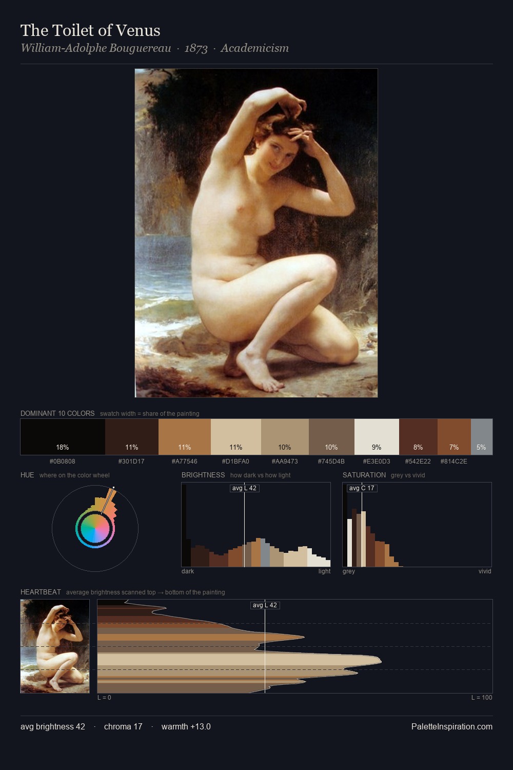
Jacob van Schuppen sits in the centre of the value range, lending the palette a sense of even, sustained light. Temperature reads distinctly warm: the reds and earth tones from Jacob van Schuppen carry the compositional weight. The absence of saturated colour is itself an expressive choice: this is a palette of restraint and atmosphere. The saturated accent, #B89F7C, registers at 12.5% - sparse enough to feel like a deliberate surprise. The value range spans 68 units across the palette, providing the full gamut from deep shadow to near-white and ensuring clear tonal hierarchy. This is the light Jacob van Schuppen preferred, made measurable.
Example use cases
- music labels
- luxury hospitality
- editorial photography
- leather goods
- premium streaming
I Love This!
Use This Palette
Copy, export, or download for your project
Copy, export, or download for your project
Copy:
Download:
Share: