Jacob van Schuppen Palette 2

Palette Analysis
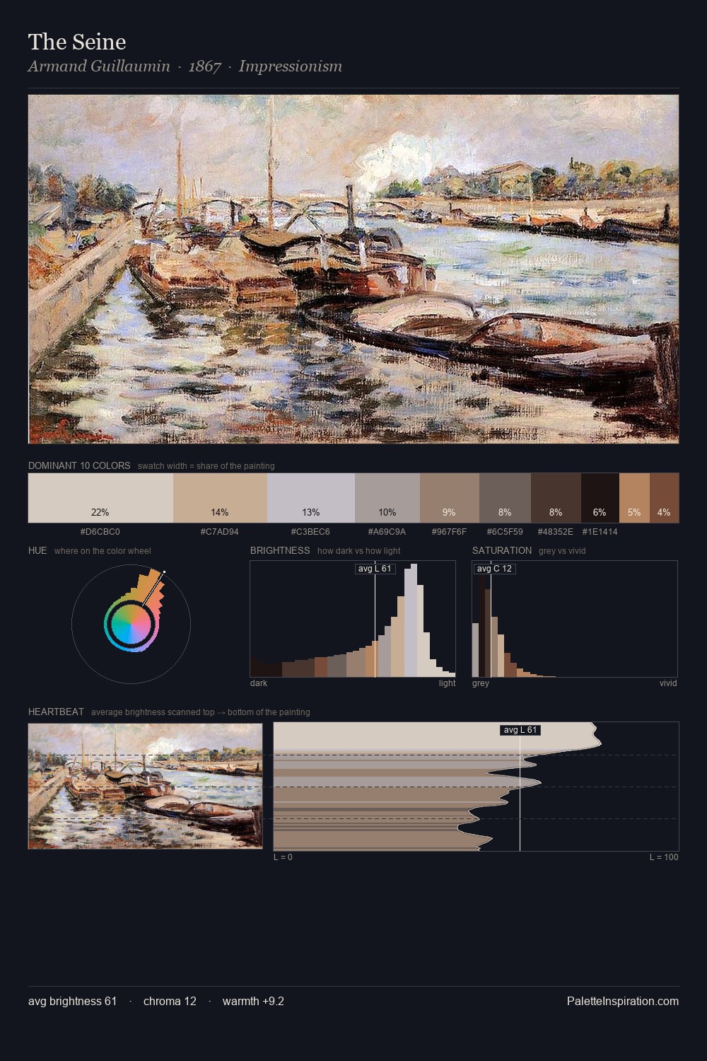
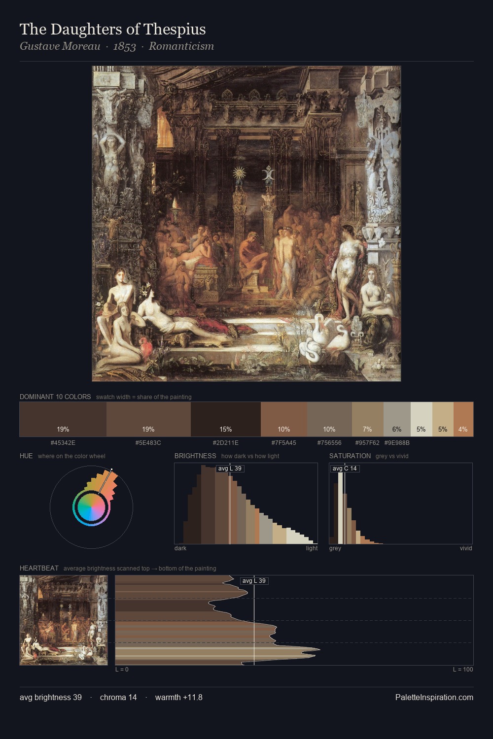
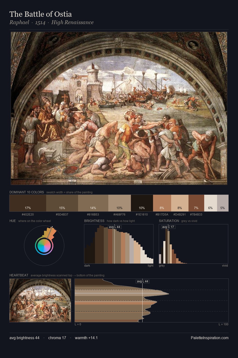
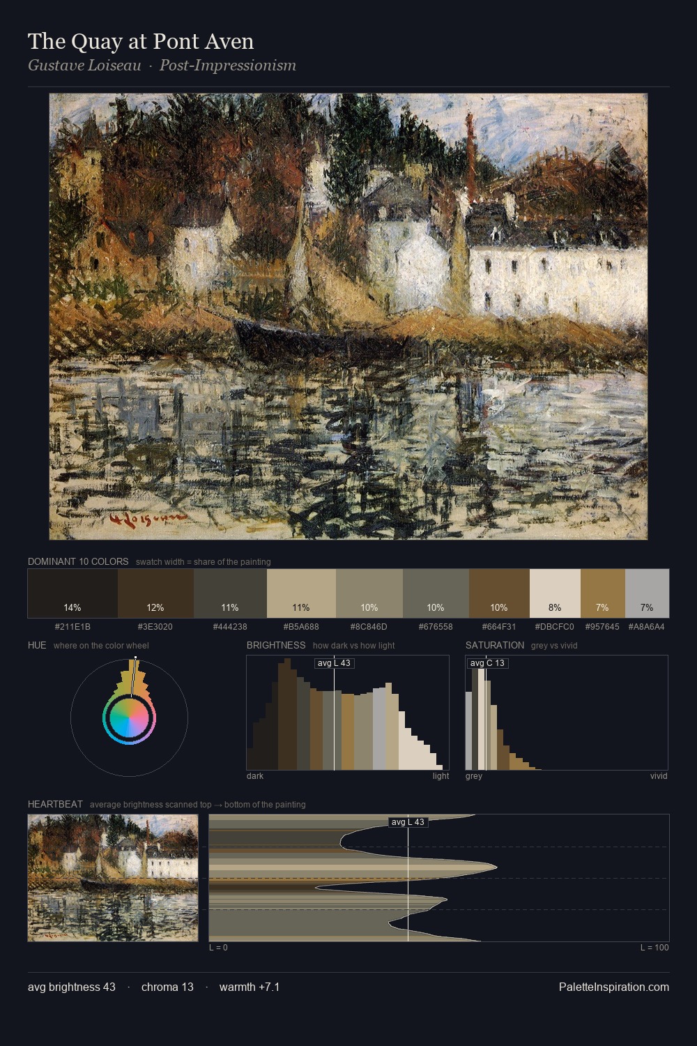
Jacob van Schuppen distributes its values across the middle register, creating harmony without high contrast. Temperature reads distinctly warm: the reds and earth tones from Jacob van Schuppen carry the compositional weight. Chroma hovers near zero; colour declares itself through subtle shifts in hue rather than outright saturation. A single dominant - #2D2725 at 30.0% - sets the character of the whole composition. At 2.2%, #A97C51 carries the palette's sharpest chromatic charge: an accent that earns its place precisely because it is withheld. From deepest dark to palest light, the palette traverses 70 units of the value scale - a span that creates natural depth. Jacob van Schuppen's palette 2 carries its own internal logic while remaining in conversation with the artist's broader colour intelligence.
Example use cases
- theater design
- jewelry brands
- tobacco-adjacent retail
- event branding
- film & entertainment
I Love This!
Copy, export, or download for your project