Ivan Vladimirov Master Palette

Palette Analysis
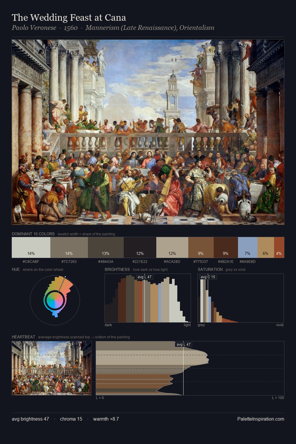
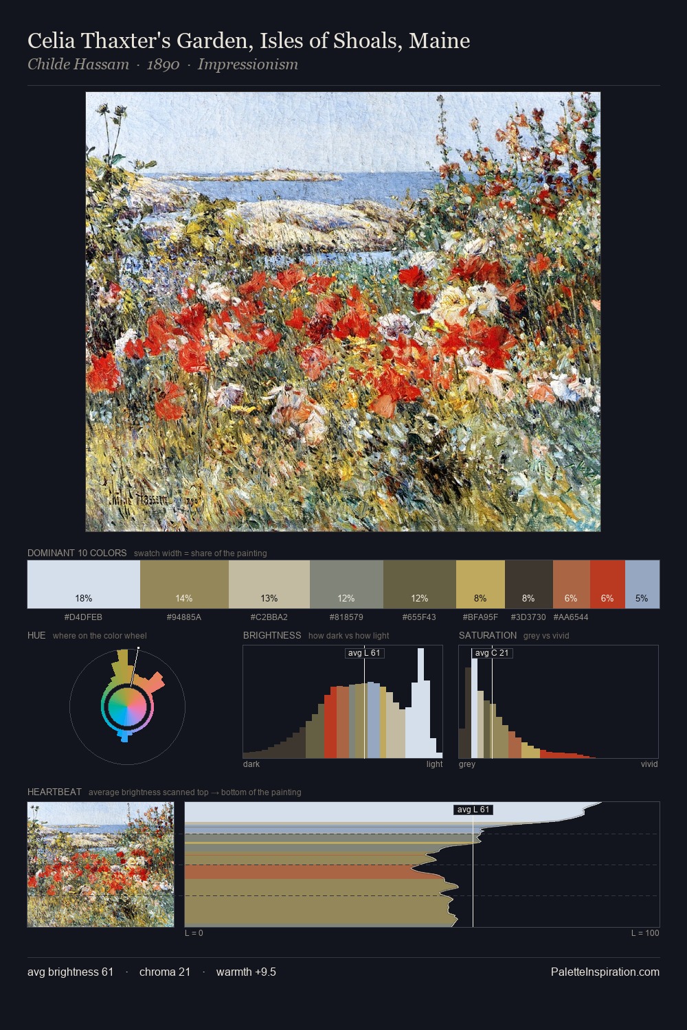
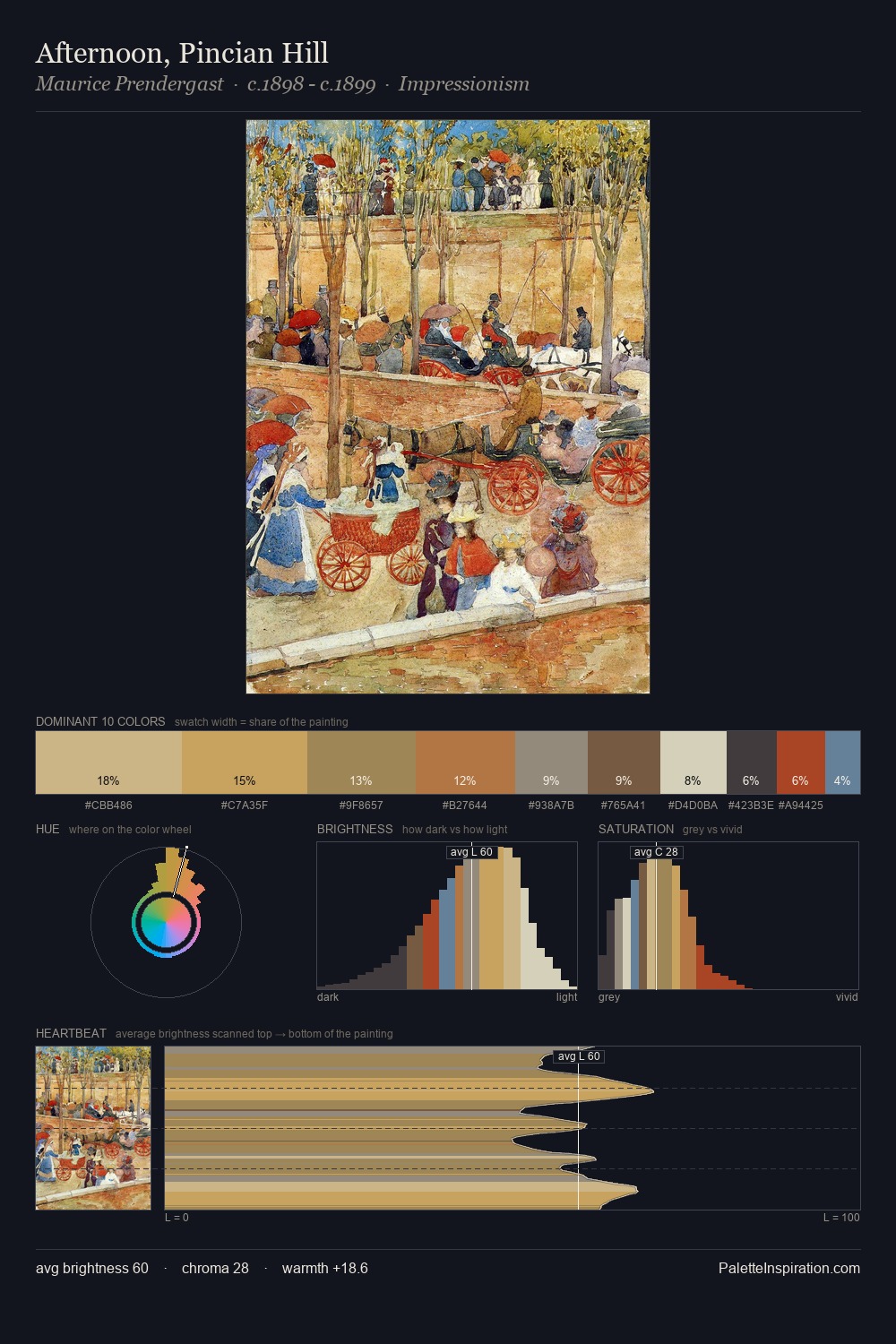
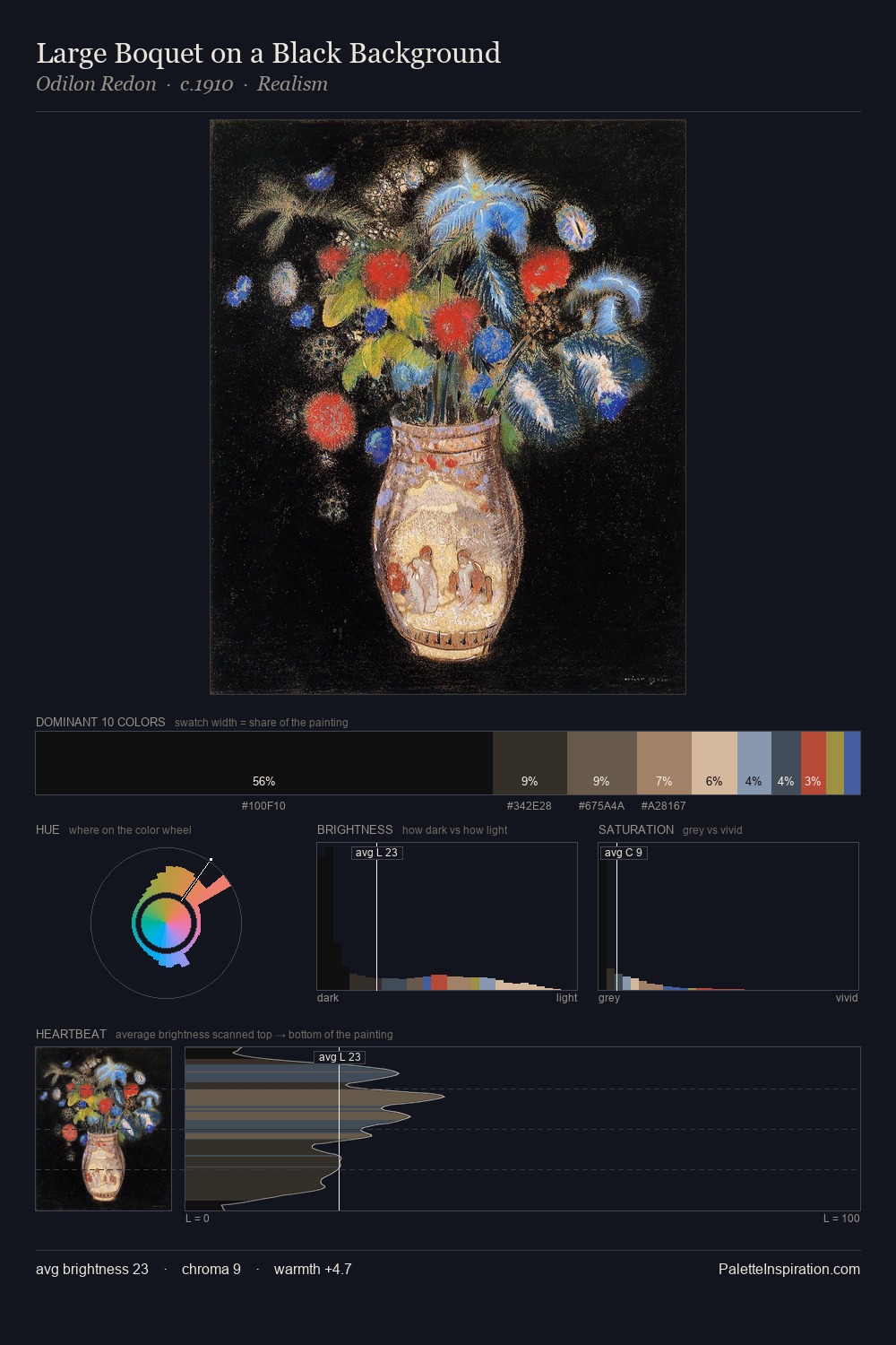
Ivan Vladimirov occupies the comfortable middle of the value scale, avoiding both extremes to hold the eye in a sustained middle grey. Cool tones set the register here - the blues and greens easily outweigh any warm accents. All colours lean toward grey, building depth through value rather than colour punch. The highest-chroma note - #BEA056 - appears at just 4.2%, deployed as a precision accent against the quieter ground. The value range spans 56 units across the palette, providing the full gamut from deep shadow to near-white and ensuring clear tonal hierarchy. The palette has the character of outdoor light: cool, mid-bright, with colour rendered faithfully rather than expressively. The palette is a signature: Ivan Vladimirov's particular sense of value, warmth, and colour weight made legible.
Example use cases
- museums & galleries
- academic publishing
- heritage brands
- auction houses
- exhibition design
I Love This!
Copy, export, or download for your project