Ivan Vladimirov Palette 2

Palette Analysis
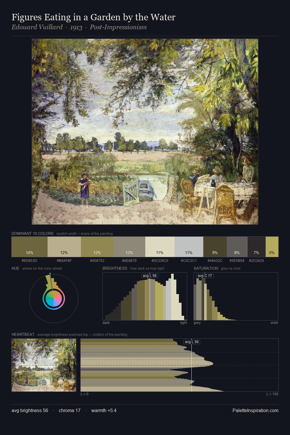
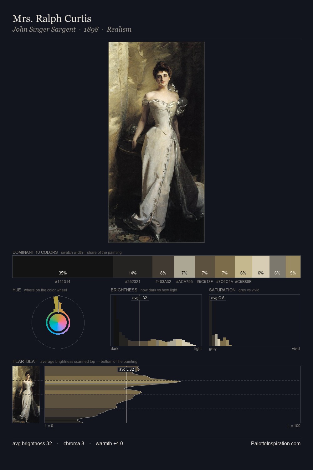
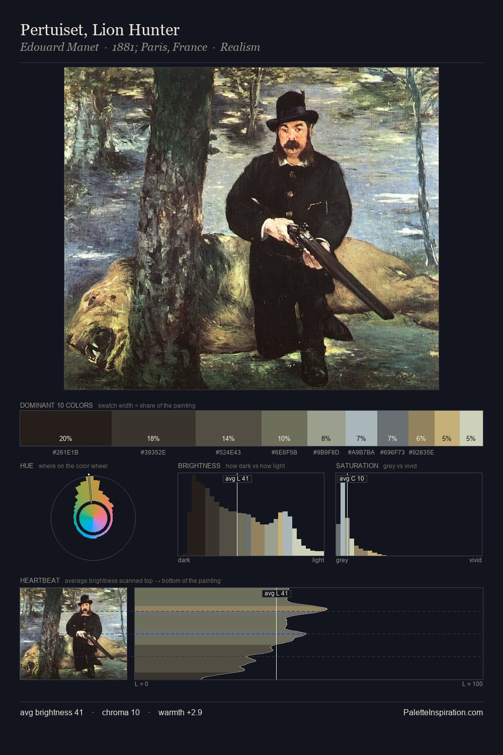
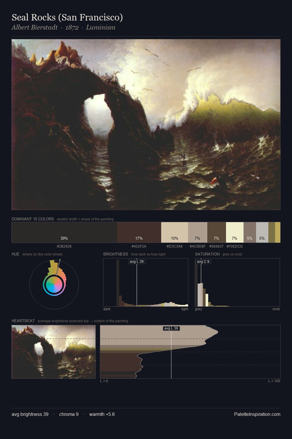
Values in Ivan Vladimirov rest in the mid-range - neither dramatically lit nor steeped in shadow. Cool tones set the register here - the blues and greens easily outweigh any warm accents. Muted throughout, the palette achieves its effects through value and temperature rather than chromatic force. The most saturated colour, #A69E5A, is reserved to 4.1% of the surface, where it acts as a focal punctuation. A value spread of 66 units gives the palette both depth and air - shadows are genuinely dark, lights genuinely light. The palette has the character of outdoor light: cool, mid-bright, with colour rendered faithfully rather than expressively. This is palette 2 of Ivan Vladimirov's sequence - a single chapter in a chromatic story told across many works.
Example use cases
- archival print
- university identity
- rare books
- cultural institutions
- nonprofit identity
I Love This!
Copy, export, or download for your project