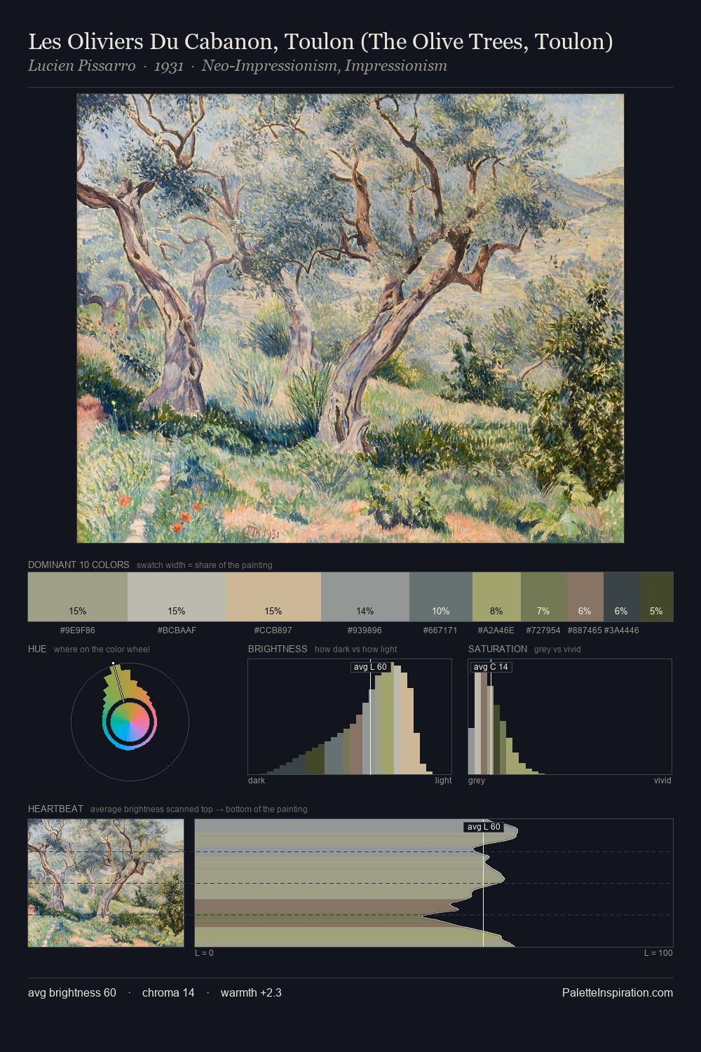
Ivan Grohar Palette 2

Palette Analysis
Ivan Grohar works in the upper reaches of the value scale, creating an atmosphere of brightness and expansiveness. Ivan Grohar builds on cool foundations: the palette favours the blue-cyan-green arc. Every colour is desaturated; the palette proceeds through near-neutrals and gently-coloured greys. Only 2.2% is devoted to #E1C191, yet that small allocation delivers the palette's entire chromatic tension. At 26 units across the value scale, the palette keeps contrast readable without letting it dominate. The mid-to-high key, cool bias, and moderate chroma point to outdoor observation - sky and diffused daylight as the dominant light source. Ivan Grohar's palette 2 carries its own internal logic while remaining in conversation with the artist's broader colour intelligence.
Example use cases
- florist branding
- event design
- real estate
- jewelry retail
- hospitality branding
I Love This!
Copy, export, or download for your project