Ivan Grohar Palette 1

Palette Analysis
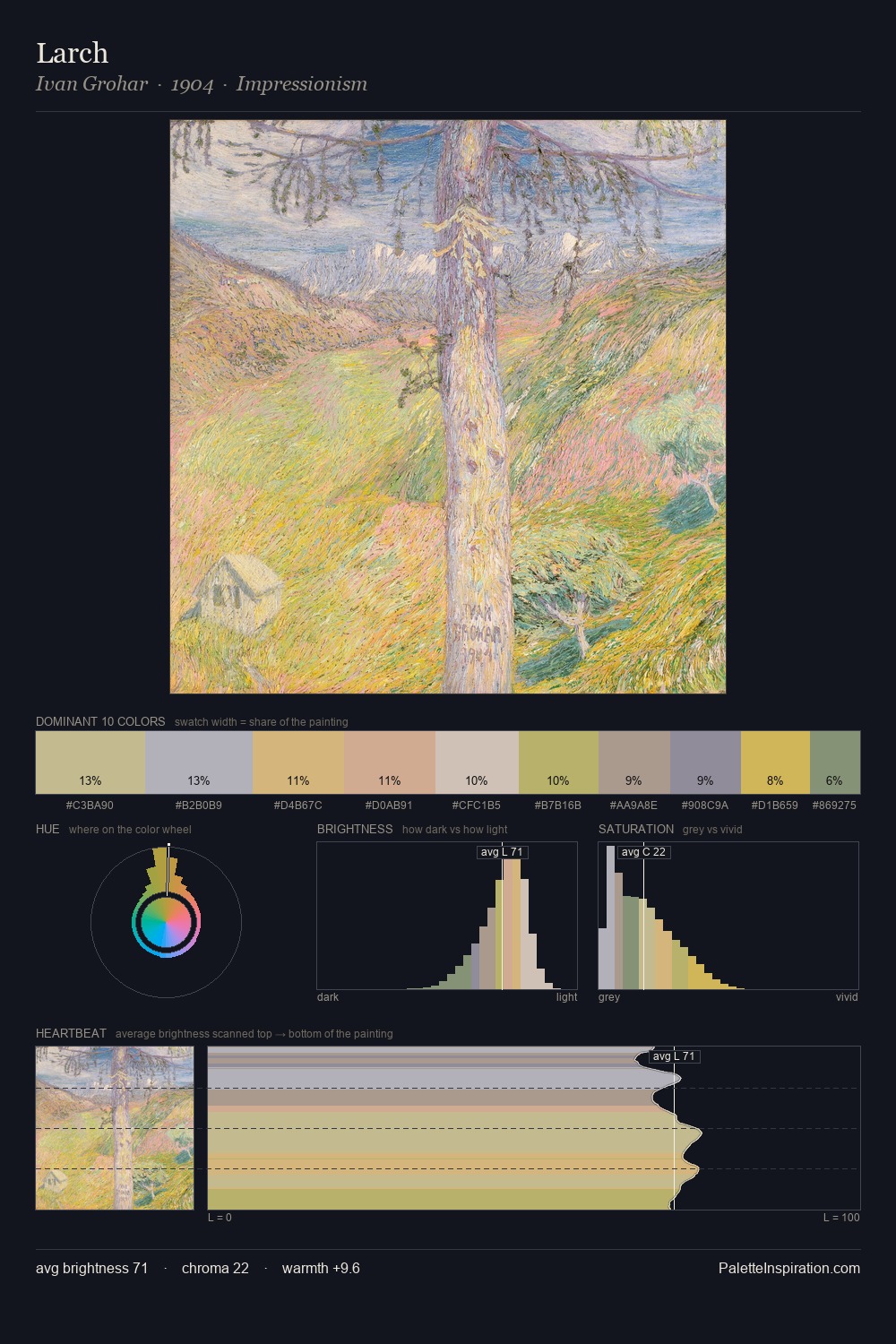
Ivan Grohar is strongly light-biased - shadow is suggested rather than declared. A distinctly cool atmosphere runs through this palette: sky, water, and mist given colour form. Chroma hovers near zero; colour declares itself through subtle shifts in hue rather than outright saturation. The saturated accent, #CCB35B, registers at 7.5% - sparse enough to feel like a deliberate surprise. The tight 15-unit value span produces a palette with no strong contrasts, instead building its character through subtle tonal shifts. The palette has the character of outdoor light: cool, mid-bright, with colour rendered faithfully rather than expressively. Ivan Grohar's palette 1 carries its own internal logic while remaining in conversation with the artist's broader colour intelligence.
Example use cases
- publishing
- corporate identity
- consumer apps
- hospitality
- design agencies
I Love This!
Copy, export, or download for your project