Horace Pippin Palette 4

Palette Analysis
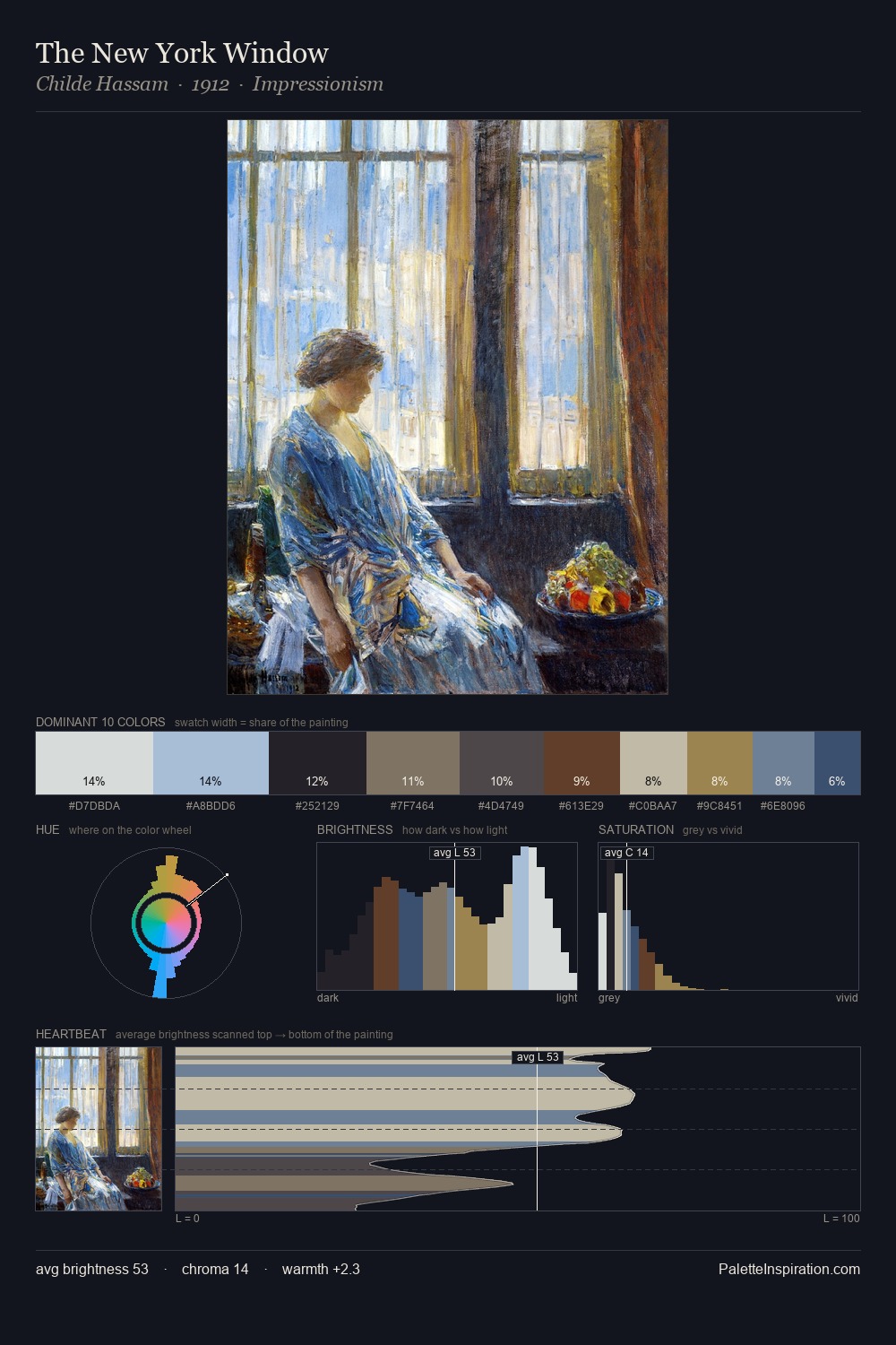
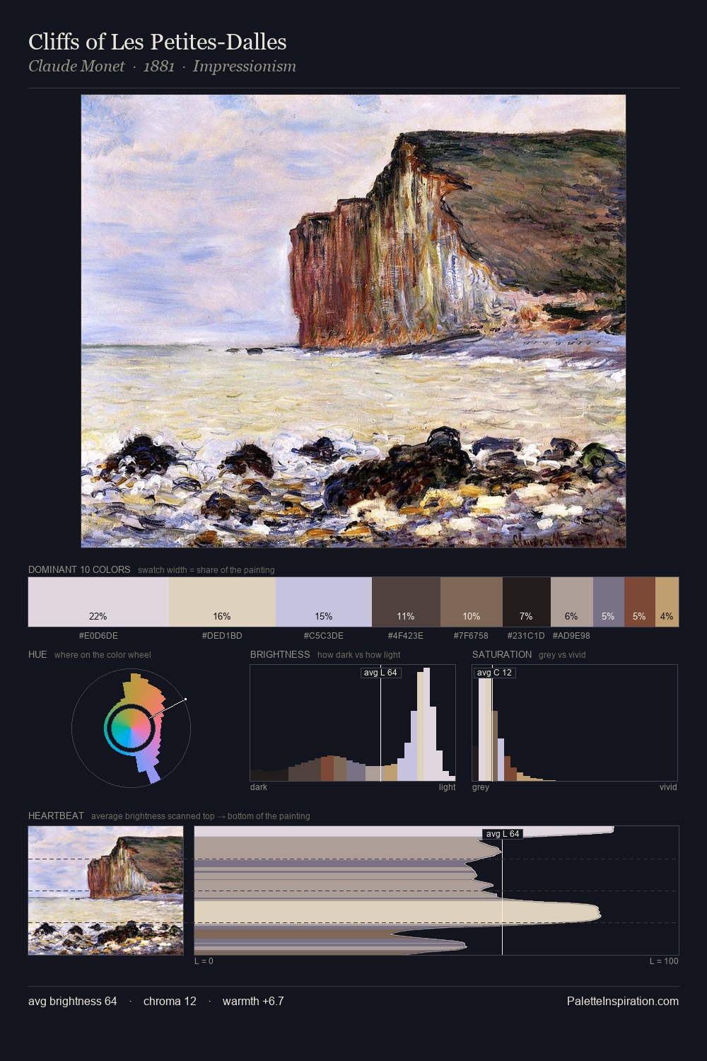
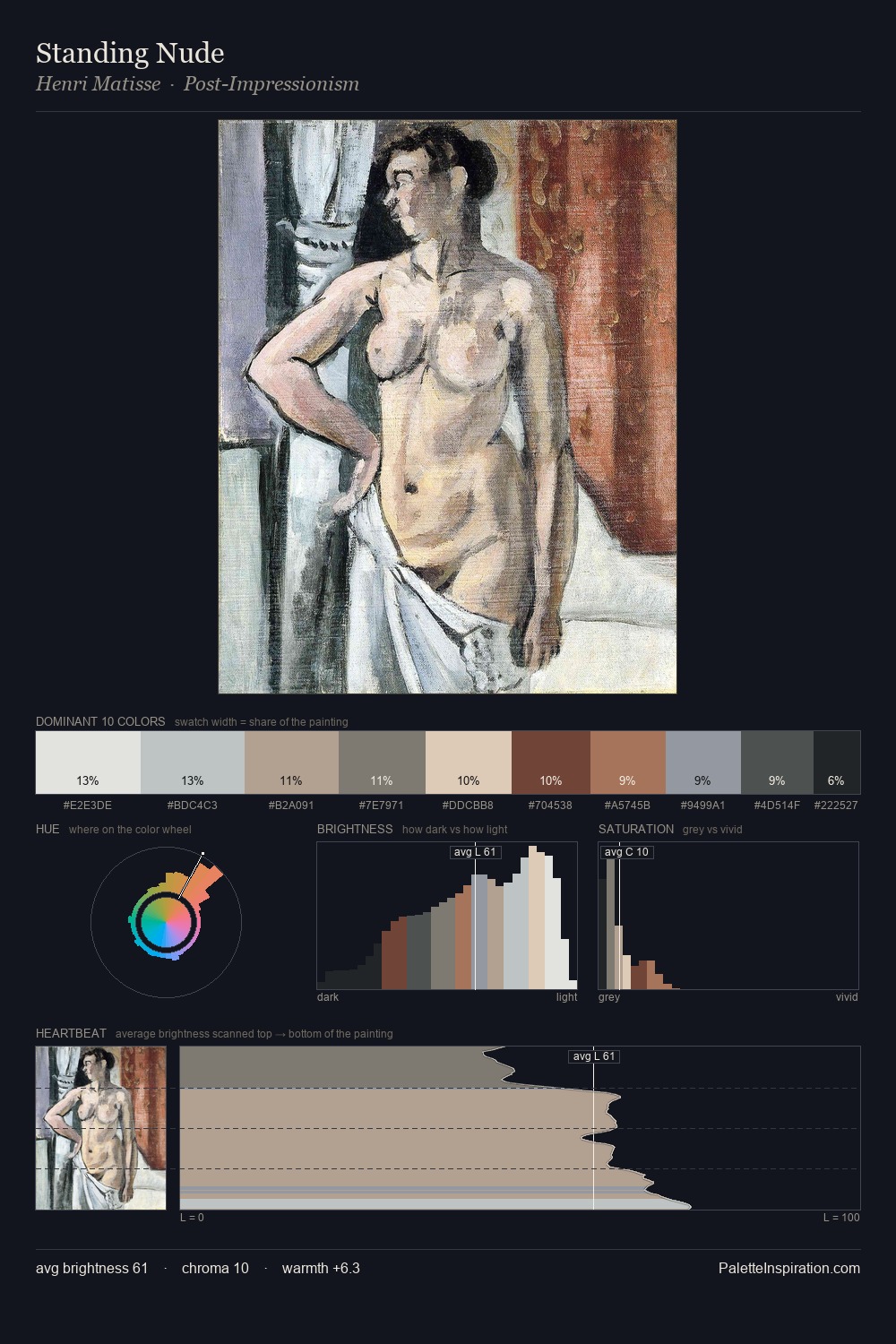
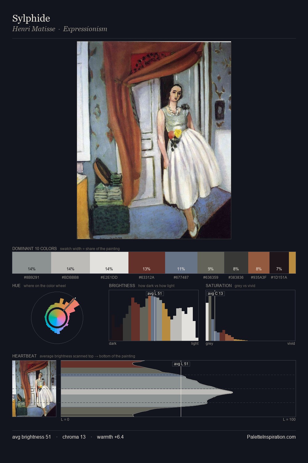
Horace Pippin distributes its values across the middle register, creating harmony without high contrast. Warm and cool tones are held in careful balance - neither family dominates, creating tension and resolution simultaneously. Saturation is deliberately withheld - the beauty here lies in the near-monochromatic gradations rather than colour difference. A single dominant - #D0C6B0 at 30.2% - sets the character of the whole composition. The highest-chroma note - #68829C - appears at just 5.5%, deployed as a precision accent against the quieter ground. 77 units of value range underpin the palette's structural clarity: the eye always knows where light falls. In the context of Horace Pippin's full range of palettes, group 4 represents one movement in an ongoing chromatic dialogue.
Example use cases
- exhibition design
- foundation branding
- estate management
- art education
- museums & galleries
I Love This!
Copy, export, or download for your project