Henry Stacy-Marks Palette 1

Palette Analysis
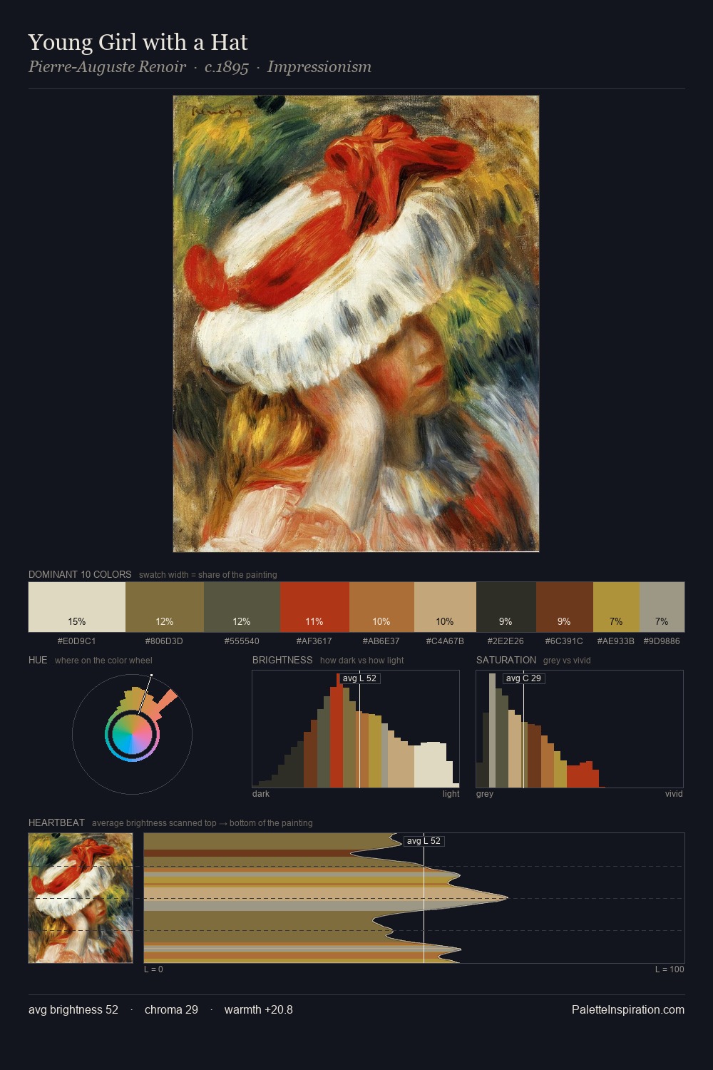
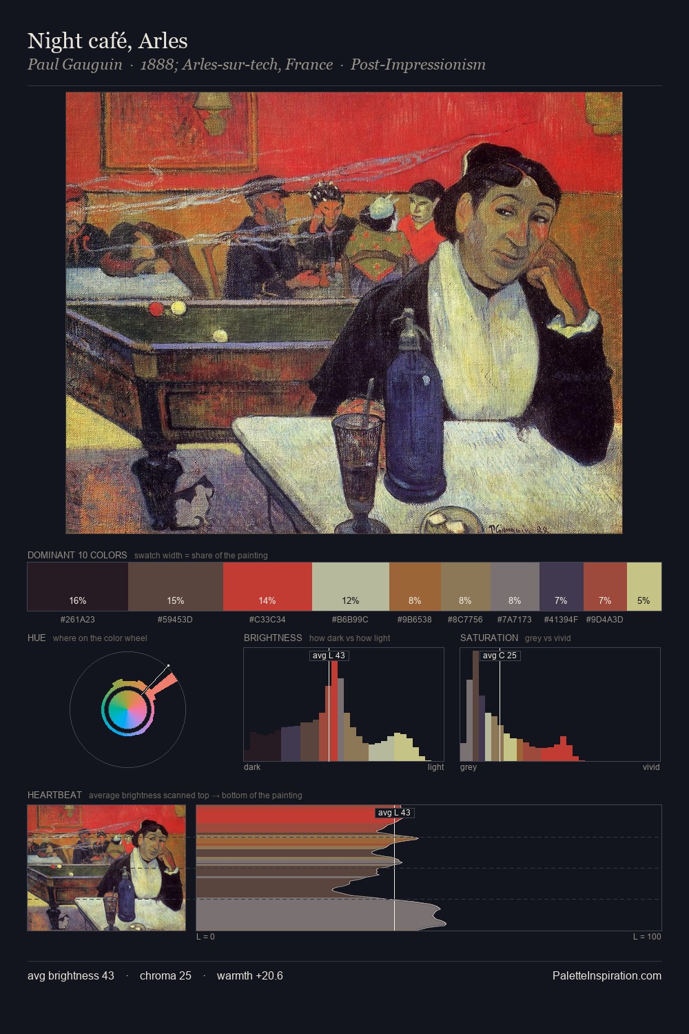
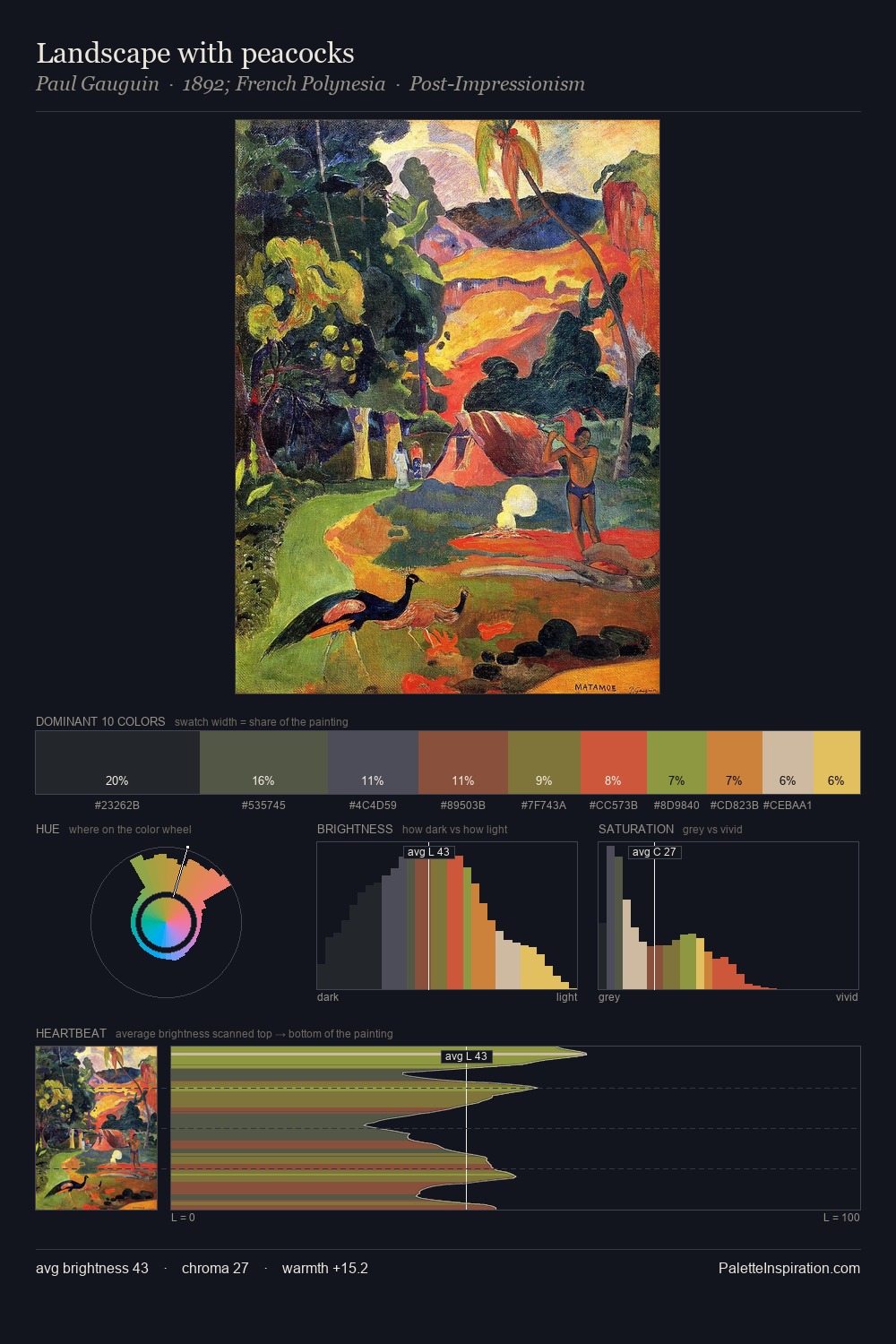
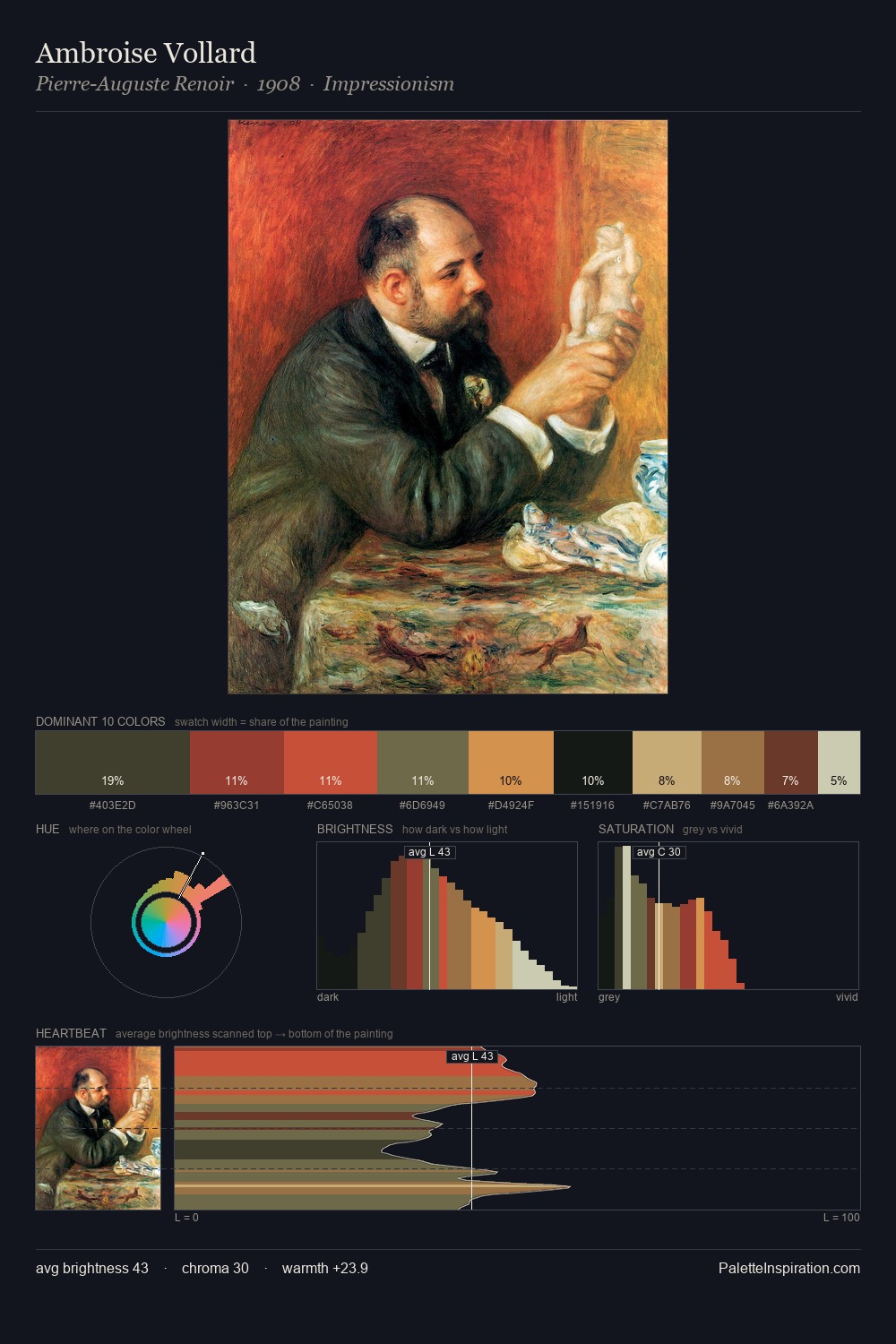
Henry Stacy-Marks works in the upper reaches of the value scale, creating an atmosphere of brightness and expansiveness. Blues and teal-greys govern the palette, lending it an aquatic or atmospheric quality. A restrained, mid-chroma palette: every hue is present and legible, but nothing shouts. Henry Stacy-Marks gives 41.7% of the composition to a single #D1CAA7 - a decisive chromatic anchor. Only 5.0% is devoted to #81412F, yet that small allocation delivers the palette's entire chromatic tension. 45 units of value spread create a palette that is varied but unified - contrast in the service of harmony. High luminosity and cool temperature suggest the plein-air condition: unfiltered daylight and open sky. Henry Stacy-Marks's palette 1 carries its own internal logic while remaining in conversation with the artist's broader colour intelligence.
Example use cases
- publishing
- corporate identity
- consumer apps
- hospitality
- design agencies
I Love This!
Copy, export, or download for your project