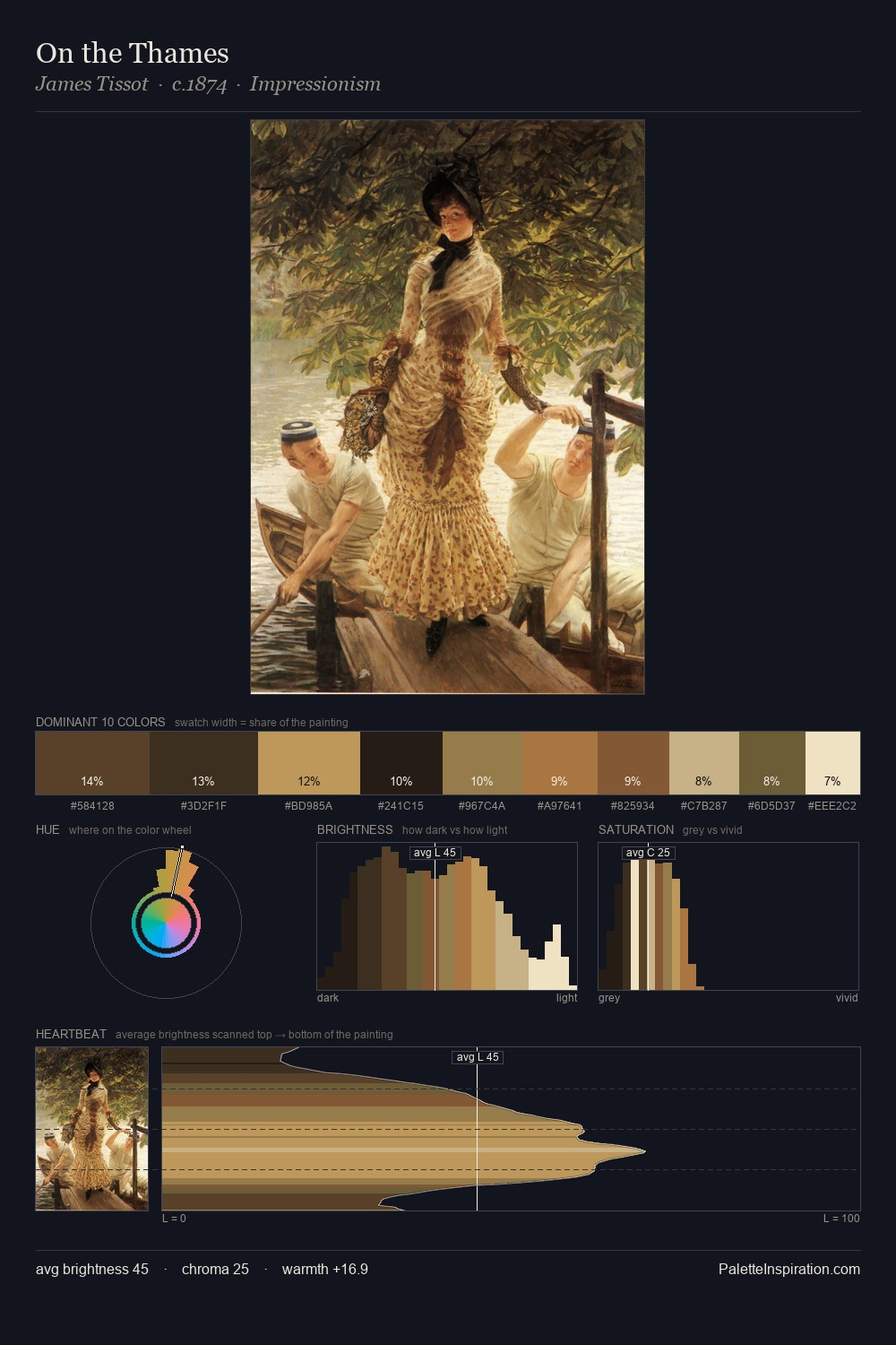
Hendrik Heerschop Palette 4

Palette Analysis
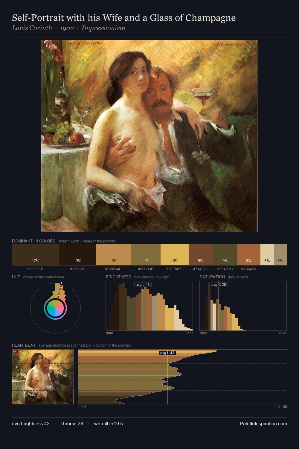
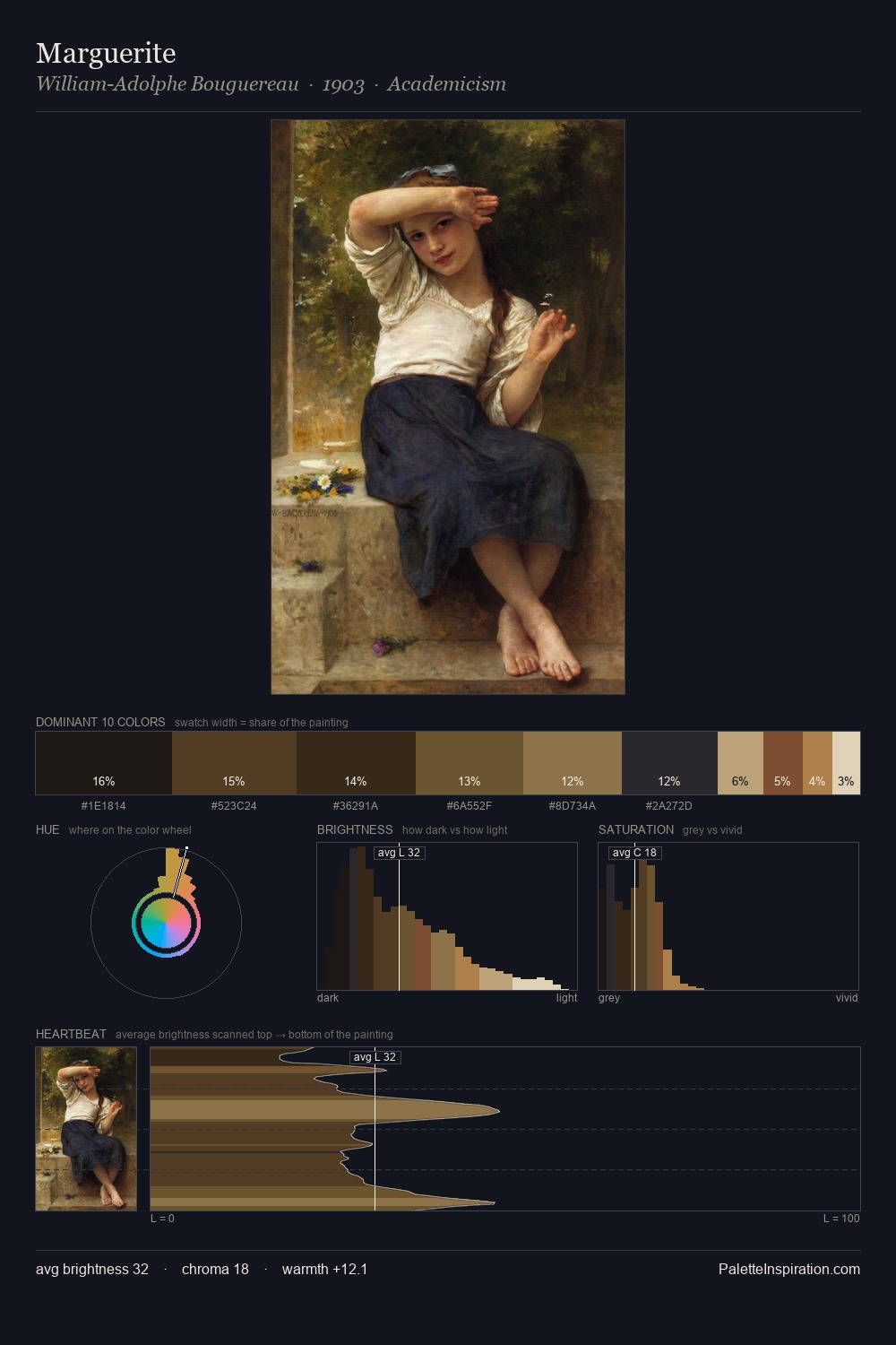
Hendrik Heerschop is low-key throughout, a quality associated with Abyssal Bister - deep shadows dominate the composition. Warm hues command this palette; Hendrik Heerschop favours the reds, oranges, and yellows of firelight and earth. All colours lean toward grey, building depth through value rather than colour punch. At 31.7%, #1A0D03 functions less as a colour accent and more as a complete atmospheric environment. At 0.5%, #C18650 carries the palette's sharpest chromatic charge: an accent that earns its place precisely because it is withheld. 62 units of value range underpin the palette's structural clarity: the eye always knows where light falls. This tonal restraint is characteristic of the Hendrik Heerschop approach: colour serves light, not the reverse. Palette 4 sits within the larger chromatic argument that Hendrik Heerschop's complete body of work advances.
Example use cases
- theater design
- jewelry brands
- tobacco-adjacent retail
- event branding
- film & entertainment
I Love This!
Copy, export, or download for your project