Hendrick Avercamp Palette 4

Palette Analysis
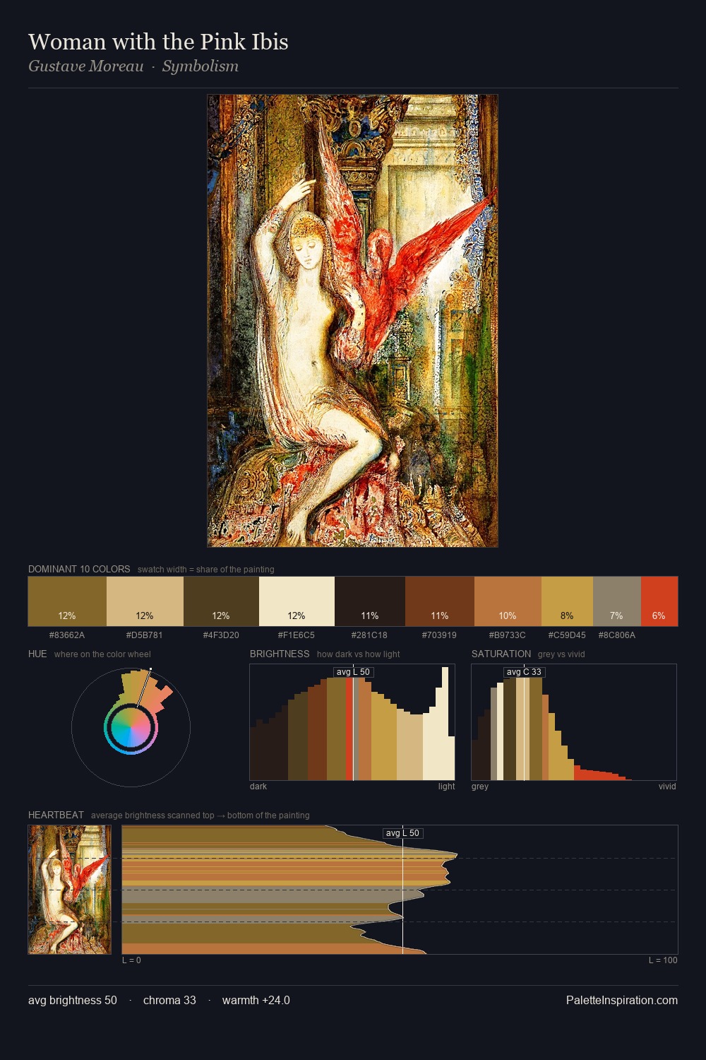
Values in Hendrick Avercamp tilt decisively toward white, giving the palette its luminous character. Hendrick Avercamp tilts toward cool - blues and silver-greys carry the structural weight. Muted throughout, the palette achieves its effects through value and temperature rather than chromatic force. #DDD2AC at 26.9% of the palette: an overwhelming presence that pulls all other colours into its gravitational field. The most saturated colour, #5B401E, is reserved to 4.7% of the surface, where it acts as a focal punctuation. A value spread of 70 units gives the palette both depth and air - shadows are genuinely dark, lights genuinely light. High luminosity and cool temperature suggest the plein-air condition: unfiltered daylight and open sky. Palette 4 sits within the larger chromatic argument that Hendrick Avercamp's complete body of work advances.
Example use cases
- art galleries
- creative studios
- consumer goods
- lifestyle media
- professional services
I Love This!
Copy, export, or download for your project