Heinrich Schonfeld Palette 2
Dimmed Vellum
Dimmed Moderate shadow - values pulled toward mid-dark, as if a light source has been reduced.
Vellum Smooth pale tan - the color of prepared calf-skin vellum, warmer than parchment.

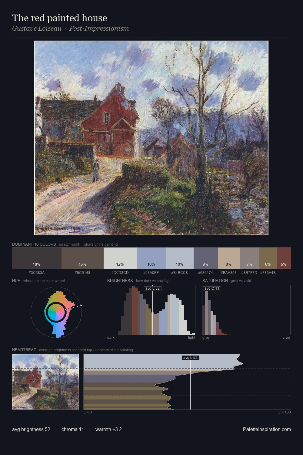
Palette Analysis
Heinrich Schonfeld occupies the comfortable middle of the value scale, avoiding both extremes to hold the eye in a sustained middle grey. Warm and cool tones are held in careful balance - neither family dominates, creating tension and resolution simultaneously. Saturation is deliberately withheld - the beauty here lies in the near-monochromatic gradations rather than colour difference. #B2A284 functions as the palette's exclamation mark: highest chroma, lowest percentage (2.5%). 49 units of value spread create a palette that is varied but unified - contrast in the service of harmony. This is palette 2 of Heinrich Schonfeld's sequence - a single chapter in a chromatic story told across many works.
Example use cases
- exhibition design
- foundation branding
- estate management
- art education
- museums & galleries
I Love This!
Use This Palette
Copy, export, or download for your project
Copy, export, or download for your project
Copy:
Download:
Share: