Heinrich Papin Palette 4

Palette Analysis
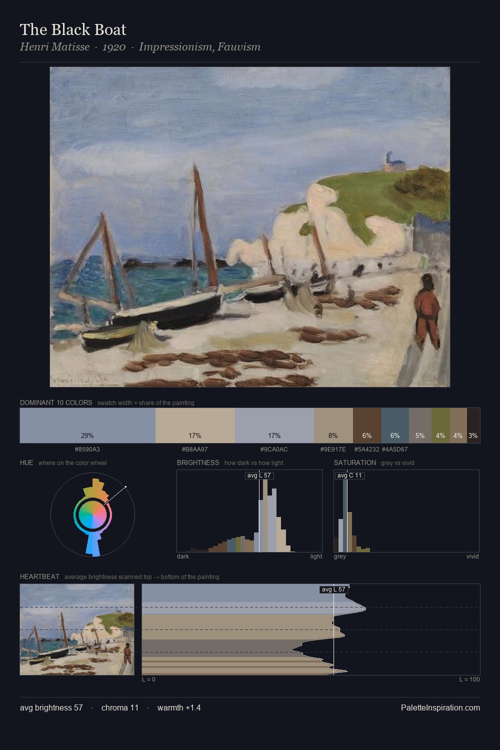
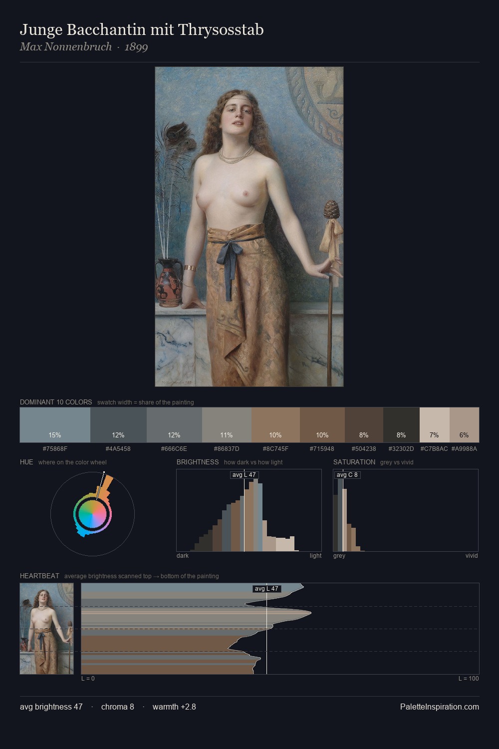
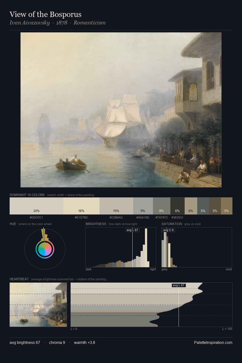
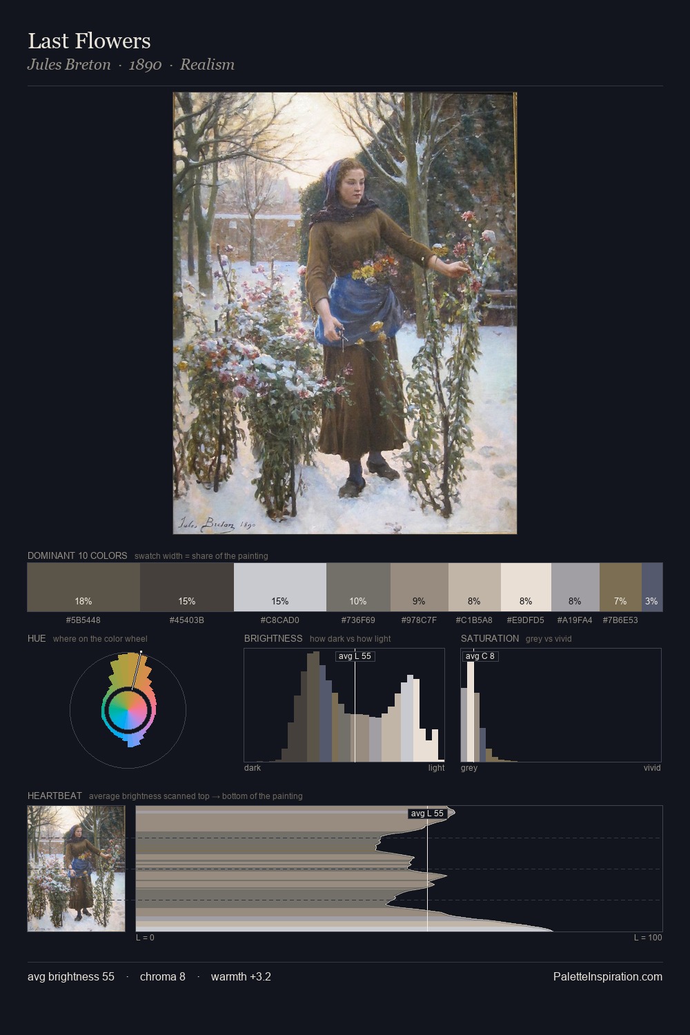
Light floods Heinrich Papin; the palette keeps values pale and airy across its range. Heinrich Papin builds on cool foundations: the palette favours the blue-cyan-green arc. Every colour is desaturated; the palette proceeds through near-neutrals and gently-coloured greys. Heinrich Papin gives 36.0% of the composition to a single #BFB9AC - a decisive chromatic anchor. The most saturated colour, #847055, is reserved to 2.5% of the surface, where it acts as a focal punctuation. Spanning 46 units on the value axis, the palette achieves the balance between tonal flatness and fragmentation. The mid-to-high key, cool bias, and moderate chroma point to outdoor observation - sky and diffused daylight as the dominant light source. This is palette 4 of Heinrich Papin's sequence - a single chapter in a chromatic story told across many works.
Example use cases
- exhibition design
- foundation branding
- estate management
- art education
- museums & galleries
I Love This!
Copy, export, or download for your project