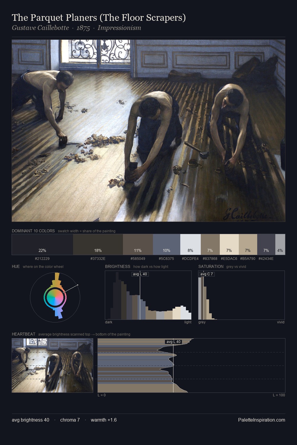
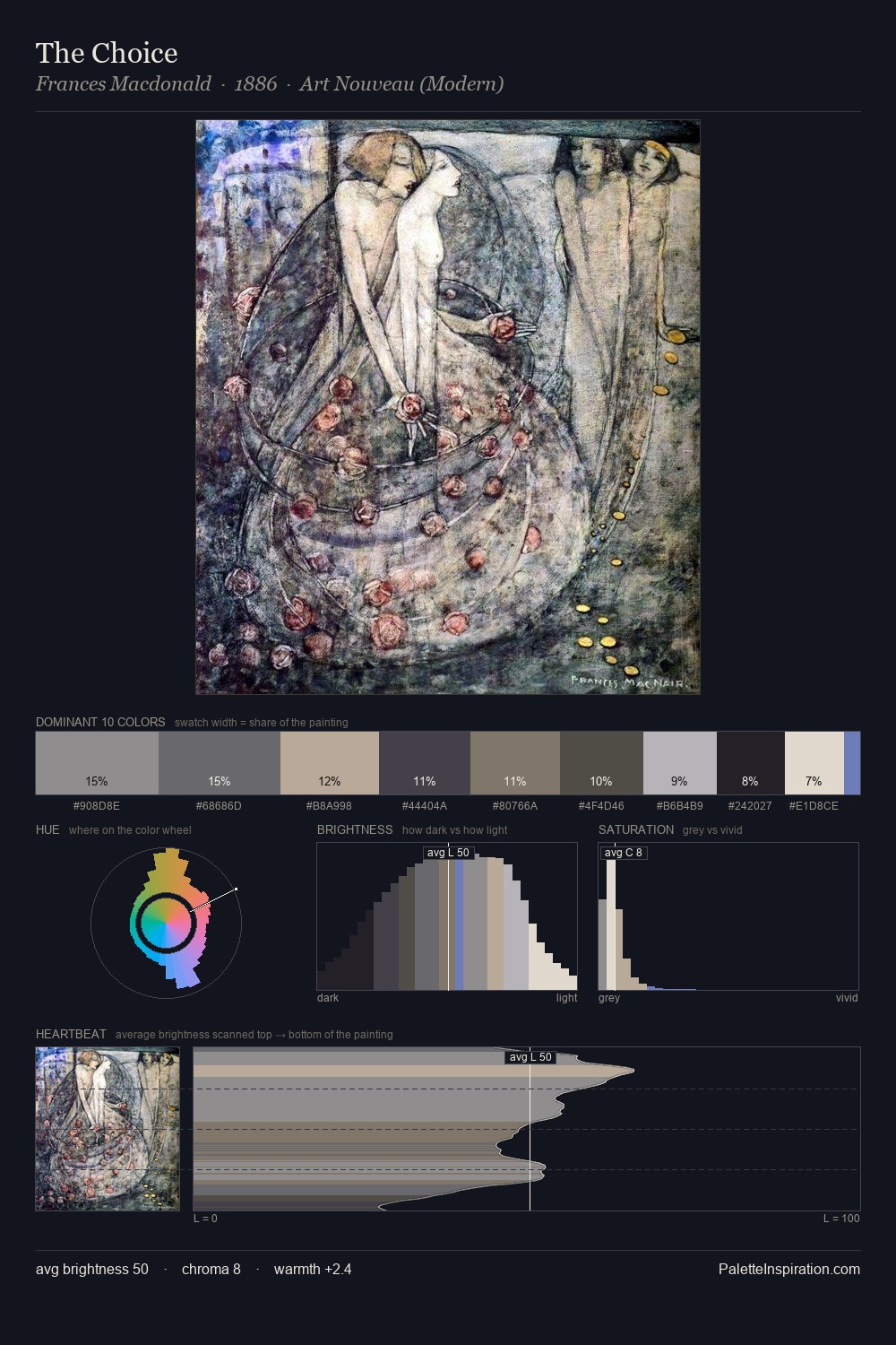
Heinrich Papin Palette 3

Palette Analysis
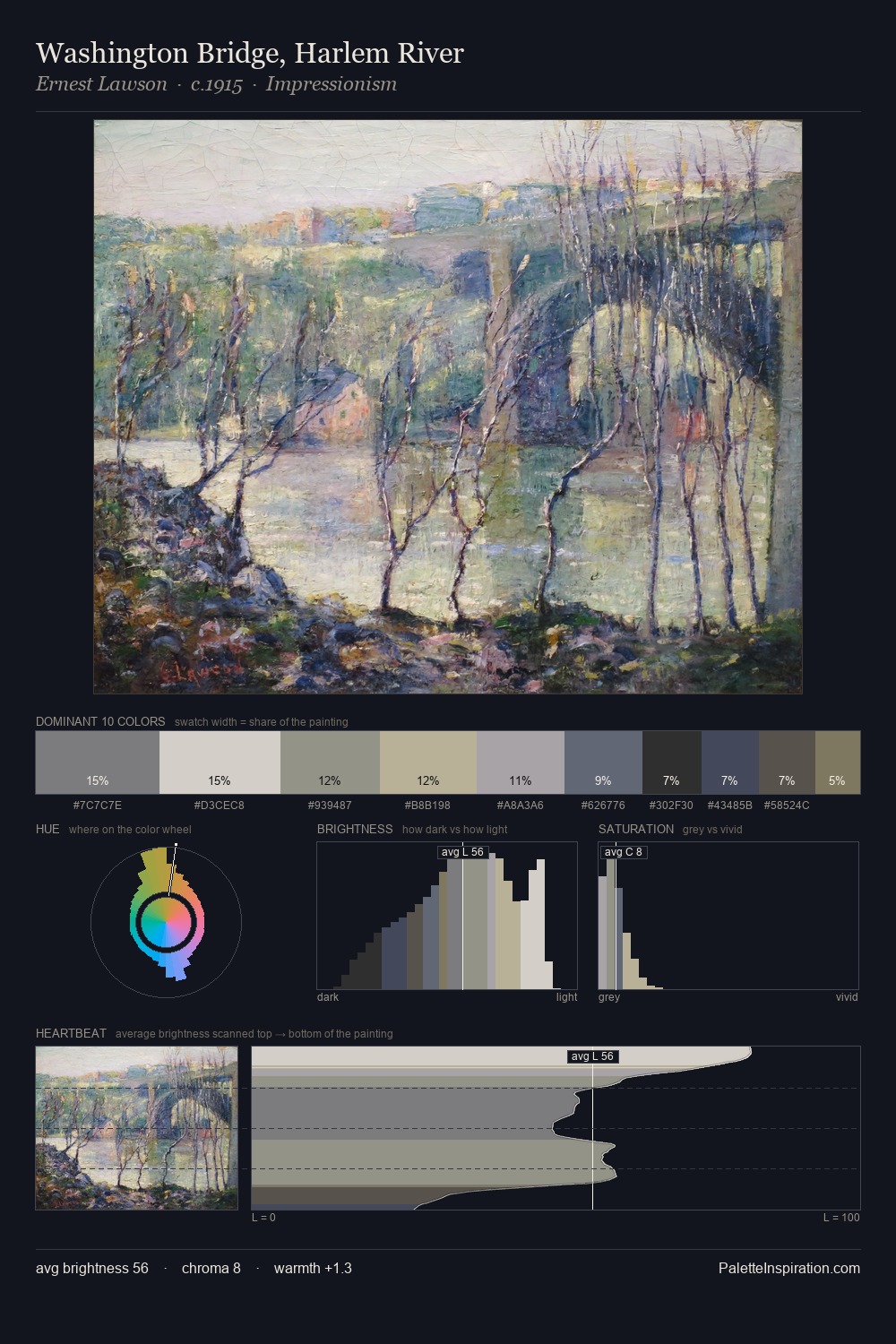
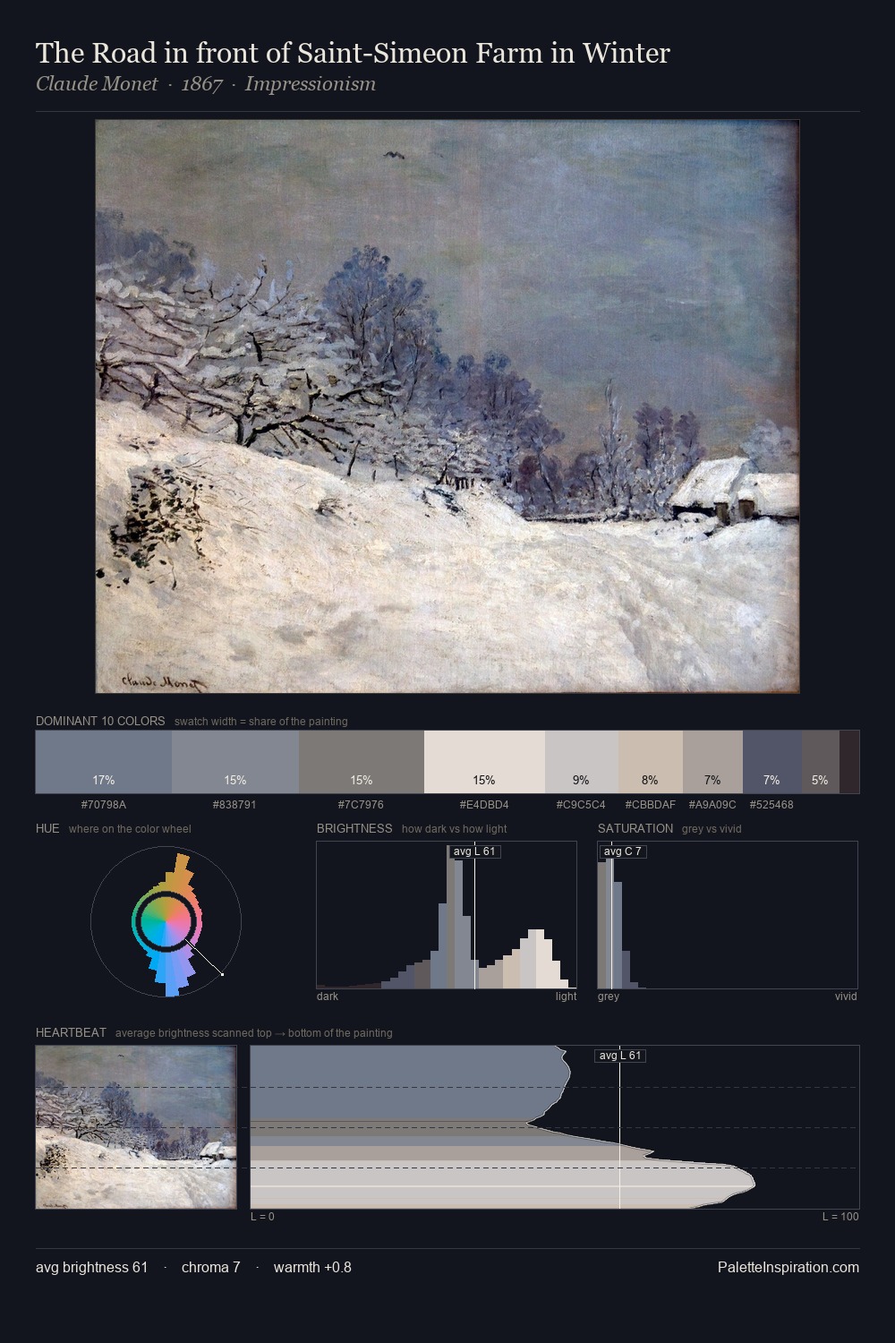
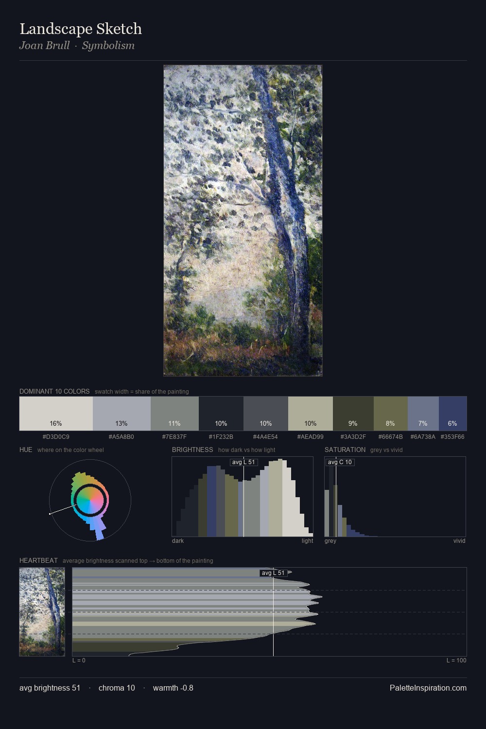
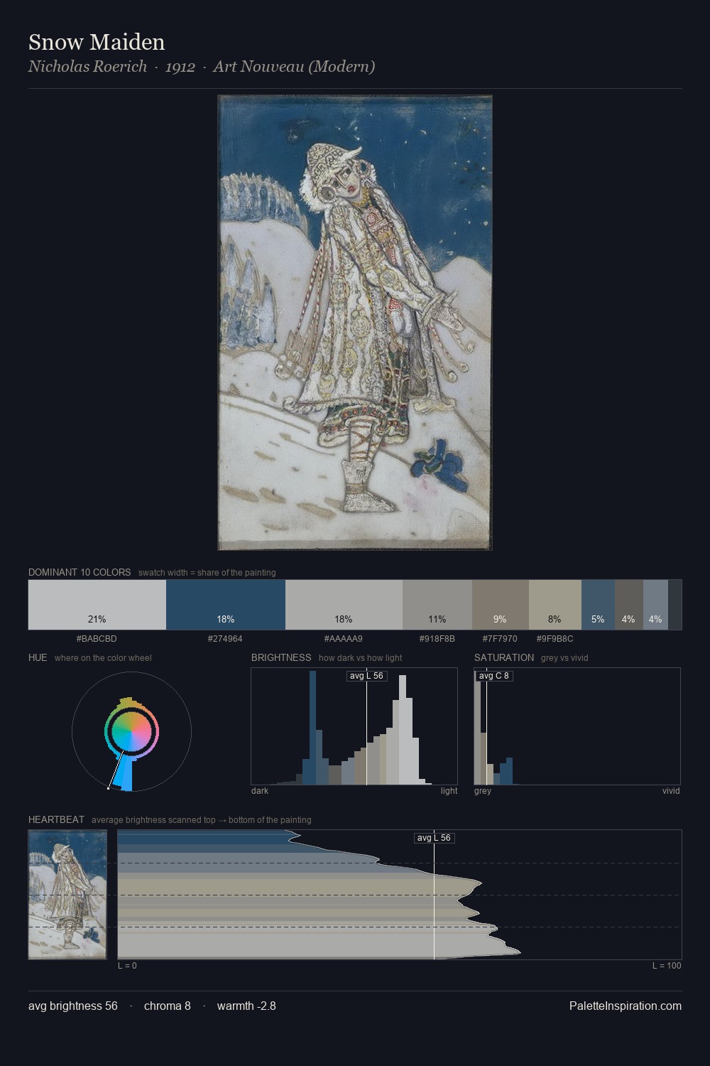
Heinrich Papin works in the upper reaches of the value scale, creating an atmosphere of brightness and expansiveness. Blues and teal-greys govern the palette, lending it an aquatic or atmospheric quality. The absence of saturated colour is itself an expressive choice: this is a palette of restraint and atmosphere. Heinrich Papin gives 32.3% of the composition to a single #E6DED3 - a decisive chromatic anchor. The most saturated colour, #2F4460, is reserved to 2.4% of the surface, where it acts as a focal punctuation. 61 units of value range underpin the palette's structural clarity: the eye always knows where light falls. High luminosity and cool temperature suggest the plein-air condition: unfiltered daylight and open sky. Heinrich Papin's palette 3 carries its own internal logic while remaining in conversation with the artist's broader colour intelligence.
Example use cases
- florist branding
- event design
- real estate
- jewelry retail
- hospitality branding
I Love This!
Copy, export, or download for your project