Heinrich Papin Palette 1

Palette Analysis
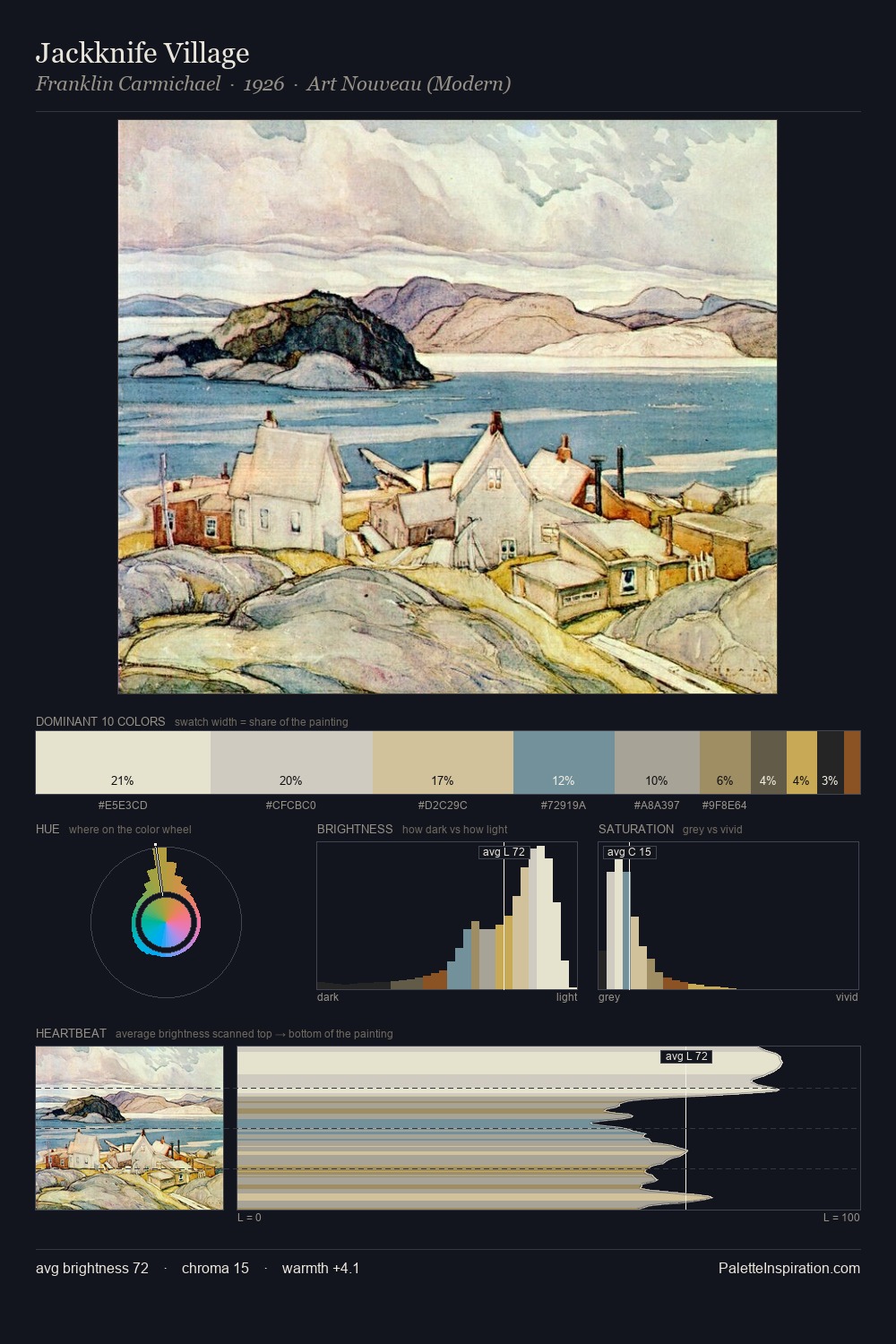
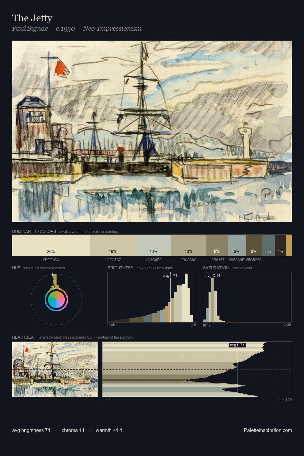
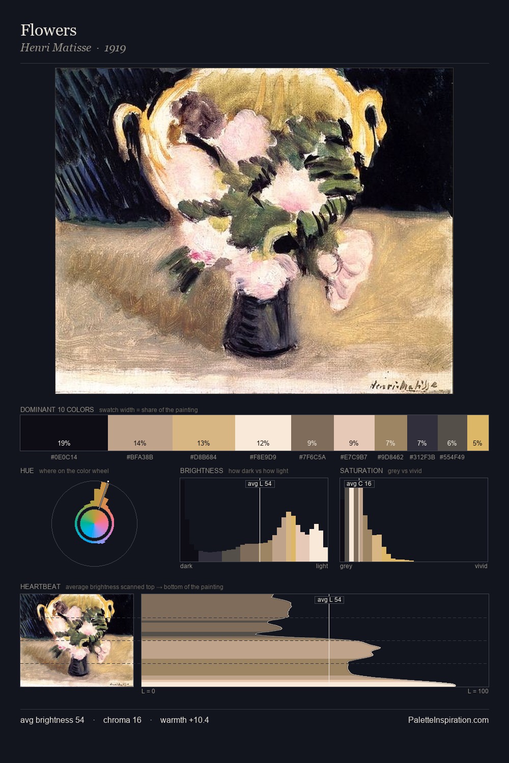
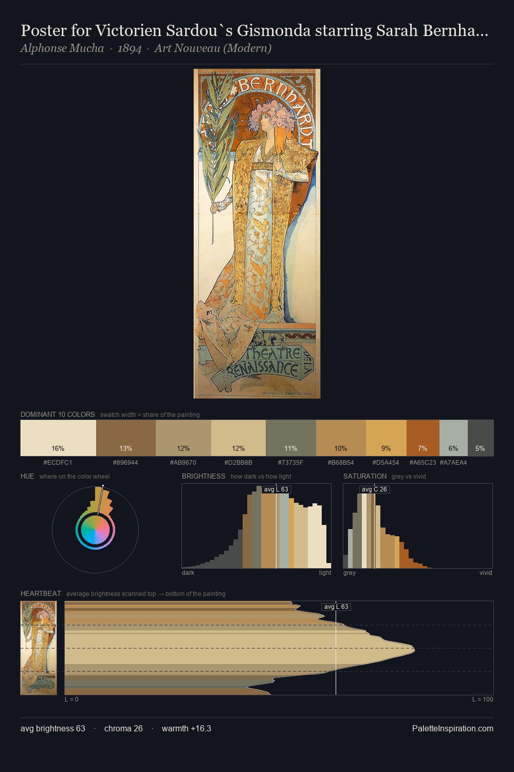
Heinrich Papin works in the upper reaches of the value scale, creating an atmosphere of brightness and expansiveness. Heinrich Papin tilts toward cool - blues and silver-greys carry the structural weight. Muted throughout, the palette achieves its effects through value and temperature rather than chromatic force. Only 11.3% is devoted to #C9B28B, yet that small allocation delivers the palette's entire chromatic tension. 63 units of value range underpin the palette's structural clarity: the eye always knows where light falls. The palette has the character of outdoor light: cool, mid-bright, with colour rendered faithfully rather than expressively. In the context of Heinrich Papin's full range of palettes, group 1 represents one movement in an ongoing chromatic dialogue.
Example use cases
- ceramics & pottery
- boutique hospitality
- menswear
- heritage food brands
- craft & artisan brands
I Love This!
Copy, export, or download for your project