Heinrich Bürkel Palette 3
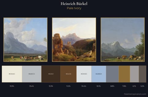
Pale Ivory
Pale High-key and low-chroma - delicate, bleached, washed with light.
Ivory Warm creamy white - the color of natural ivory, warmer than pure white.
Palette Analysis
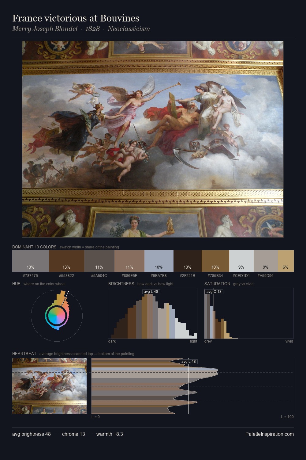
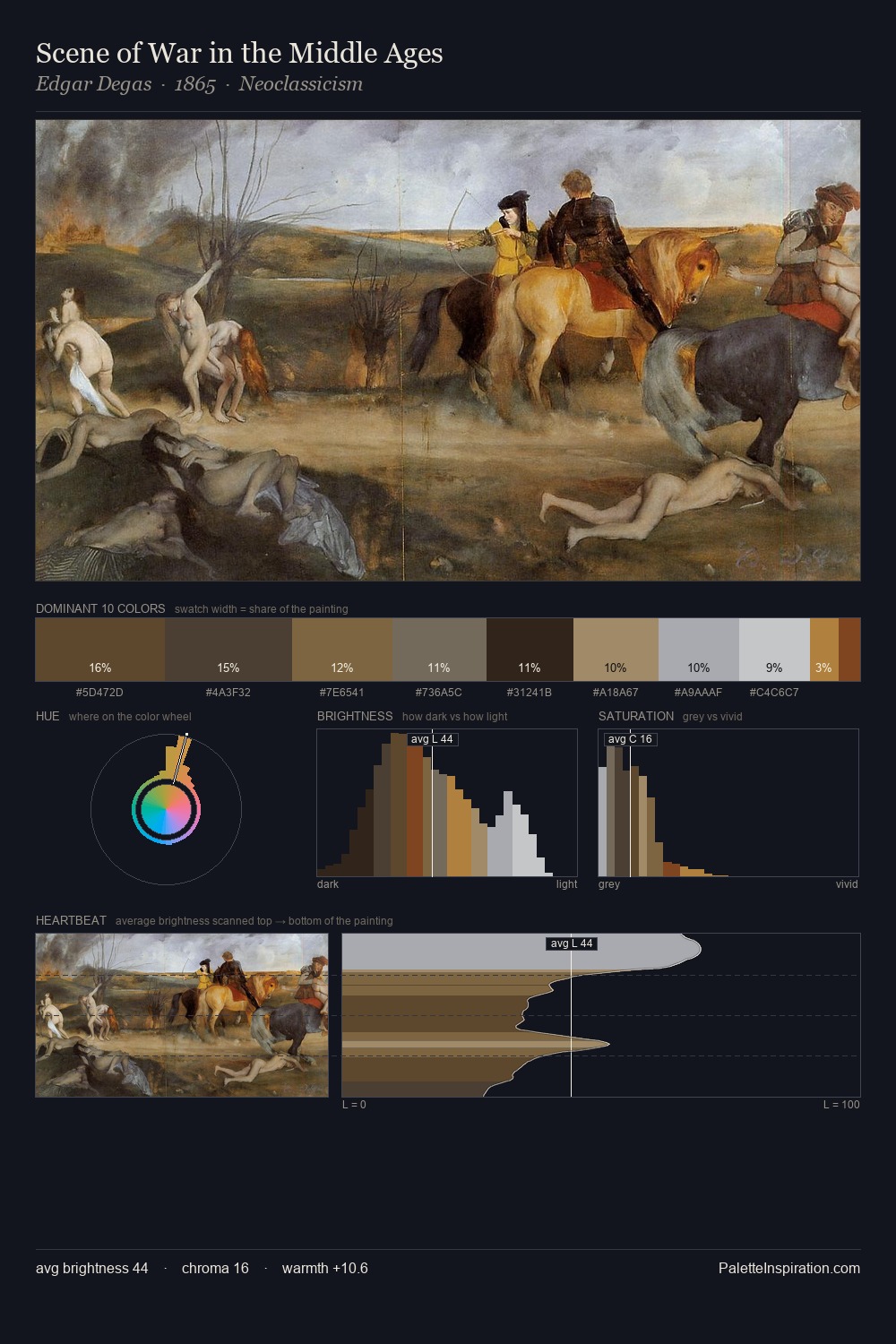
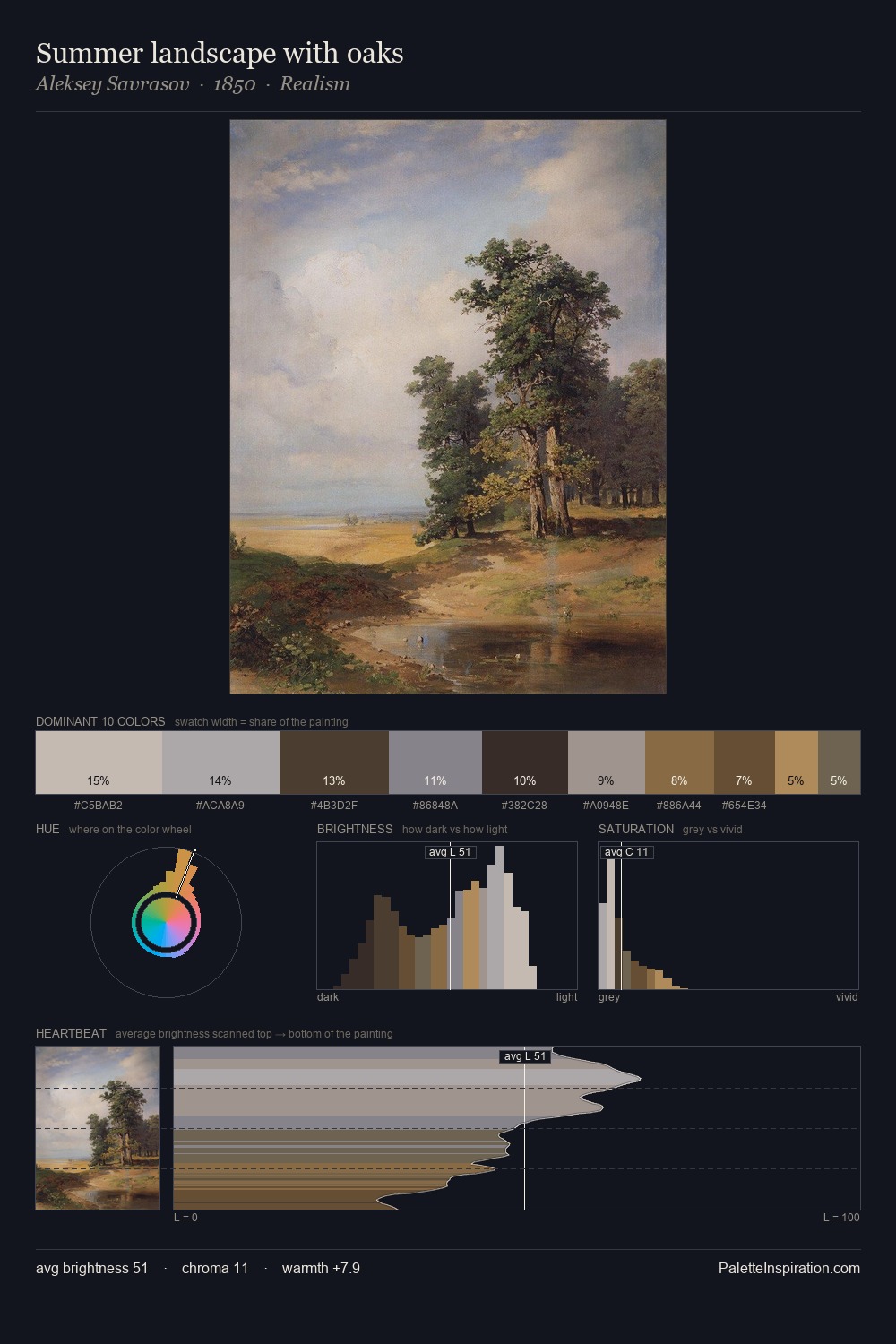
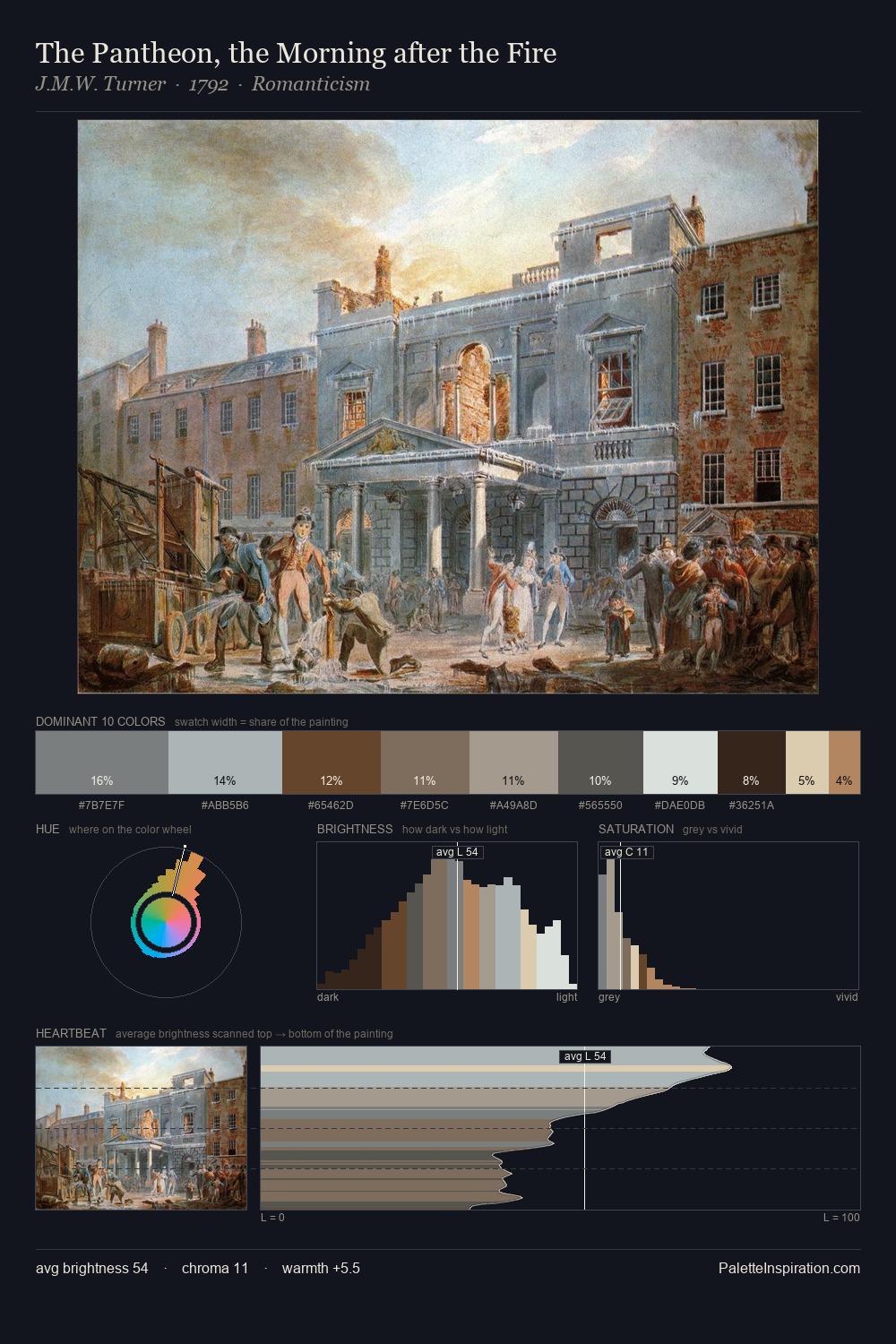
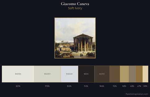
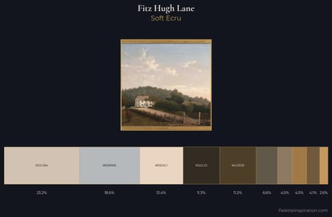
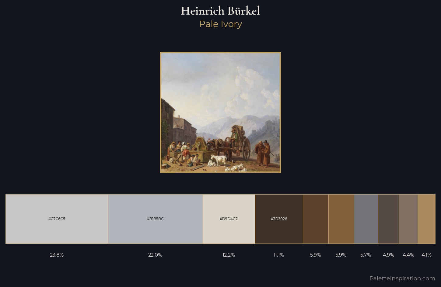
Values in Heinrich Bürkel tilt decisively toward white, giving the palette its luminous character. Heinrich Bürkel keeps warm and cool in parity, a balance that lends the work a perceptual shimmer. Chroma hovers near zero; colour declares itself through subtle shifts in hue rather than outright saturation. Only 4.1% is devoted to #AB8B5D, yet that small allocation delivers the palette's entire chromatic tension. 55 units of value range underpin the palette's structural clarity: the eye always knows where light falls. Heinrich Bürkel's palette 3 carries its own internal logic while remaining in conversation with the artist's broader colour intelligence.
Example use cases
- exhibition design
- foundation branding
- estate management
- art education
- museums & galleries
I Love This!
Use This Palette
Copy, export, or download for your project
Copy, export, or download for your project
Copy:
Download:
Share: