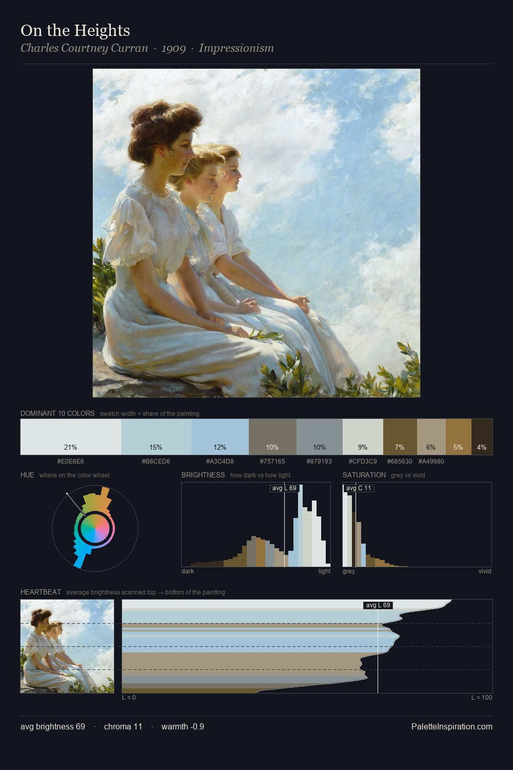
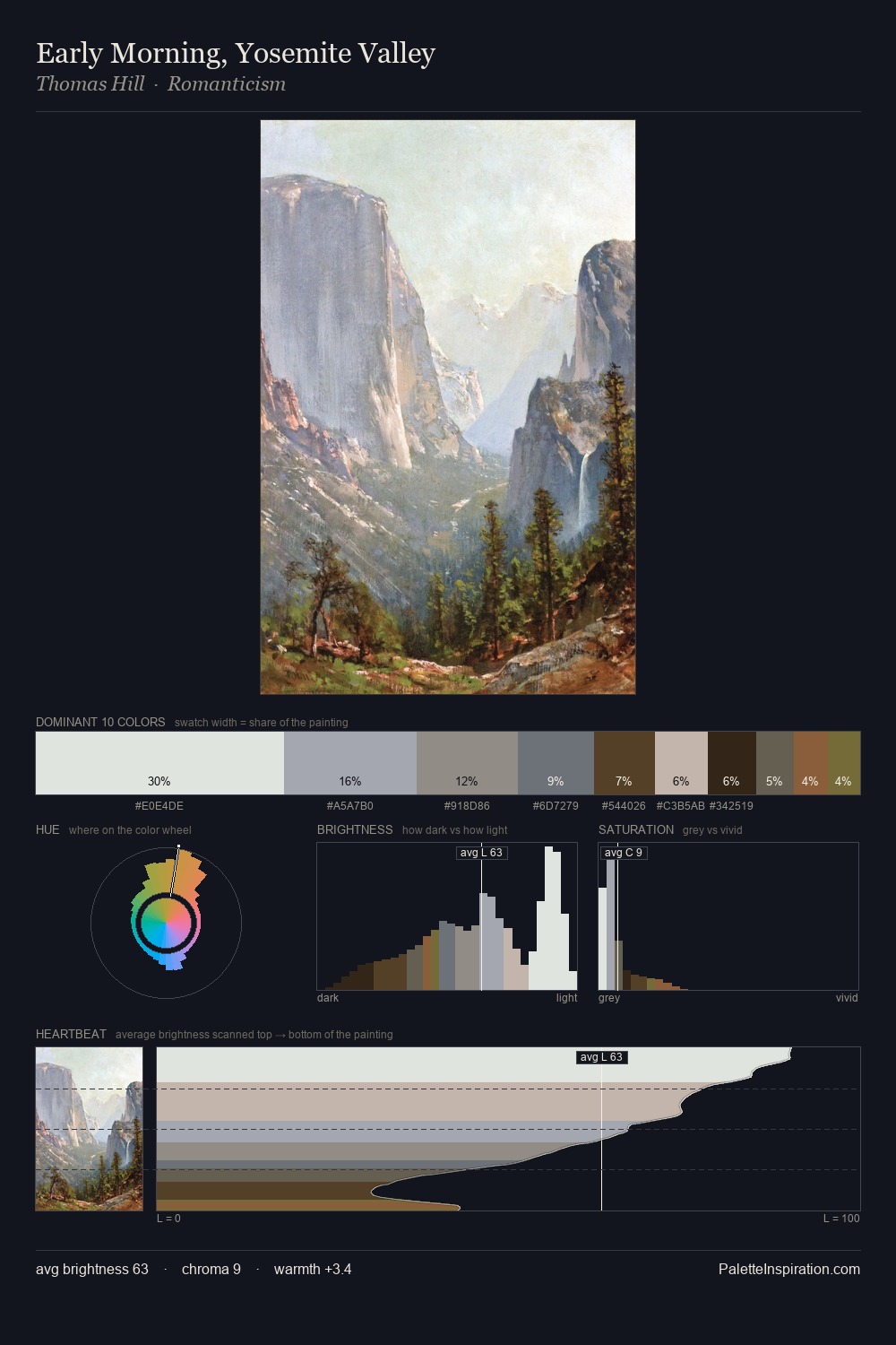
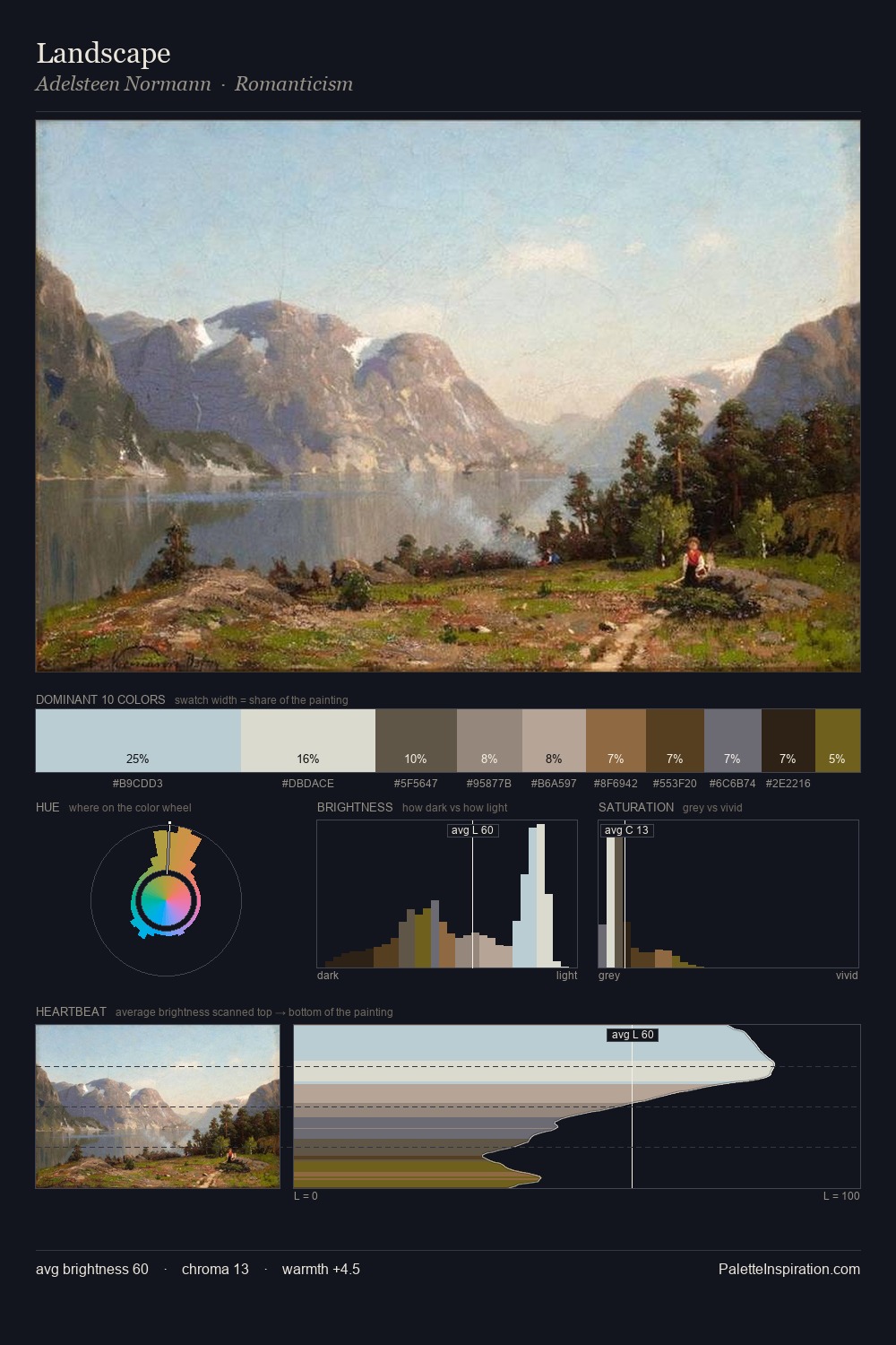
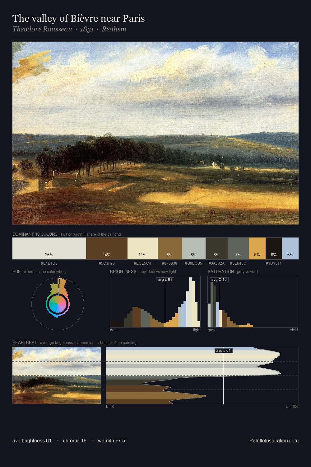
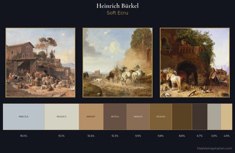
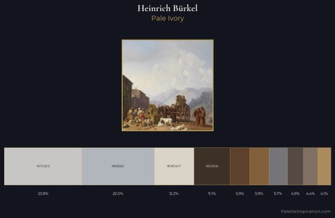
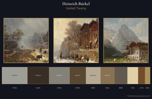
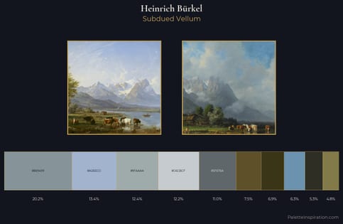
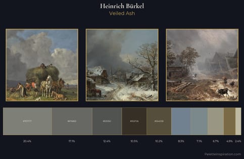
Heinrich Bürkel Palette 1
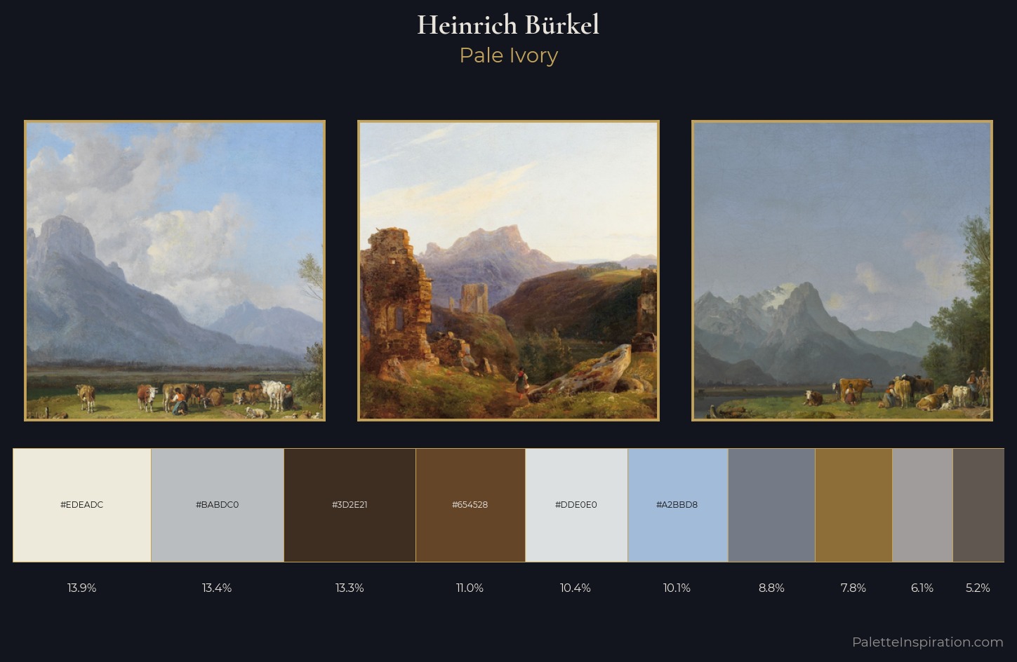
Palette Analysis
Heinrich Bürkel is high in key: pale, luminous, and filled with optical air. A distinctly cool atmosphere runs through this palette: sky, water, and mist given colour form. Saturation is deliberately withheld - the beauty here lies in the near-monochromatic gradations rather than colour difference. #8D6D38 delivers the chromatic peak at only 7.8% - a small shot of colour with outsized visual impact. 63 units of value range underpin the palette's structural clarity: the eye always knows where light falls. The mid-to-high key, cool bias, and moderate chroma point to outdoor observation - sky and diffused daylight as the dominant light source. In the context of Heinrich Bürkel's full range of palettes, group 1 represents one movement in an ongoing chromatic dialogue.
Example use cases
- interior design
- furniture brands
- cookbook publishing
- wine & spirits
- food packaging
I Love This!
Copy, export, or download for your project