Harry Clarke Palette 3

Palette Analysis
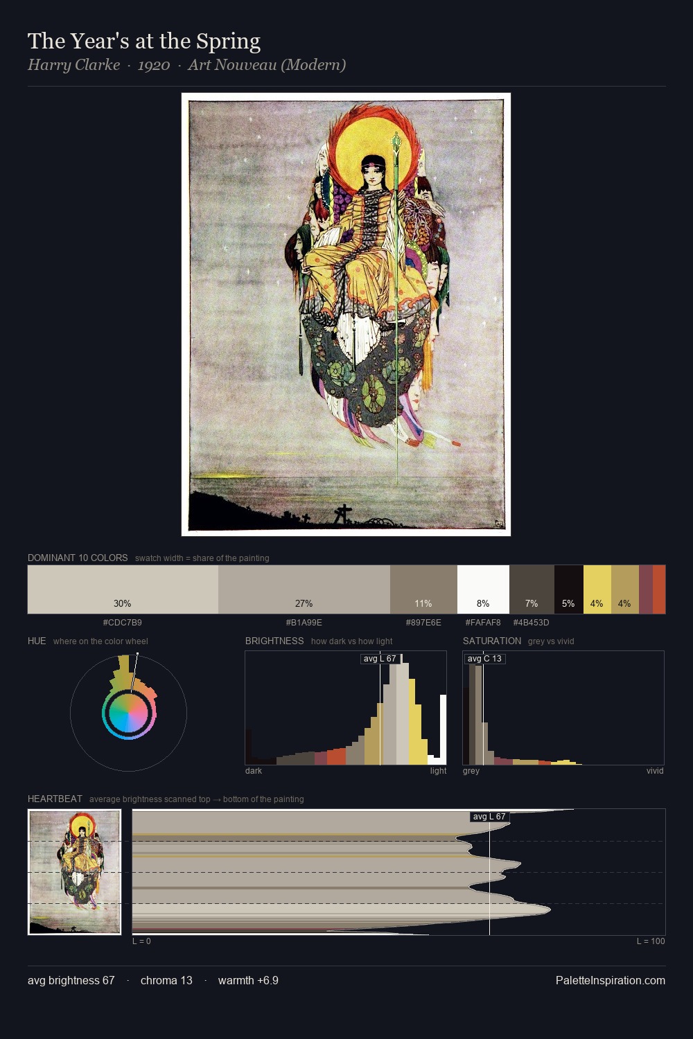
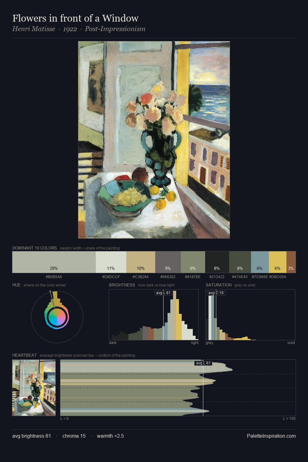
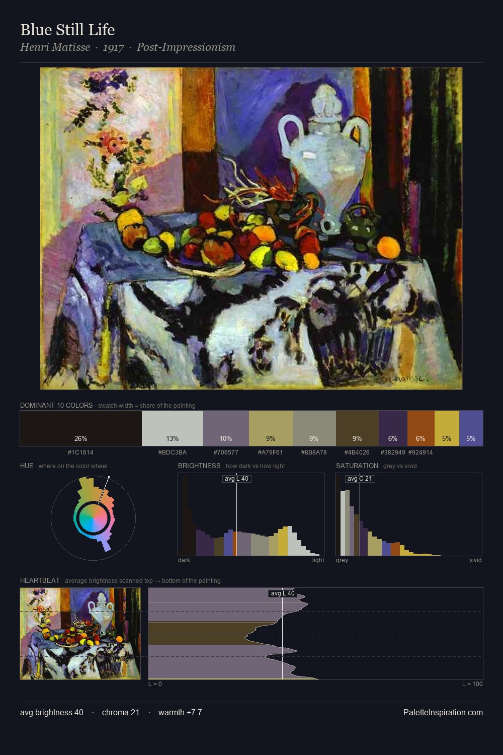
The high-key values of Harry Clarke give it an effulgent, almost bleached quality. Cool tones set the register here - the blues and greens easily outweigh any warm accents. Chroma hovers near zero; colour declares itself through subtle shifts in hue rather than outright saturation. 34.2% of the palette belongs to #DDDBD5, a concentration that makes it the unmistakable visual centre. The most saturated colour, #BCAF71, is reserved to 3.2% of the surface, where it acts as a focal punctuation. The value range spans 67 units across the palette, providing the full gamut from deep shadow to near-white and ensuring clear tonal hierarchy. The mid-to-high key, cool bias, and moderate chroma point to outdoor observation - sky and diffused daylight as the dominant light source. Palette 3 sits within the larger chromatic argument that Harry Clarke's complete body of work advances.
Example use cases
- florist branding
- event design
- real estate
- jewelry retail
- hospitality branding
I Love This!
Copy, export, or download for your project