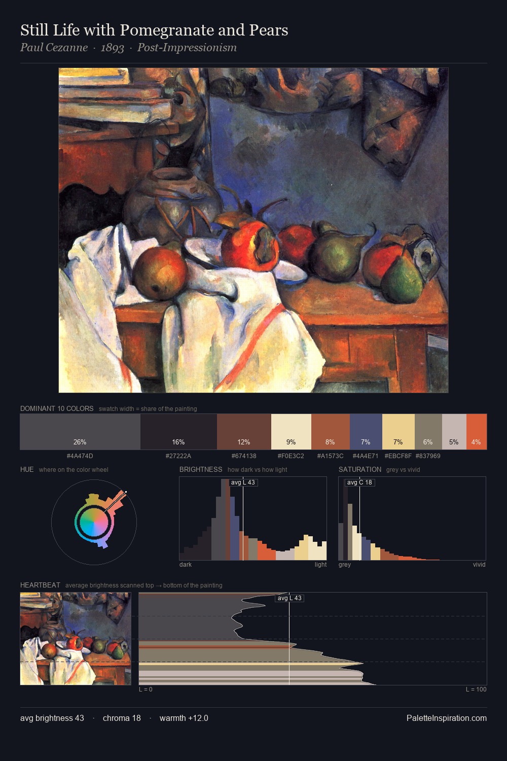
Harry Clarke Palette 1

Palette Analysis
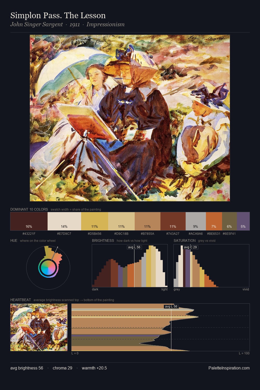
The high-key values of Harry Clarke give it an effulgent, almost bleached quality. Harry Clarke tilts toward cool - blues and silver-greys carry the structural weight. All colours lean toward grey, building depth through value rather than colour punch. 52.0% of the palette belongs to #F1EADB, a concentration that makes it the unmistakable visual centre. The most saturated colour, #DCAF83, is reserved to 4.8% of the surface, where it acts as a focal punctuation. From deepest dark to palest light, the palette traverses 70 units of the value scale - a span that creates natural depth. The palette has the character of outdoor light: cool, mid-bright, with colour rendered faithfully rather than expressively. In the context of Harry Clarke's full range of palettes, group 1 represents one movement in an ongoing chromatic dialogue.
Example use cases
- publishing
- corporate identity
- consumer apps
- hospitality
- design agencies
I Love This!
Copy, export, or download for your project